
Last observation: 2025 (N = 100)
First observation: 1990 (N = 67)
Last data update: 26 oct. 2026, 00:18
Last compile: 26 oct. 2026, 00:22
ig_b("oecd", "AV_AN_WAGE_FR")
ig_b("oecd", "average-annual-wages-for-oecd-countries-in-us-constant-1995-2023")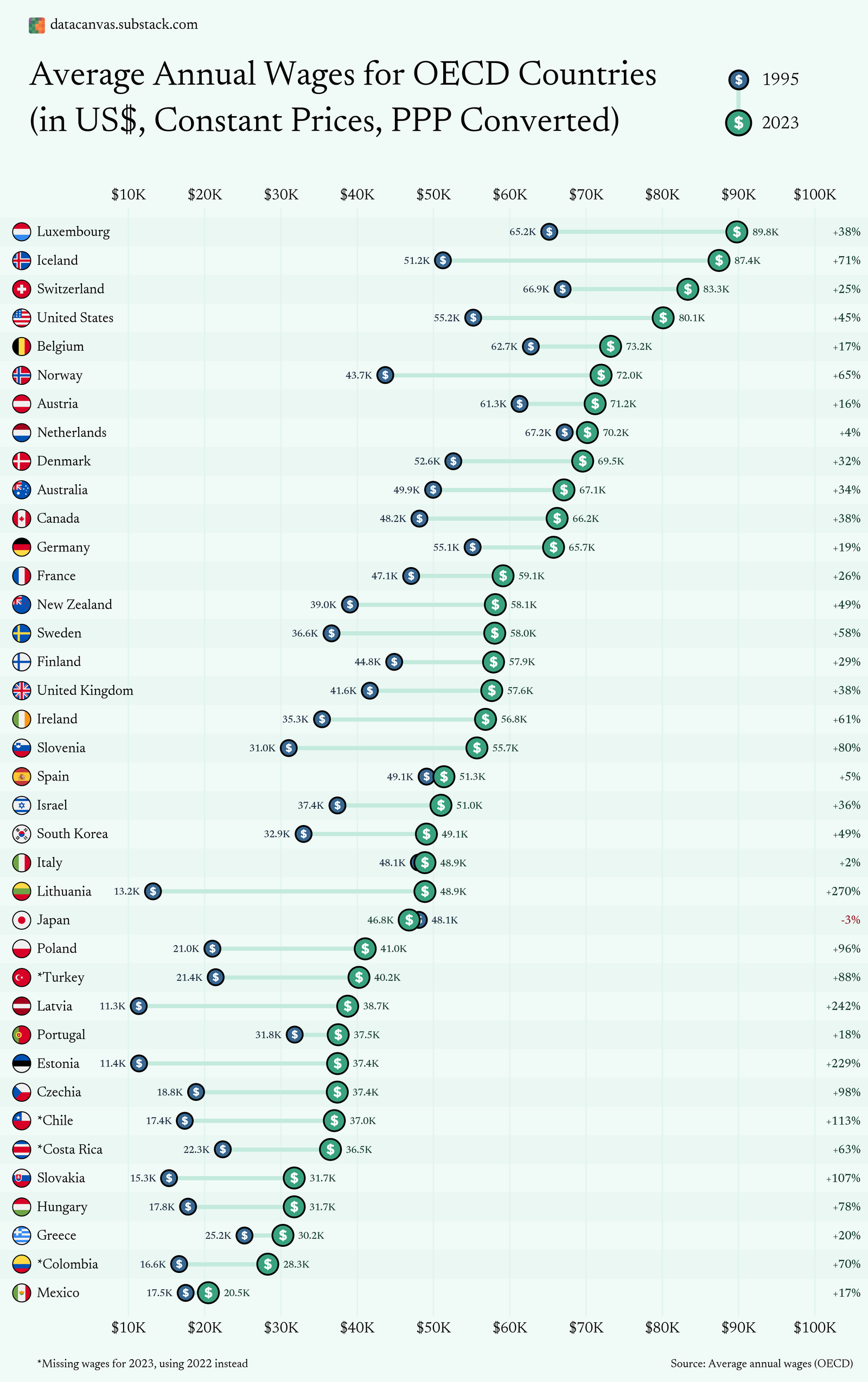
ig_b("oecd", "average-annual-wages-for-oecd-countries-in-us-constant-1995-2023")
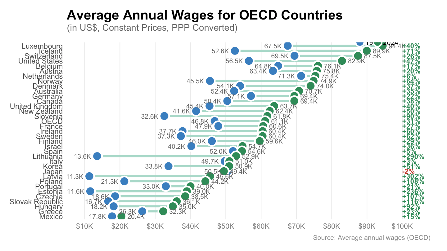
df <- AV_AN_WAGE |>
  filter(PRICE_BASE == "Q",
         obsTime %in% c("1995", "2024"),
         UNIT_MEASURE == "USD_PPP") |>

  select(REF_AREA, Ref_area, obsTime, obsValue) |>
  spread(obsTime, obsValue) |>
  arrange(desc(`2024`)) |>
  filter(!is.na(`2024`)) |>
  setNames(c("REF_AREA", "country", "w1995", "w2024")) |>
  mutate(
    pct_change = round((w2024 - w1995) / w1995 * 100),
    pct_label  = paste0(ifelse(pct_change >= 0, "+", ""), pct_change, "%"),
    # Keep countries in descending order of 2024 wage
    country = fct_reorder(country, w2024)
  )

# Colour palette matching the original
col_1995 <- "#3a7ebf"   # steel blue
col_2024 <- "#2e8b57"   # sea green
col_neg  <- "#c0392b"   # red for negative change

ggplot(df) +

  # ── segment connecting the two dots ──────────────────────────────────────
  geom_segment(
    aes(x = w1995, xend = w2024, y = country, yend = country),
    colour = "#a8d8c8", linewidth = 1.2, lineend = "round"
  ) +

  # ── 1995 dot ─────────────────────────────────────────────────────────────
  geom_point(
    aes(x = w1995, y = country),
    colour = "white", fill = col_1995, shape = 21, size = 4.5, stroke = 1.4
  ) +

  # ── 2024 dot ─────────────────────────────────────────────────────────────
  geom_point(
    aes(x = w2024, y = country),
    colour = "white", fill = col_2024, shape = 21, size = 4.5, stroke = 1.4
  ) +

  # ── 1995 value label (left of dot) ───────────────────────────────────────
  geom_text(
    aes(x = w1995, y = country,
        label = paste0(scales::number(w1995/1000, accuracy = 0.1), "K")),
    hjust = 1.35, size = 2.8, colour = "grey40"
  ) +

  # ── 2024 value label (right of dot) ──────────────────────────────────────
  geom_text(
    aes(x = w2024, y = country,
        label = paste0(scales::number(w2024/1000, accuracy = 0.1), "K")),
    hjust = -0.35, size = 2.8, colour = "grey40"
  ) +

  # ── % change label (far right) ───────────────────────────────────────────
  geom_text(
    aes(x = 100000, y = country, label = pct_label,
        colour = ifelse(pct_change < 0, col_neg, "#2e8b57")),
    hjust = 0, size = 3, fontface = "bold"
  ) +
  scale_colour_identity() +

  # ── axes & scales ─────────────────────────────────────────────────────────
  scale_x_continuous(
    labels = scales::label_dollar(scale = 1/1000, suffix = "K"),
    breaks = seq(10000, 100000, by = 10000),
    limits = c(5000, 108000),
    expand = c(0, 0)
  ) +

  # ── legend ────────────────────────────────────────────────────────────────
  annotate("point", x = 88000, y = nlevels(df$country) + 0.7,
           colour = "white", fill = col_1995, shape = 21, size = 4, stroke = 1.2) +
  annotate("text",  x = 89500, y = nlevels(df$country) + 0.7,
           label = "1995", hjust = 0, size = 3) +
  annotate("point", x = 93000, y = nlevels(df$country) + 0.7,
           colour = "white", fill = col_2024, shape = 21, size = 4, stroke = 1.2) +
  annotate("text",  x = 94500, y = nlevels(df$country) + 0.7,
           label = "2024", hjust = 0, size = 3) +

  # ── titles ────────────────────────────────────────────────────────────────
  labs(
    title    = "Average Annual Wages for OECD Countries",
    subtitle = "(in US$, Constant Prices, PPP Converted)",
    caption  = "Source: Average annual wages (OECD)",
    x = NULL, y = NULL
  ) +

  # ── theme ─────────────────────────────────────────────────────────────────
  theme_minimal(base_size = 11) +
  theme(
    plot.title       = element_text(size = 16, face = "bold", margin = margin(b = 2)),
    plot.subtitle    = element_text(size = 11, colour = "grey40", margin = margin(b = 12)),
    plot.caption     = element_text(size = 8,  colour = "grey55", hjust = 1),
    axis.text.x      = element_text(colour = "grey50"),
    axis.text.y      = element_text(size = 9),
    panel.grid.major.x = element_line(colour = "grey92", linewidth = 0.4),
    panel.grid.major.y = element_blank(),
    panel.grid.minor   = element_blank(),
    plot.margin        = margin(12, 20, 12, 12),
    legend.position    = "bottom"
  )
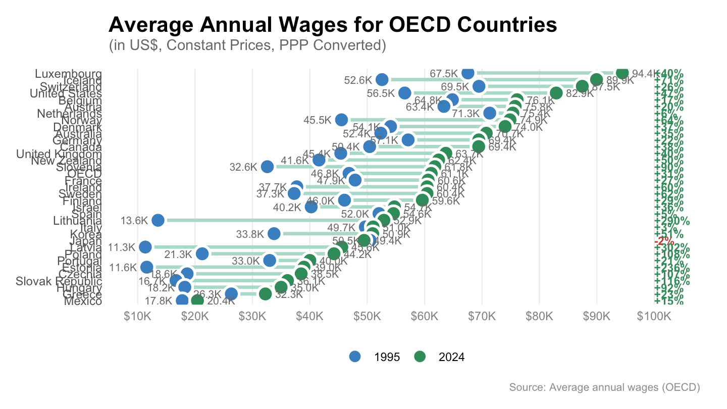
df <- AV_AN_WAGE |>
  filter(PRICE_BASE == "Q",
         obsTime %in% c("1995", "2024"),
         UNIT_MEASURE == "USD_PPP") |>

  select(REF_AREA, Ref_area, obsTime, obsValue) |>
  spread(obsTime, obsValue) |>
  arrange(desc(`2024`)) |>
  filter(!is.na(`2024`)) |>
  setNames(c("REF_AREA", "country", "w1995", "w2024")) |>
  mutate(
    pct_change = round((w2024 - w1995) / w1995 * 100),
    pct_label  = paste0(ifelse(pct_change >= 0, "+", ""), pct_change, "%"),
    # Keep countries in descending order of 2024 wage
    country = fct_reorder(country, w2024)
  )

# Colour palette matching the original
col_1995 <- "#3a7ebf"   # steel blue
col_2024 <- "#2e8b57"   # sea green
col_neg  <- "#c0392b"   # red for negative change


# ── Supprime les annotate() de légende existants ──────────────────────────
# (retire les 4 lignes annotate "point"/"text" pour 1995 et 2024)

# ── Ajoute la légende via scale + guides ──────────────────────────────────
# Transforme le dataframe en format long pour pouvoir utiliser une aesthetic fill

df_long <- df |>
  pivot_longer(cols = c(w1995, w2024), names_to = "year", values_to = "wage") |>
  mutate(year = case_match(year, "w1995" ~ "1995", "w2024" ~ "2024"))

ggplot() +

  # segment
  geom_segment(
    data = df,
    aes(x = w1995, xend = w2024, y = country, yend = country),
    colour = "#a8d8c8", linewidth = 1.2, lineend = "round"
  ) +

  # points (avec fill mappé pour la légende)
  geom_point(
    data = df_long,
    aes(x = wage, y = country, fill = year),
    colour = "white", shape = 21, size = 4.5, stroke = 1.4
  ) +

  scale_fill_manual(
    values = c("1995" = "#3a7ebf", "2024" = "#2e8b57"),
    name   = NULL
  ) +

  # value labels 1995
  geom_text(
    data = df,
    aes(x = w1995, y = country,
        label = paste0(scales::number(w1995/1000, accuracy = 0.1), "K")),
    hjust = 1.35, size = 2.8, colour = "grey40"
  ) +

  # value labels 2024
  geom_text(
    data = df,
    aes(x = w2024, y = country,
        label = paste0(scales::number(w2024/1000, accuracy = 0.1), "K")),
    hjust = -0.35, size = 2.8, colour = "grey40"
  ) +

  # % change
  geom_text(
    data = df,
    aes(x = 100000, y = country, label = pct_label,
        colour = ifelse(pct_change < 0, "#c0392b", "#2e8b57")),
    hjust = 0, size = 3, fontface = "bold"
  ) +
  scale_colour_identity() +

  scale_x_continuous(
    labels = scales::label_dollar(scale = 1/1000, suffix = "K"),
    breaks = seq(10000, 100000, by = 10000),
    limits = c(5000, 108000),
    expand = c(0, 0)
  ) +

  labs(
    title    = "Average Annual Wages for OECD Countries",
    subtitle = "(in US$, Constant Prices, PPP Converted)",
    caption  = "Source: Average annual wages (OECD)",
    x = NULL, y = NULL
  ) +

  guides(
    fill = guide_legend(
      direction        = "horizontal",
      override.aes     = list(size = 4, stroke = 1.2, colour = "white"),
      label.position   = "right"
    )
  ) +

  theme_minimal(base_size = 11) +
  theme(
    plot.title         = element_text(size = 16, face = "bold", margin = margin(b = 2)),
    plot.subtitle      = element_text(size = 11, colour = "grey40", margin = margin(b = 12)),
    plot.caption       = element_text(size = 8,  colour = "grey55", hjust = 1),
    axis.text.x        = element_text(colour = "grey50"),
    axis.text.y        = element_text(size = 9),
    panel.grid.major.x = element_line(colour = "grey92", linewidth = 0.4),
    panel.grid.major.y = element_blank(),
    panel.grid.minor   = element_blank(),
    legend.position    = "bottom",       # ← légende en bas
    legend.spacing.x   = unit(6, "pt"),
    plot.margin        = margin(12, 20, 12, 12)
  )
AV_AN_WAGE |>
  filter(PRICE_BASE == "Q",
         UNIT_MEASURE == "USD_PPP",
         REF_AREA %in% c("FRA", "DEU", "ITA", "ESP", "USA")) |>

  year_to_date() |>
  #filter(date >= as.Date("1996-01-01")) %>%
  group_by(Ref_area) |>
  arrange(date) |>
  mutate(obsValue = 100*obsValue/obsValue[1]) |>
  add_flag_color("Ref_area") |>
  ggplot() + geom_line(aes(x = date, y = obsValue, color = color)) +
  scale_color_identity() + add_5flags + theme_minimal() +
  scale_x_date(breaks = seq(1920, 2100, 2) |> paste0("-01-01") |> as.Date(),
               labels = date_format("%Y")) +
  scale_y_log10(breaks = seq(10, 500, 10)) +
  ylab("Current prices in NCU") + xlab("")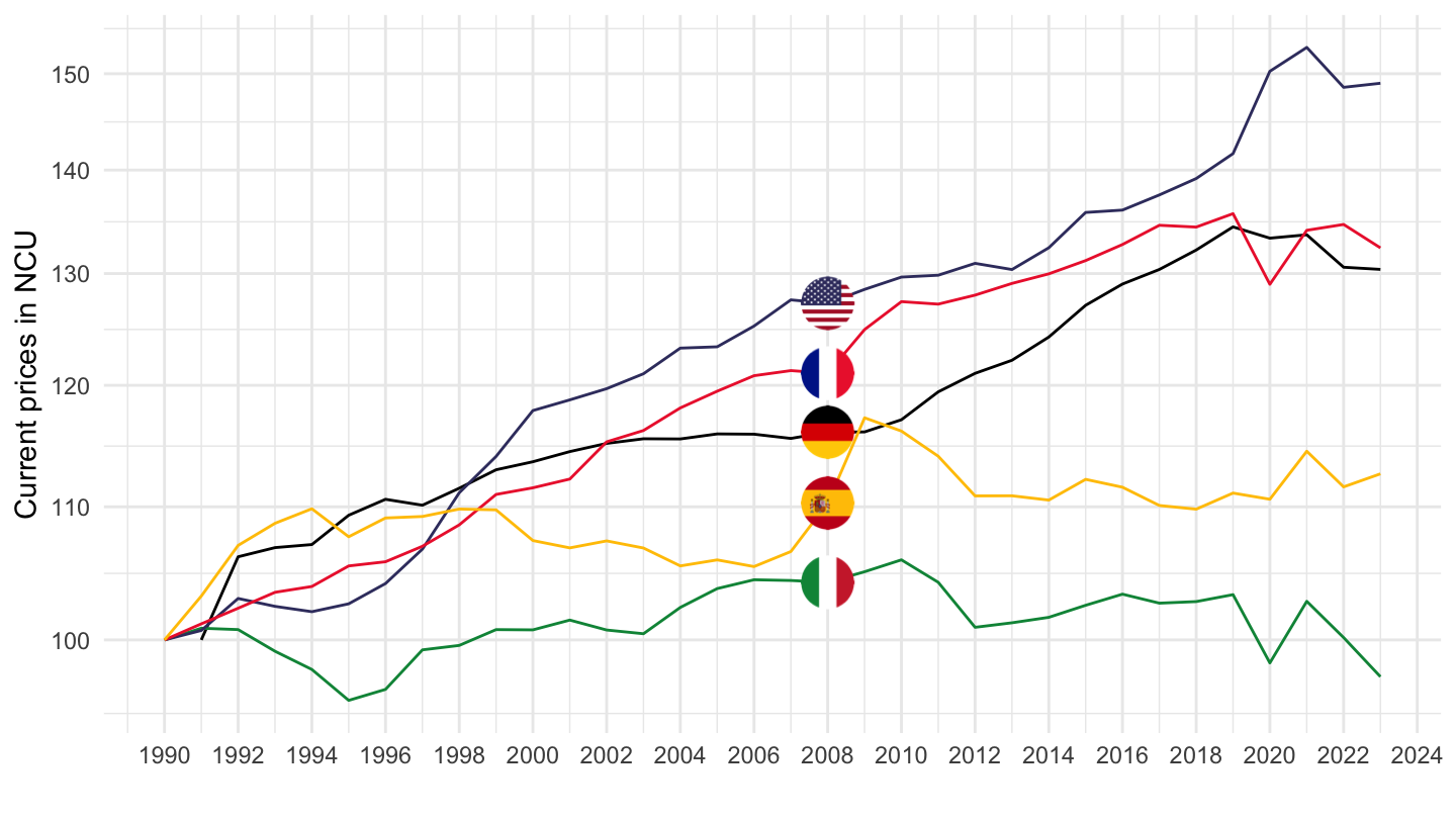
AV_AN_WAGE |>
  filter(PRICE_BASE == "Q",
         UNIT_MEASURE == "USD_PPP",
         REF_AREA %in% c("FRA", "DEU", "ITA", "ESP", "USA")) |>

  year_to_date() |>
  filter(date >= as.Date("1996-01-01")) |>
  group_by(Ref_area) |>
  arrange(date) |>
  mutate(obsValue = 100*obsValue/obsValue[1]) |>
  add_flag_color("Ref_area") |>
  ggplot() + geom_line(aes(x = date, y = obsValue, color = color)) +
  scale_color_identity() + add_5flags + theme_minimal() +
  scale_x_date(breaks = seq(1920, 2100, 2) |> paste0("-01-01") |> as.Date(),
               labels = date_format("%Y")) +
  scale_y_log10(breaks = seq(10, 500, 10)) +
  ylab("Current prices in NCU") + xlab("")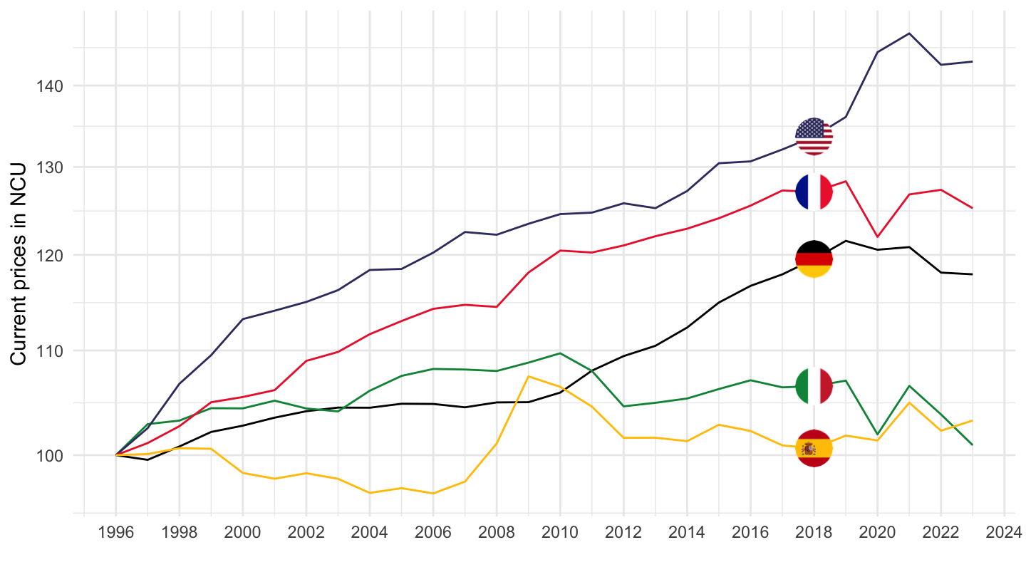
AV_AN_WAGE |>
  filter(PRICE_BASE == "V",
         REF_AREA %in% c("FRA", "DEU", "ITA", "ESP", "USA")) |>

  year_to_date() |>
  #filter(date >= as.Date("1996-01-01")) %>%
  group_by(Ref_area) |>
  arrange(date) |>
  mutate(obsValue = 100*obsValue/obsValue[1]) |>
  add_flag_color("Ref_area") |>
  ggplot() + geom_line(aes(x = date, y = obsValue, color = color)) +
  scale_color_identity() + add_5flags + theme_minimal() +
  scale_x_date(breaks = seq(1920, 2100, 2) |> paste0("-01-01") |> as.Date(),
               labels = date_format("%Y")) +
  scale_y_log10(breaks = seq(10, 500, 10)) +
  ylab("Current prices in NCU") + xlab("")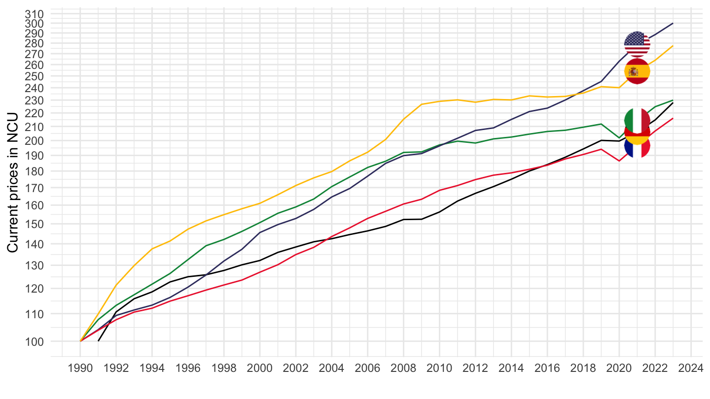
AV_AN_WAGE |>
  filter(PRICE_BASE == "V",
         REF_AREA %in% c("FRA", "DEU", "ITA", "ESP", "USA")) |>

  year_to_date() |>
  filter(date >= as.Date("1992-01-01")) |>
  group_by(Ref_area) |>
  arrange(date) |>
  mutate(obsValue = 100*obsValue/obsValue[1]) |>
  add_flag_color("Ref_area") |>
  ggplot() + geom_line(aes(x = date, y = obsValue, color = color)) +
  scale_color_identity() + add_5flags + theme_minimal() +
  scale_x_date(breaks = seq(1920, 2100, 2) |> paste0("-01-01") |> as.Date(),
               labels = date_format("%Y")) +
  scale_y_log10(breaks = seq(10, 500, 10)) +
  ylab("Current prices in NCU") + xlab("")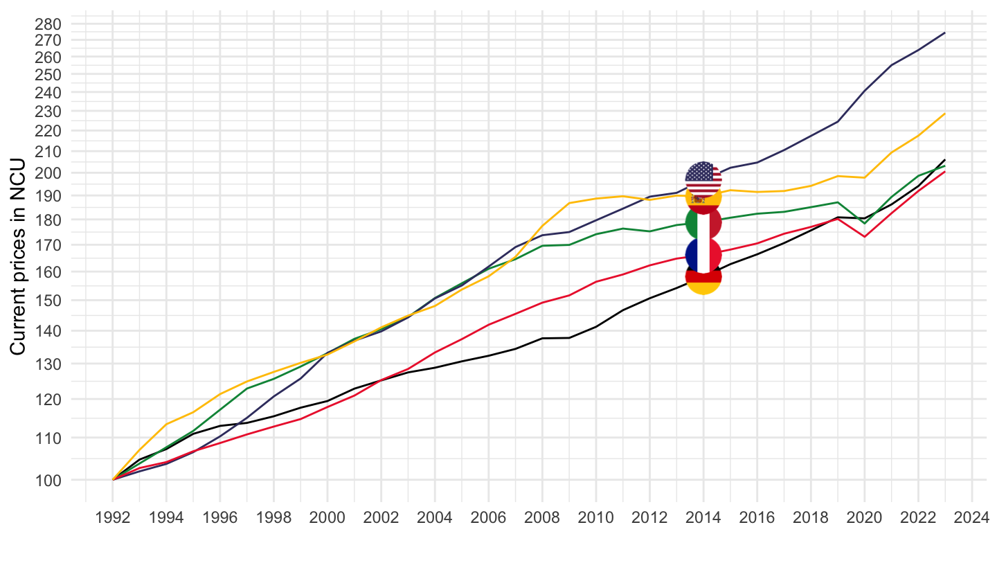
AV_AN_WAGE |>
  filter(PRICE_BASE == "V",
         REF_AREA %in% c("FRA", "DEU", "ITA", "ESP", "USA")) |>

  year_to_date() |>
  filter(date >= as.Date("1996-01-01")) |>
  group_by(Ref_area) |>
  arrange(date) |>
  mutate(obsValue = 100*obsValue/obsValue[1]) |>
  add_flag_color("Ref_area") |>
  ggplot() + geom_line(aes(x = date, y = obsValue, color = color)) +
  scale_color_identity() + add_5flags + theme_minimal() +
  scale_x_date(breaks = seq(1920, 2100, 2) |> paste0("-01-01") |> as.Date(),
               labels = date_format("%Y")) +
  scale_y_log10(breaks = seq(10, 500, 10)) +
  ylab("Current prices in NCU") + xlab("")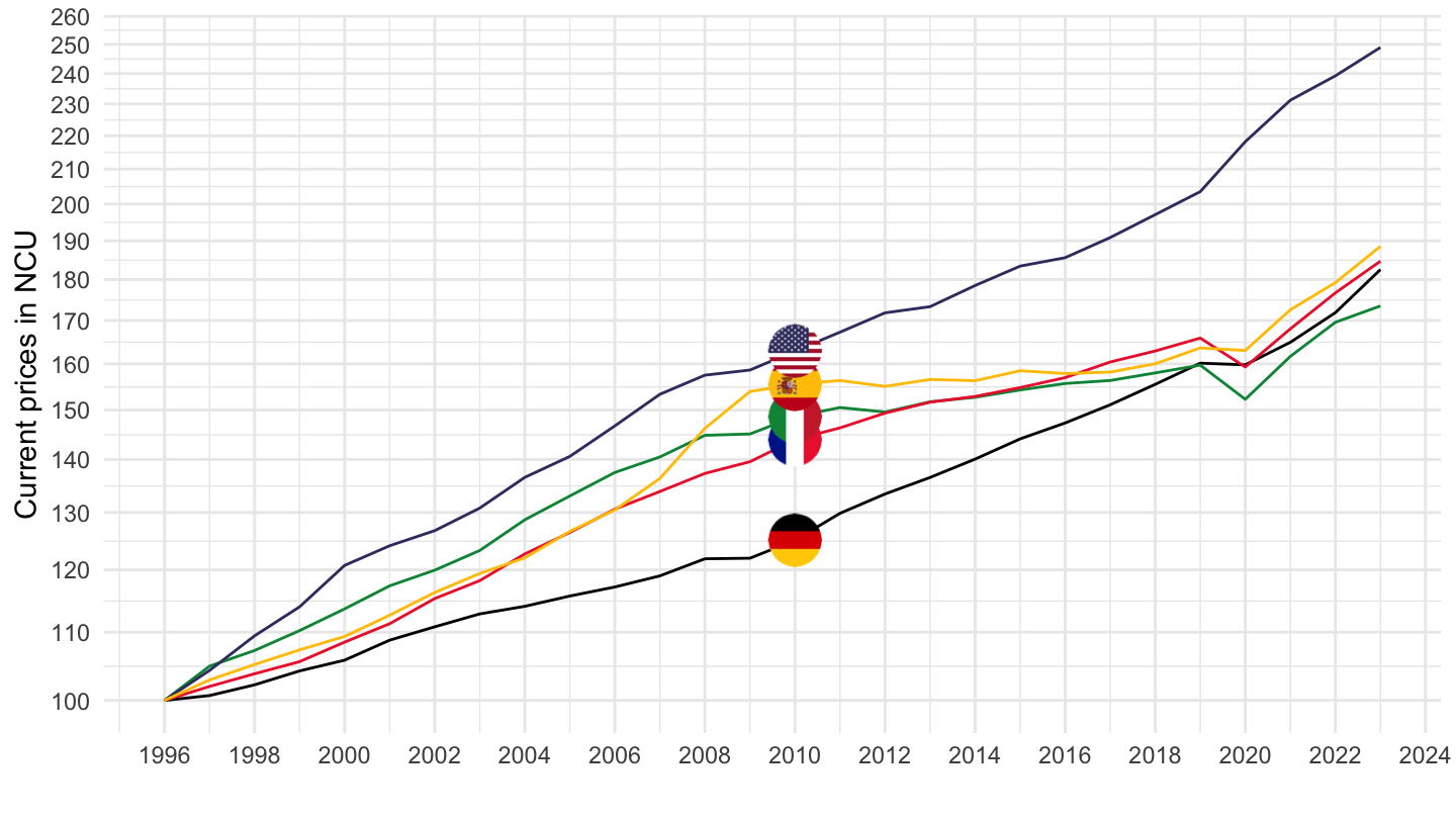
AV_AN_WAGE |>
  filter(PRICE_BASE == "V",
         REF_AREA %in% c("FRA", "DEU", "ITA", "ESP", "USA")) |>

  year_to_date() |>
  filter(date >= as.Date("2008-01-01")) |>
  group_by(Ref_area) |>
  arrange(date) |>
  mutate(obsValue = 100*obsValue/obsValue[1]) |>
  add_flag_color("Ref_area") |>
  ggplot() + geom_line(aes(x = date, y = obsValue, color = color)) +
  scale_color_identity() + add_5flags + theme_minimal() +
  scale_x_date(breaks = seq(1920, 2100, 2) |> paste0("-01-01") |> as.Date(),
               labels = date_format("%Y")) +
  scale_y_log10(breaks = seq(10, 500, 10)) +
  ylab("Current prices in NCU") + xlab("")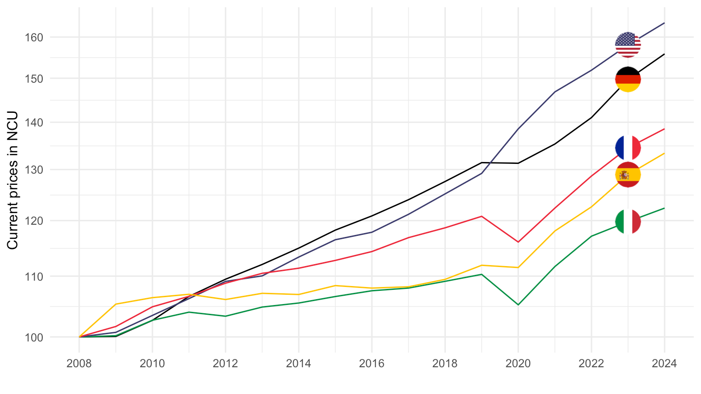
AV_AN_WAGE |>
  filter(PRICE_BASE == "Q",
         REF_AREA %in% c("FRA", "DEU", "ITA", "ESP", "USA"),
         UNIT_MEASURE == "EUR") |>

  year_to_date() |>
  #filter(date >= as.Date("1996-01-01")) %>%
  group_by(Ref_area) |>
  arrange(date) |>
  mutate(obsValue = 100*obsValue/obsValue[1]) |>
  add_flag_color("Ref_area") |>
  ggplot() + geom_line(aes(x = date, y = obsValue, color = color)) +
  scale_color_identity() + add_4flags + theme_minimal() +
  scale_x_date(breaks = seq(1920, 2100, 2) |> paste0("-01-01") |> as.Date(),
               labels = date_format("%Y")) +
  scale_y_log10(breaks = seq(10, 500, 10)) +
  ylab("Constant prices in NCU") + xlab("")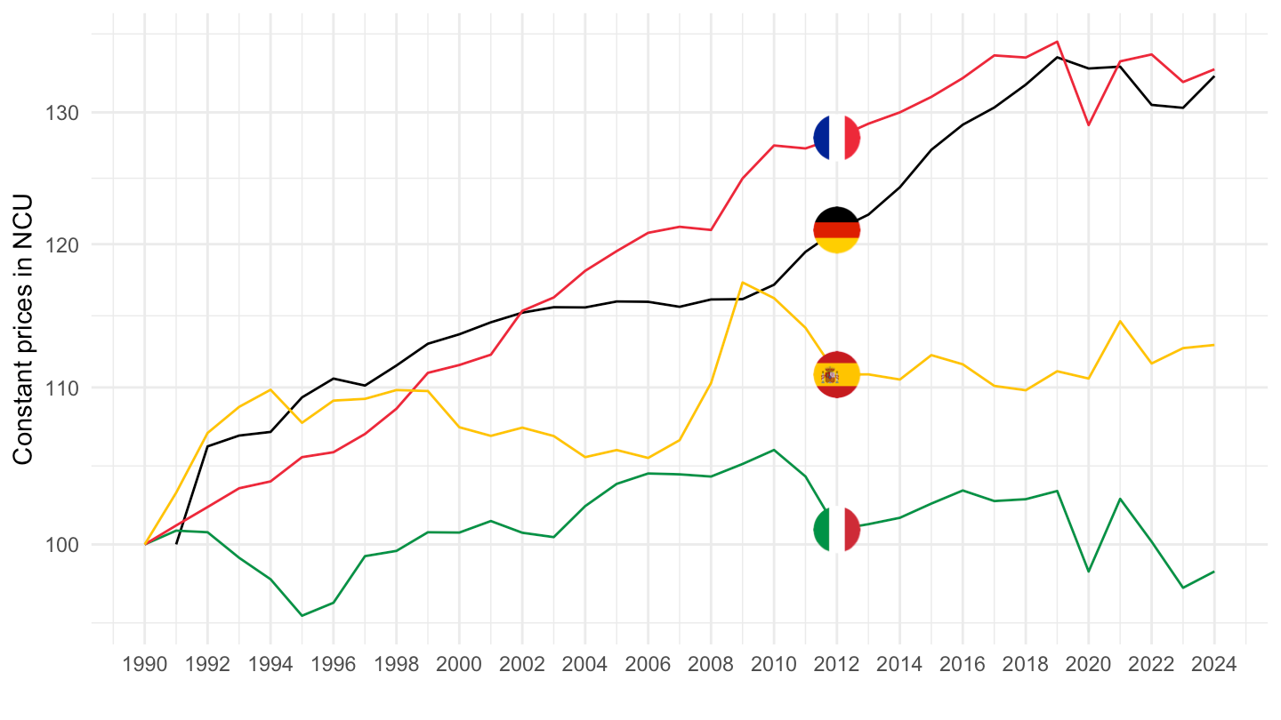
AV_AN_WAGE |>
  filter(PRICE_BASE == "Q",
         REF_AREA %in% c("FRA", "DEU", "ITA", "ESP", "USA"),
         UNIT_MEASURE == "EUR") |>

  year_to_date() |>
  filter(date >= as.Date("1992-01-01")) |>
  group_by(Ref_area) |>
  arrange(date) |>
  mutate(obsValue = 100*obsValue/obsValue[1]) |>
  add_flag_color("Ref_area") |>
  ggplot() + geom_line(aes(x = date, y = obsValue, color = color)) +
  scale_color_identity() + add_flags + theme_minimal() +
  scale_x_date(breaks = seq(1920, 2100, 2) |> paste0("-01-01") |> as.Date(),
               labels = date_format("%Y")) +
  scale_y_log10(breaks = seq(10, 500, 5)) +
  ylab("Constant prices in NCU") + xlab("")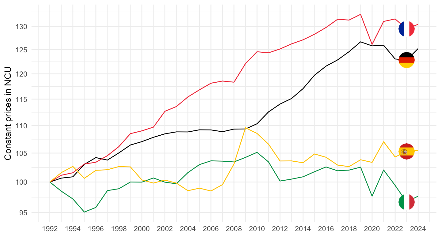
AV_AN_WAGE |>
  filter(PRICE_BASE == "Q",
         REF_AREA %in% c("FRA", "DEU", "ITA", "ESP", "USA"),
         UNIT_MEASURE == "EUR") |>

  year_to_date() |>
  filter(date >= as.Date("1996-01-01")) |>
  group_by(Ref_area) |>
  arrange(date) |>
  mutate(obsValue = 100*obsValue/obsValue[1]) |>
  add_flag_color("Ref_area") |>
  ggplot() + geom_line(aes(x = date, y = obsValue, color = color)) +
  scale_color_identity() + add_flags + theme_minimal() +
  scale_x_date(breaks = seq(1920, 2100, 2) |> paste0("-01-01") |> as.Date(),
               labels = date_format("%Y")) +
  scale_y_log10(breaks = seq(10, 500, 5)) +
  ylab("Current prices in NCU") + xlab("")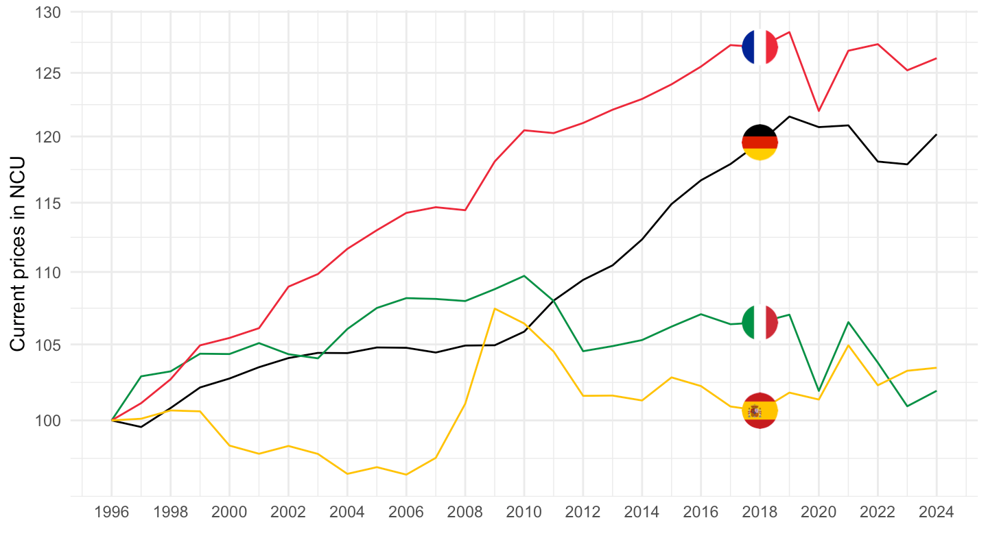
AV_AN_WAGE |>
  filter(PRICE_BASE == "Q",
         REF_AREA %in% c("FRA", "DEU", "ITA", "ESP", "USA"),
         UNIT_MEASURE == "EUR") |>

  year_to_date() |>
  filter(date >= as.Date("2008-01-01")) |>
  group_by(Ref_area) |>
  arrange(date) |>
  mutate(obsValue = 100*obsValue/obsValue[1]) |>
  add_flag_color("Ref_area") |>
  ggplot() + geom_line(aes(x = date, y = obsValue, color = color)) +
  scale_color_identity() + add_4flags + theme_minimal() +
  scale_x_date(breaks = seq(1920, 2100, 2) |> paste0("-01-01") |> as.Date(),
               labels = date_format("%Y")) +
  scale_y_log10(breaks = seq(10, 500, 2)) +
  ylab("Current prices in NCU") + xlab("")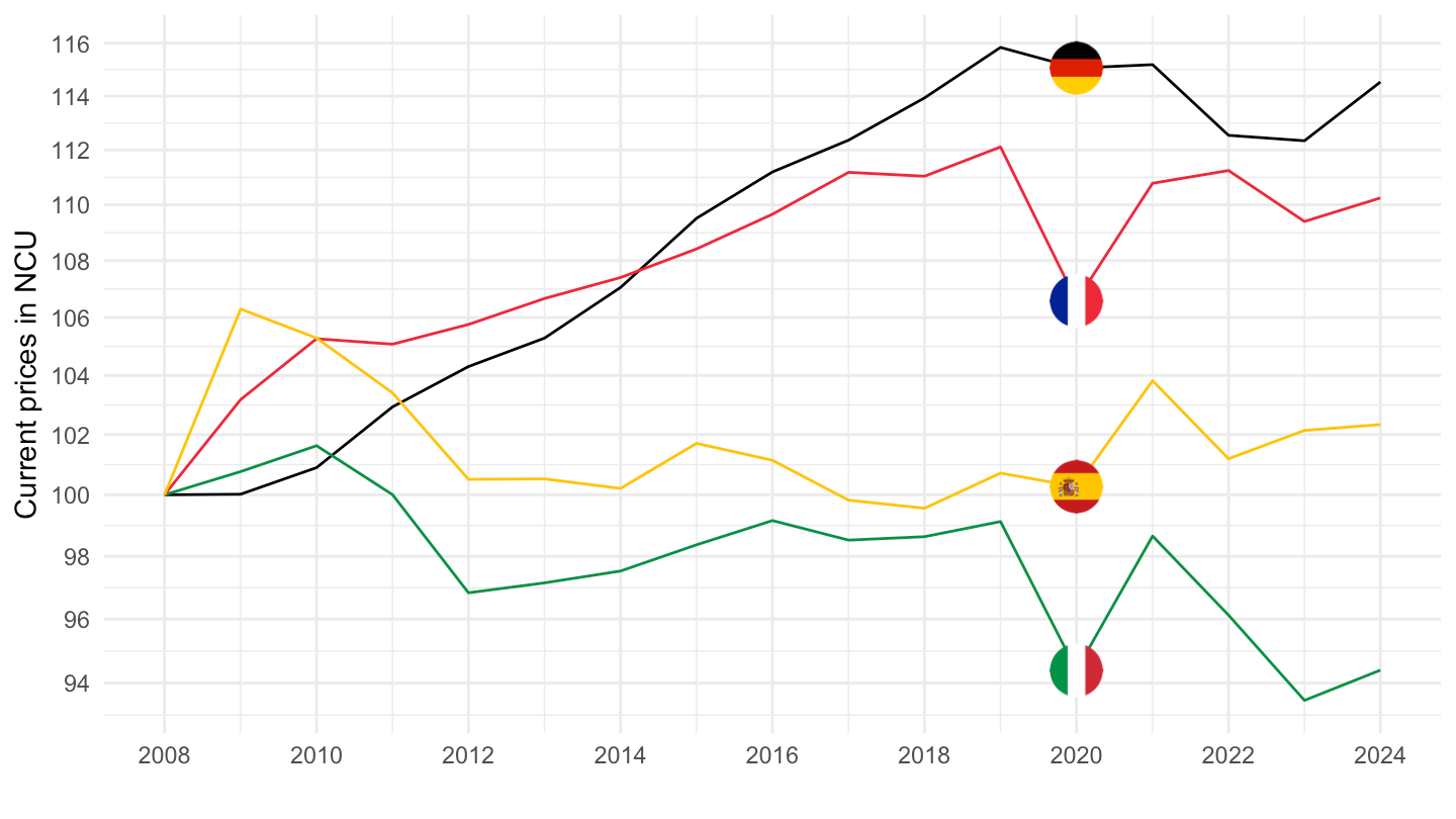
AV_AN_WAGE |>
  filter(PRICE_BASE %in% c("Q", "V"),
         REF_AREA %in% c("FRA", "DEU", "ITA", "ESP", "USA"),
         UNIT_MEASURE == "EUR") |>

  year_to_date() %>%
  select_if(~ n_distinct(.) > 1) |>
  select(-BASE_PER, -`Price base`) |>
  spread(PRICE_BASE, obsValue) |>
  mutate(obsValue = V/Q) |>
  #filter(date >= as.Date("1996-01-01")) %>%
  group_by(Ref_area) |>
  arrange(date) |>
  mutate(obsValue = 100*obsValue/obsValue[1]) |>
  add_flag_color("Ref_area") |>
  ggplot() + geom_line(aes(x = date, y = obsValue, color = color)) +
  scale_color_identity() + add_4flags + theme_minimal() +
  scale_x_date(breaks = seq(1920, 2100, 2) |> paste0("-01-01") |> as.Date(),
               labels = date_format("%Y")) +
  scale_y_log10(breaks = seq(10, 500, 10)) +
  ylab("Implicit price: V/Q") + xlab("")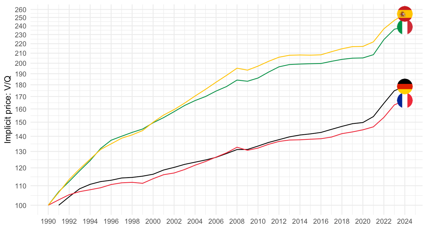
AV_AN_WAGE |>
  filter(PRICE_BASE %in% c("Q", "V"),
         REF_AREA %in% c("FRA", "DEU", "ITA", "ESP", "USA"),
         UNIT_MEASURE == "EUR") |>

  year_to_date() %>%
  select_if(~ n_distinct(.) > 1) |>
  select(-BASE_PER, -`Price base`) |>
  spread(PRICE_BASE, obsValue) |>
  mutate(obsValue = V/Q) |>
  filter(date >= as.Date("1996-01-01")) |>
  group_by(Ref_area) |>
  arrange(date) |>
  mutate(obsValue = 100*obsValue/obsValue[1]) |>
  add_flag_color("Ref_area") |>
  ggplot() + geom_line(aes(x = date, y = obsValue, color = color)) +
  scale_color_identity() + add_4flags + theme_minimal() +
  scale_x_date(breaks = seq(1920, 2100, 2) |> paste0("-01-01") |> as.Date(),
               labels = date_format("%Y")) +
  scale_y_log10(breaks = seq(10, 500, 10)) +
  ylab("Implicit price: V/Q") + xlab("")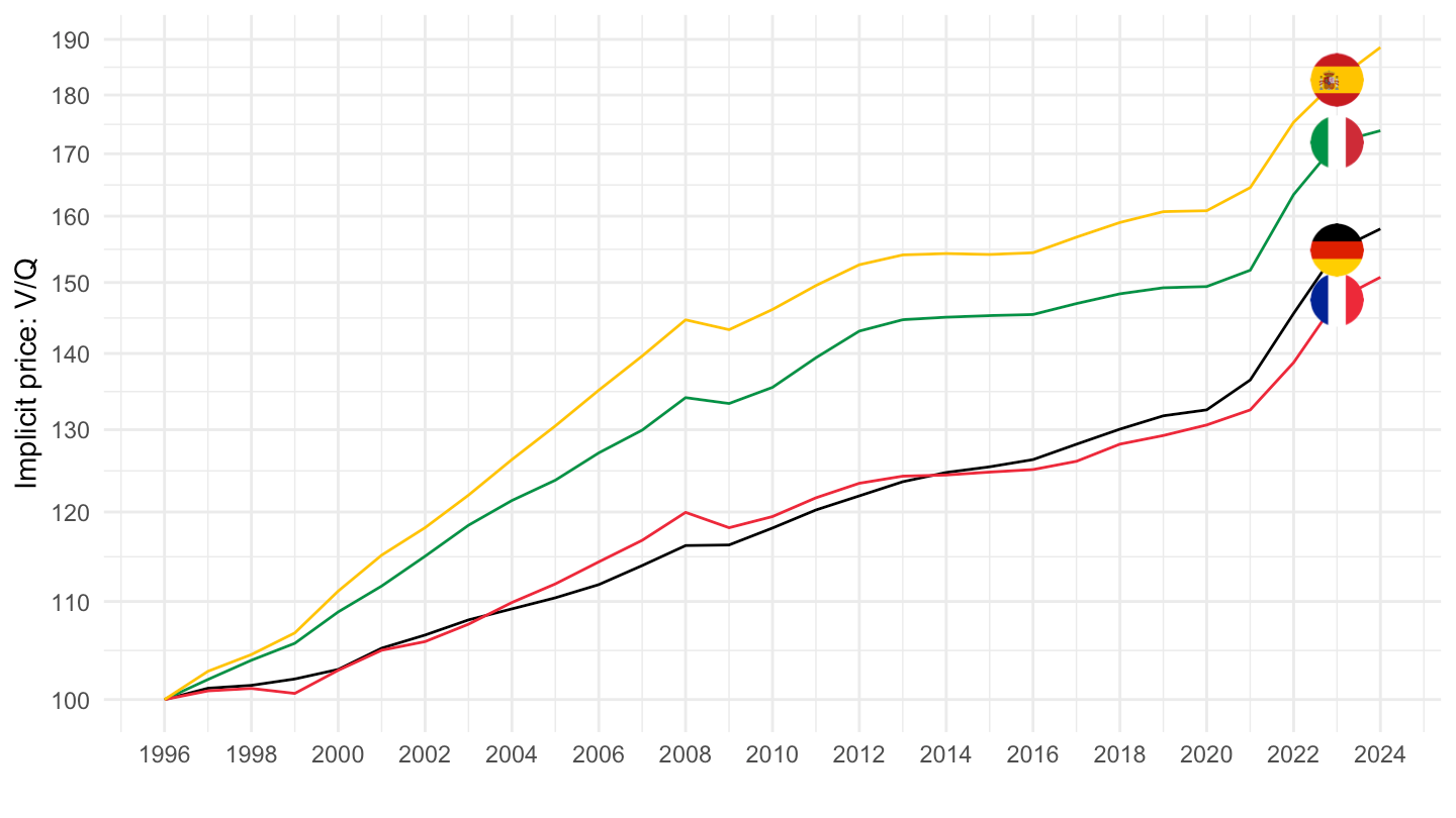
AV_AN_WAGE |>
  filter(PRICE_BASE %in% c("Q", "V"),
         REF_AREA %in% c("FRA", "DEU", "ITA", "ESP", "USA"),
         UNIT_MEASURE == "EUR") |>

  year_to_date() %>%
  select_if(~ n_distinct(.) > 1) |>
  select(-BASE_PER, -`Price base`) |>
  spread(PRICE_BASE, obsValue) |>
  mutate(obsValue = V/Q) |>
  filter(date >= as.Date("1999-01-01")) |>
  group_by(Ref_area) |>
  arrange(date) |>
  mutate(obsValue = 100*obsValue/obsValue[1]) |>
  add_flag_color("Ref_area") |>
  ggplot() + geom_line(aes(x = date, y = obsValue, color = color)) +
  scale_color_identity() + add_4flags + theme_minimal() +
  scale_x_date(breaks = seq(1920, 2100, 2) |> paste0("-01-01") |> as.Date(),
               labels = date_format("%Y")) +
  scale_y_log10(breaks = seq(10, 500, 10)) +
  ylab("Implicit price: V/Q") + xlab("")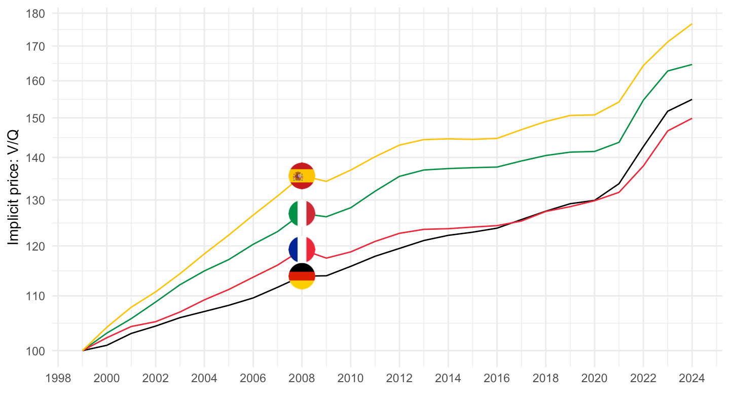
Average annual wages are the annual rates paid per employee in full-time equivalent unit in the total economy. Average annual wages are calculated by dividing the national-accounts-based total wage bill by the average number of employees in the total economy, which is then converted in full-time equivalent unit by applying the ratio of average usual weekly hours per full-time employee to that of all employees. This calculation helps to gauge the general level of income by economy. Average wages are often used for comparison purposes, to track changes in income levels over time, or to analyse disparities in earnings among different groups. This indicator is measured in US dollars, PPP converted.
This dataset contains data on average annual wages per employee in full-time equivalent unit in the total economy. Average annual wages per full-time equivalent dependent employee are obtained by dividing the national-accounts-based total wage bill by the average number of employees in the total economy, which is then converted in full-time equivalent unit by applying the ratio of average usual weekly hours per full-time employee to that of all employees. For more details, see: http://www.oecd.org/els/oecd-employment-outlook-19991266.htm and http://www.oecd.org/employment/emp/onlineoecdemploymentdatabase.htm The data are available in Current prices in NCU, in 2024 constant prices and NCU, in 2024 USD PPPs and 2024 constant prices. NCU: National currency units. For further details on these estimates, please see http://www.oecd.org/els/emp/AVERAGE_WAGES.pdf
| source | dataset | Title | Updated |
|---|---|---|---|

