Housing Data - Zillow Research
Data
François Geerolf
Datasets
| id | Geography | Nobs | html |
|---|---|---|---|
| City_MedianValuePerSqft_AllHomes | City | 8049470 | html |
| City_PriceToRentRatio_AllHomes | City | 2347688 | html |
| County_MedianRentalPrice_AllHomes | County | 54654 | html |
| County_MedianRentalPricePerSqft_AllHomes | County | 56716 | html |
| County_MedianValuePerSqft_AllHomes | County | 589123 | html |
| County_PriceToRentRatio_AllHomes | County | 240760 | html |
| Metro_MedianRentalPrice_AllHomes | Metro | 50760 | html |
| Metro_ZORI_AllHomesPlusMultifamily_SSA | Metro | 8766 | html |
| Zip_ZORI_AllHomesPlusMultifamily_SSA | Zip | 254960 | html |
Other Datasets
Definitions
Home types
All Homes: Zillow defines all homes as single-family, condominium and co-operative homes with a county record. Unless specified, all series cover this segment of the housing stock.
Condo/Co-op: Condominium and co-operative homes.
Multifamily 2+ units: Units in buildings with 5 or more housing units, that are not condominiums or co-ops.
Duplex/Triplex: Housing units in buildings with 2 or 3 housing units.
Inventory and Sales
For-Sale Inventory: The count of unique listings that were active at any time in a given month.
Newly Pending Listings: The count of listings that changed from for-sale to pending status on Zillow.com in a given time period.
Days to Pending: How long it takes homes in a region to change to pending status on Zillow.com after first being shown as for sale. The reported figure indicates the number of days (mean or median) that it took for homes that went pending during the week being reported, to go pending. This differs from the old “Days on Zillow” metric in that it excludes the in-contract period before a home sells.
Median List Price: The median price at which homes across various geographies were listed.
Median Sale Price: The median price at which homes across various geographies were sold.
Share of Listings With a Price Cut: The number of unique properties with a list price at the end of the month that’s less than the list price at the beginning of the month, divided by the number of unique properties with an active listing at some point during the month.
Price Cuts: The mean and median price cut for listings in a given region during a given time period, expressed as both dollars ($) and as a percentage (%) of list price.
County Map
dataraw_county_long %>%
  filter(variable == "UNR", date == as.Date("2007-10-01")) %>%
  select(county_code, value) %>%
  mutate(value = value/100) %>%
  left_join(county_code_name %>%
              select(county_code, subregion = county_name3, region = state_name3),
            by = "county_code") %>%
  right_join(map_county, by = c("region", "subregion")) %>%
  ggplot(aes(long, lat, group = group)) +
  geom_polygon(aes(fill = value), colour = alpha("black", 1/2), size = 0.2)  +
  scale_fill_viridis_c(labels = scales::percent_format(accuracy = 1),
                       na.value = "white",
                       breaks = c(0, 0.05, 0.10, 0.15, 0.20),
                       values = c(0, 0.1, 0.2, 0.3, 1)) +
  theme_void() +
  theme(legend.position = c(0.9, 0.2)) + labs(fill = "Unemp.\nRate")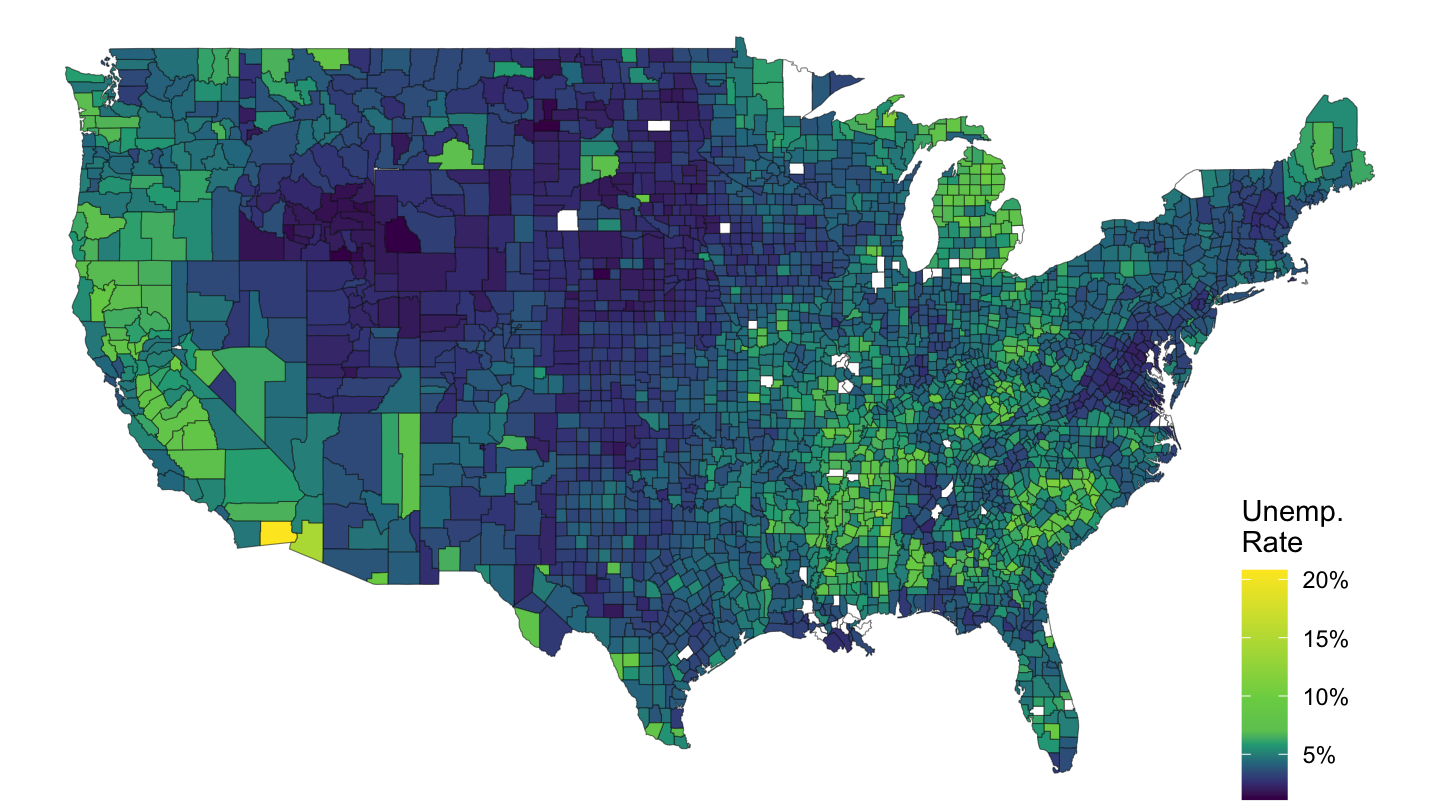
Figure 1: Mortgage Debt Per Capita, 2007-Q4, FRB
mme_percap_county %>%
  select(county_code = fips, value) %>%
  filter(value <= 500) %>%
  left_join(county_code_name %>%
              select(county_code, subregion = county_name3, region = state_name3),
            by = "county_code") %>%
  right_join(map_county, by = c("region", "subregion")) %>%
  ggplot(aes(long, lat, group = group)) +
  geom_polygon(aes(fill = value), colour = alpha("black", 1/2), size = 0.2)  +
  scale_fill_viridis_c(labels = scales::dollar_format(accuracy = 1, prefix = ""),
                       na.value = "white",
                       breaks = c(-100,  0, 100, 200, 300, 400, 500),
                       values = c(0, 0.1, 0.2, 0.3, 1)) +
  theme_void() +
  theme(legend.position = c(0.9, 0.2)) + labs(fill = "Opioid\nConsumption")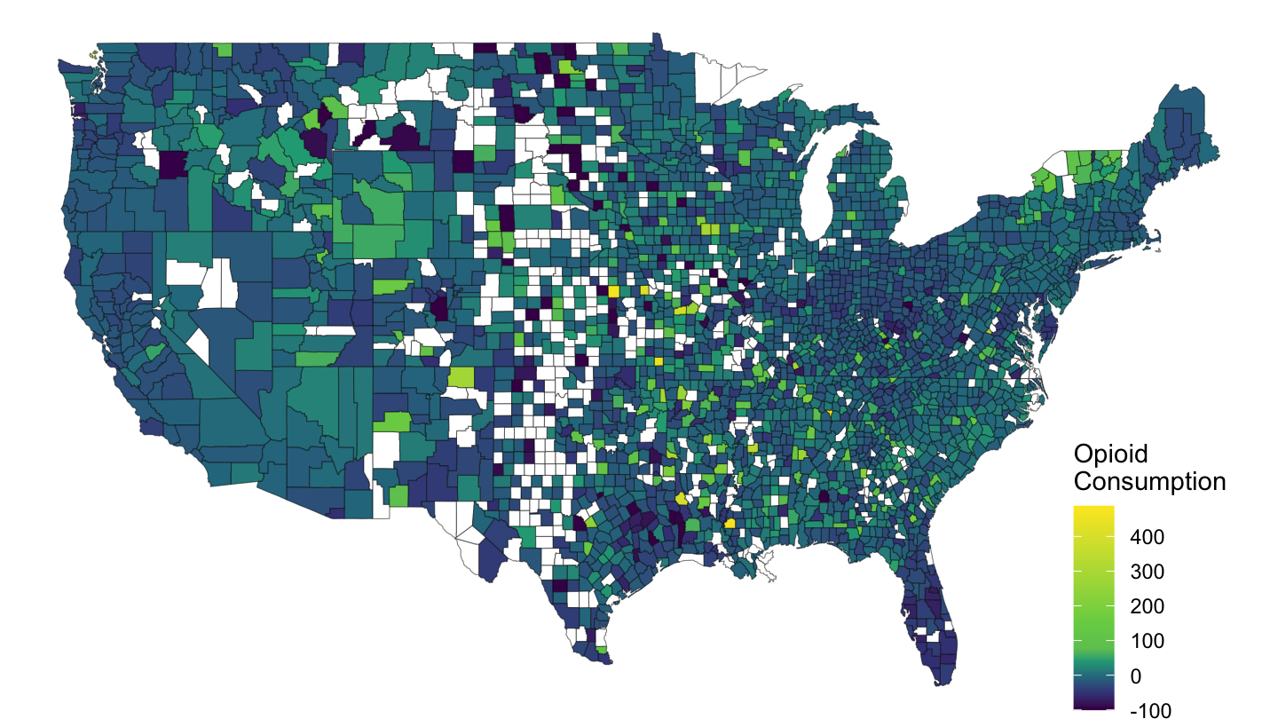
Figure 2: Opioid Consumption by County
California
dataraw_county_long %>%
  filter(variable == "UNR", date == as.Date("2007-10-01")) %>%
  select(county_code, value) %>%
  mutate(value = value/100) %>%
  left_join(county_code_name %>%
              select(county_code, subregion = county_name3, region = state_name3),
            by = "county_code") %>%
  right_join(map_county %>%
               filter(region == "california"),
             by = c("region", "subregion")) %>%
  ggplot(aes(long, lat, group = group)) +
  geom_polygon(aes(fill = value), colour = alpha("black", 1/2), size = 0.2)  +
  scale_fill_viridis_c(labels = scales::percent_format(accuracy = 1),
                       na.value = "white",
                       breaks = c(0, 0.05, 0.10, 0.15, 0.20),
                       values = c(0, 0.1, 0.2, 0.3, 1)) +
  theme_void() +
  theme(legend.position = c(0.8, 0.8)) +
  labs(fill = "Unemp.\nRate") + coord_fixed(ratio = 1)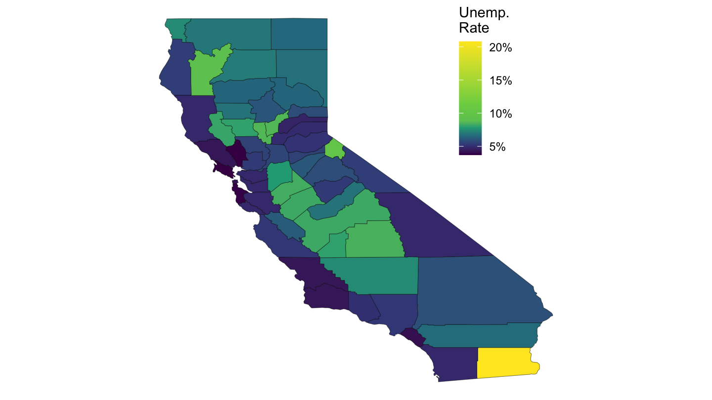
Figure 3: Mortgage Debt Per Capita, 2007-Q4, FRB
dataraw_county_long %>%
  filter(variable == "HOUSE_zillow_sqfeet", date == as.Date("2007-10-01")) %>%
  select(county_code, value) %>%
  left_join(county_code_name %>%
              select(county_code, subregion = county_name3, region = state_name3),
            by = "county_code") %>%
  right_join(map_county %>%
               filter(region == "california"),
             by = c("region", "subregion")) %>%
  ggplot(aes(long, lat, group = group)) +
  geom_polygon(aes(fill = value), colour = alpha("black", 1/2), size = 0.2)  +
  scale_fill_viridis_c(labels = scales::dollar_format(accuracy = 1),
                       na.value = "white",
                       breaks = c(0, 200, 300, 400, 500, 600),
                       values = c(0, 0.2, 0.4, 0.6, 0.8, 1)) +
  theme_void() +
  theme(legend.position = c(0.8, 0.8)) +
  labs(fill = "Price Per\nSq Feet") + coord_fixed(ratio = 1)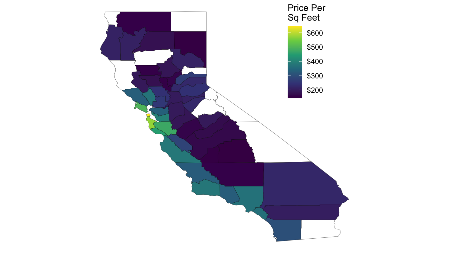
Figure 4: Price per Square Feet, 2007-Q4, FRB
County Map - Dynamic
County Map
The list of maps data is: https://code.highcharts.com/mapdata/
dataraw_county_long %>%
  filter(variable == "UNR", date == as.Date("2007-10-01")) %>%
  select(county_code, value) %>%
  mutate(county_code = str_pad(county_code, 5, pad = "0")) %>%
  hcmap("countries/us/us-all-all", data = .,
        name = "Unemployment", value = "value", joinBy = c("fips", "county_code"),
        borderColor = "transparent", valueSuffix = "%") %>%
  hc_colorAxis(dataClasses = color_classes(c(seq(0, 10, by = 2), 50))) %>%
  hc_legend(layout = "vertical", align = "right",
            floating = TRUE, valueDecimals = 0, valueSuffix = "%") %>%
  hc_mapNavigation(enabled = TRUE)
California
dataraw_county_long %>%
  filter(variable == "UNR", date == as.Date("2007-10-01")) %>%
  select(county_code, value) %>%
  mutate(county_code = str_pad(county_code, 5, pad = "0")) %>%
  hcmap("countries/us/us-ca-all", data = .,
        name = "Unemployment", value = "value", joinBy = c("fips", "county_code"),
        borderColor = "transparent") %>%
  hc_colorAxis(dataClasses = color_classes(c(seq(0, 10, by = 2), 50))) %>%
  hc_legend(layout = "vertical", align = "right",
            floating = TRUE, valueDecimals = 0, valueSuffix = "%")
United Kingdom
cities <- data.frame(
  name = c("London", "Birmingham", "Glasgow", "Liverpool"),
  lat = c(51.507222, 52.483056, 55.858, 53.4),
  lon = c(-0.1275, -1.893611, -4.259, -3),
  z = c(1, 2, 3, 2)
)

hcmap("countries/gb/gb-all", showInLegend = FALSE) %>%
  hc_add_series(data = cities, type = "mapbubble", name = "Cities", maxSize = '10%') %>%
  hc_mapNavigation(enabled = TRUE)
CBSA Map
CBSA-level
cbsa_nodate %>%
  select(cbsa_code, value = elasticity) %>%
  left_join(county_to_cbsa %>%
              select(county_code, cbsa_code),
            by = "cbsa_code") %>%
  left_join(county_code_name %>%
              select(county_code, subregion = county_name3, region = state_name3),
            by = c("county_code")) %>%
  right_join(map_county,
             by = c("region", "subregion")) %>%
  ggplot(aes(long, lat, group = group)) +
  geom_polygon(aes(fill = value), colour = alpha("black", 1/2), size = 0.2)  +
  scale_fill_viridis_c(na.value = "white",
                       labels = scales::dollar_format(accuracy = 1, prefix = "")) +
  theme_void() +
  theme(legend.position = c(0.9, 0.2)) +
  labs(fill = "CBSA\nElasticity")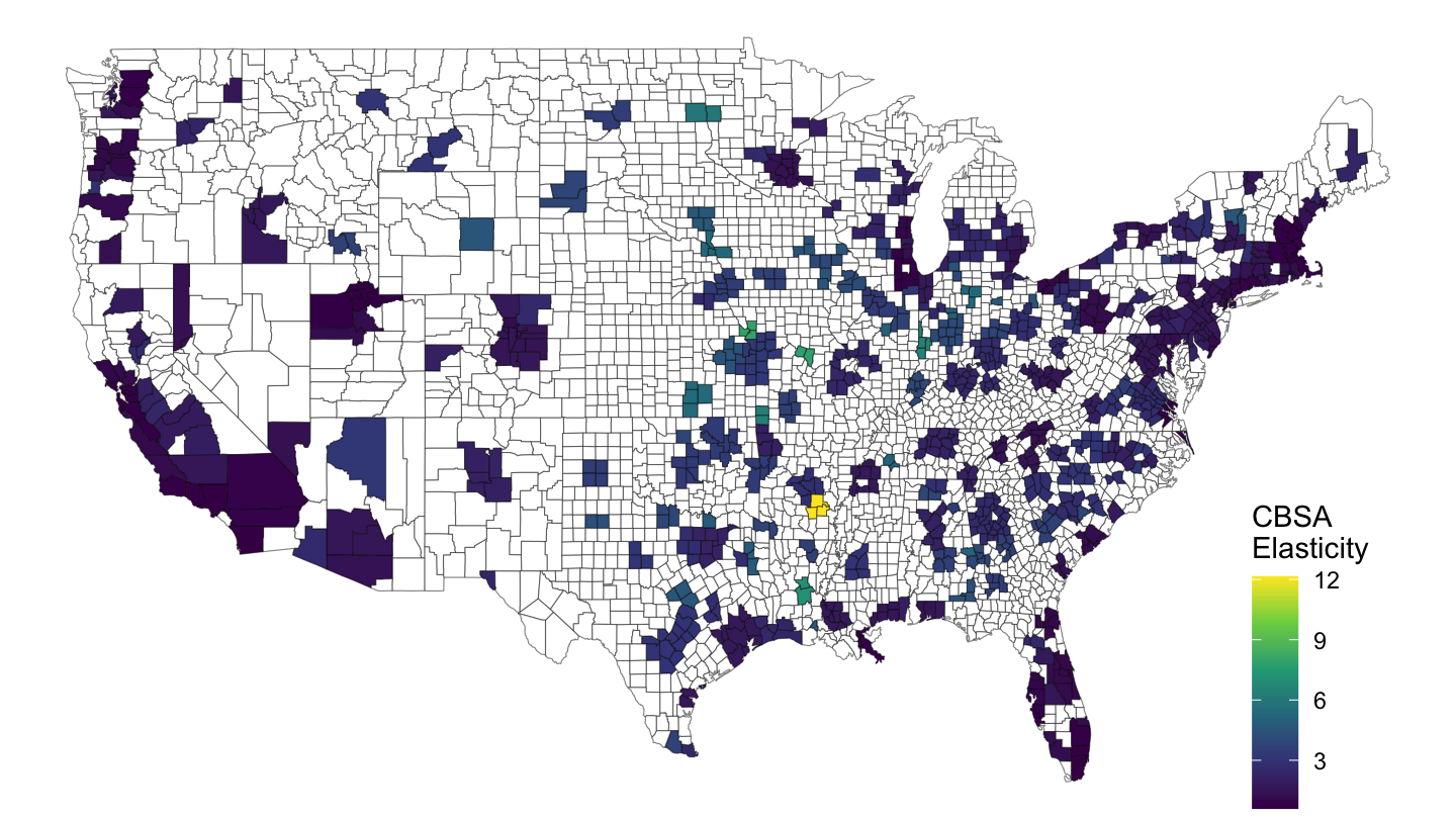
Figure 5: CBSA Level
cbsa_nodate %>%
  select(cbsa_code, value = elasticity) %>%
  left_join(county_to_cbsa %>%
              select(county_code, cbsa_code),
            by = "cbsa_code") %>%
  left_join(county_code_name %>%
              select(county_code, subregion = county_name3, region = state_name3),
            by = c("county_code")) %>%
  right_join(map_county %>%
               filter(region == "florida"),
             by = c("region", "subregion")) %>%
  ggplot(aes(long, lat, group = group)) +
  geom_polygon(aes(fill = value), colour = alpha("black", 1/2), size = 0.2)  +
  scale_fill_viridis_c(na.value = "white",
                       labels = scales::dollar_format(accuracy = 0.1, prefix = "")) +
  theme_void() +
  theme(legend.position = c(0.2, 0.4)) +
  labs(fill = "CBSA\nElasticity") +
  coord_fixed(ratio = 1)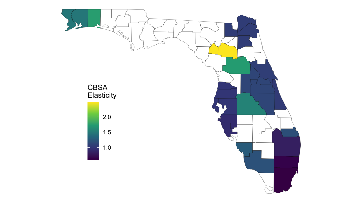
Figure 6: CBSA Level Elasticity, Florida
cbsa_nodate %>%
  select(cbsa_code, value = elasticity) %>%
  left_join(county_to_cbsa %>%
              select(county_code, cbsa_code),
            by = "cbsa_code") %>%
  left_join(county_code_name %>%
              select(county_code, subregion = county_name3, region = state_name3),
            by = c("county_code")) %>%
  right_join(map_county %>%
               filter(region == "california"),
             by = c("region", "subregion")) %>%
  ggplot(aes(long, lat, group = group)) +
  geom_polygon(aes(fill = value), colour = alpha("black", 1/2), size = 0.2)  +
  scale_fill_viridis_c(na.value = "white",
                       labels = scales::dollar_format(accuracy = 0.1, prefix = "")) +
  theme_void() +
  theme(legend.position = c(0.05, 0.25)) +
  labs(fill = "CBSA\nElasticity") +
  coord_fixed(ratio = 1)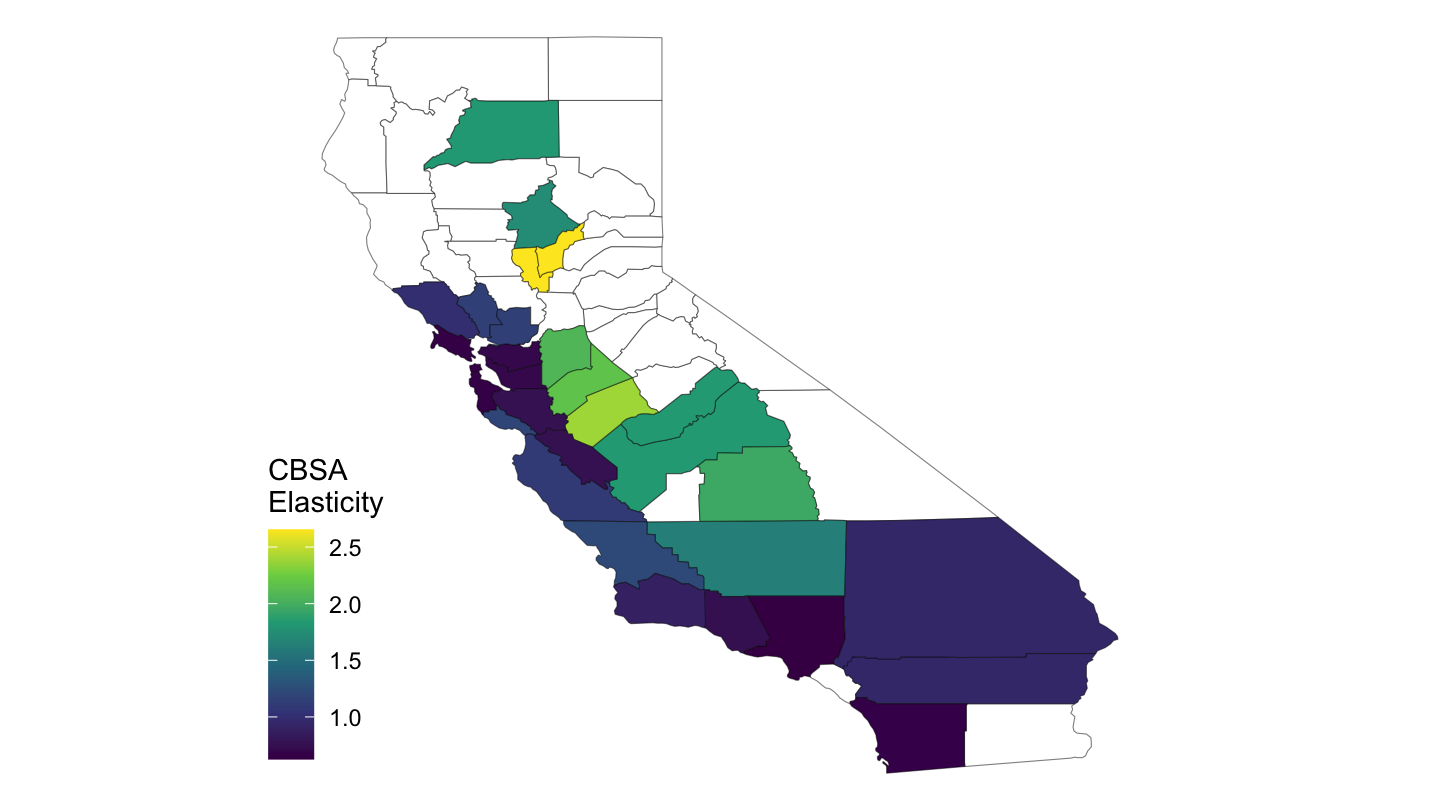
Figure 7: CBSA Level Elasticity, California
cbsa %>%
  filter(date == as.Date("2017-01-01")) %>%
  mutate(rent_share = median_rent*12/medincome) %>%
  select(cbsa_code, value = rent_share) %>%
  left_join(county_to_cbsa %>%
              select(county_code, cbsa_code),
            by = "cbsa_code") %>%
  left_join(county_code_name %>%
              select(county_code, subregion = county_name3, region = state_name3),
            by = c("county_code")) %>%
  right_join(map_county %>%
               filter(region == "florida"),
             by = c("region", "subregion")) %>%
  ggplot(aes(long, lat, group = group)) +
  geom_polygon(aes(fill = value), colour = alpha("black", 1/2), size = 0.2)  +
  scale_fill_viridis_c(na.value = "white",
                       labels = scales::percent_format(accuracy = 1, prefix = "")) +
  theme_void() +
  theme(legend.position = c(0.2, 0.4)) +
  labs(fill = "Rent\nShare") +
  coord_fixed(ratio = 1)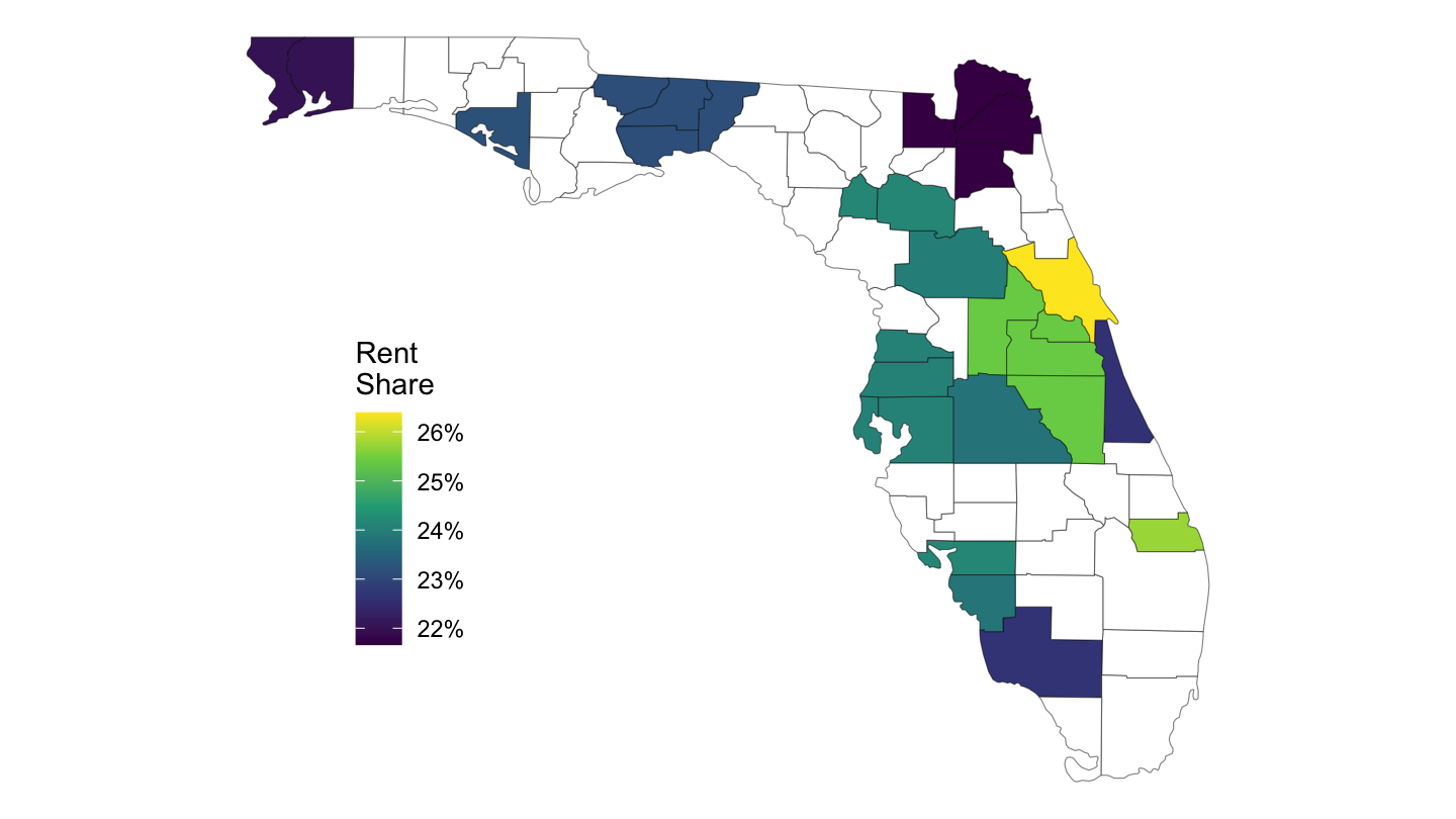
Figure 8: CBSA Level Rent Share (%)
cbsa %>%
  filter(date == as.Date("2015-01-01")) %>%
  mutate(rent_share = median_gross_rent*12/medincome) %>%
  select(cbsa_code, value = rent_share) %>%
  left_join(county_to_cbsa %>%
              select(county_code, cbsa_code),
            by = "cbsa_code") %>%
  left_join(county_code_name %>%
              select(county_code, subregion = county_name3, region = state_name3),
            by = c("county_code")) %>%
  right_join(map_county %>%
               filter(region == "california"),
             by = c("region", "subregion")) %>%
  ggplot(aes(long, lat, group = group)) +
  geom_polygon(aes(fill = value), colour = alpha("black", 1/2), size = 0.2)  +
  scale_fill_viridis_c(na.value = "white",
                       labels = scales::percent_format(accuracy = 1, prefix = "")) +
  theme_void() +
  theme(legend.position = c(0.05, 0.4)) +
  labs(fill = "Rent\nShare") +
  coord_fixed(ratio = 1)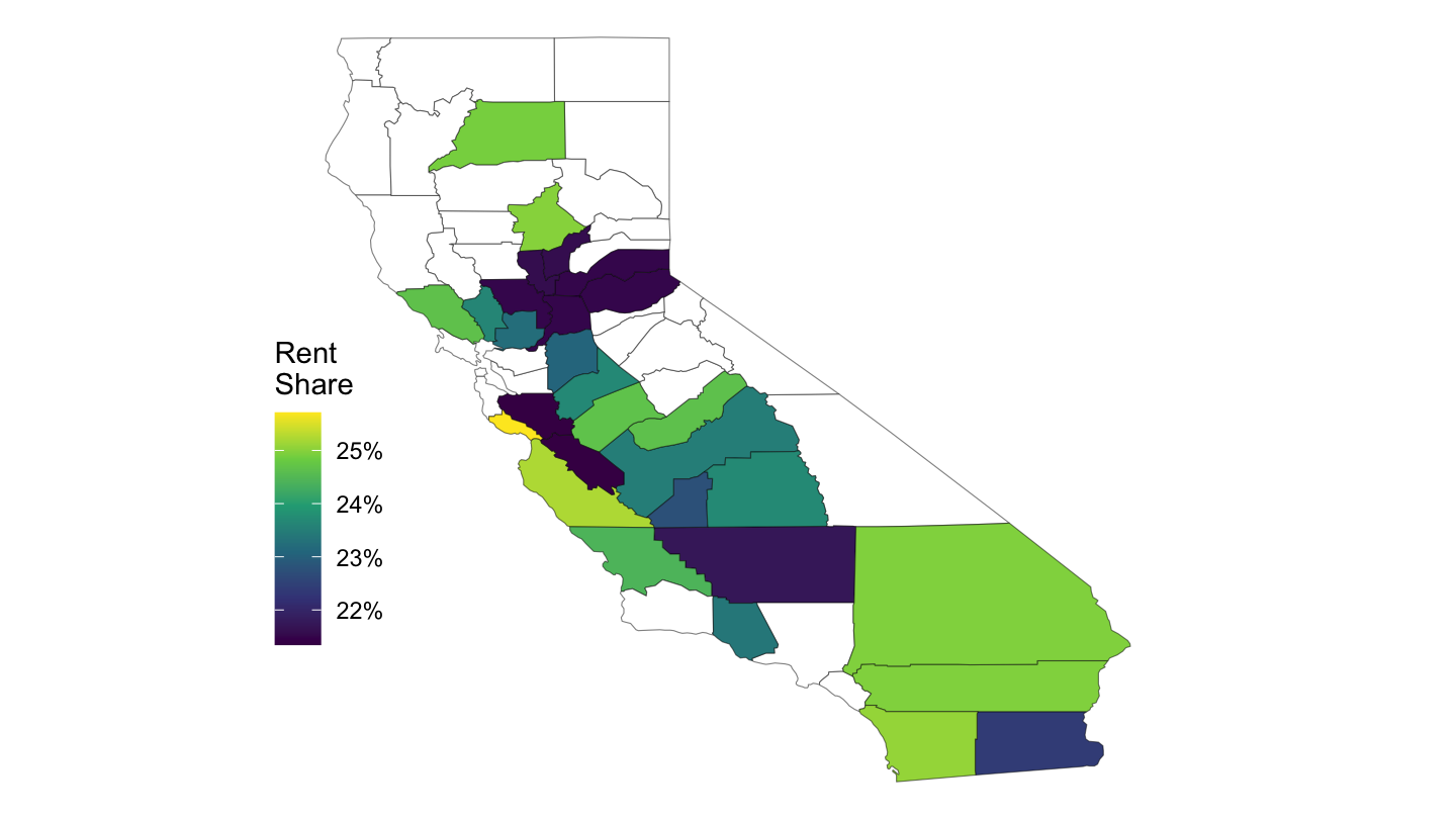
Figure 9: CBSA Level (California)
CBSA Map - Dynamic
cbsa_nodate %>%
  left_join(county_to_cbsa %>%
              select(county_code, cbsa_code),
            by = "cbsa_code") %>%
  select(county_code, value = elasticity) %>%
  mutate(county_code = str_pad(county_code, 5, pad = "0"),
         value = value %>% round(digits = 1)) %>%
  hcmap("countries/us/us-all-all", data = .,
        name = "Elasticity", value = "value", joinBy = c("fips", "county_code"),
        borderColor = "transparent") %>%
  hc_colorAxis(dataClasses = color_classes(c(seq(0, 10, by = 1), 15))) %>%
  hc_legend(layout = "vertical", align = "right",
            floating = TRUE, valueDecimals = 0) %>%
  hc_mapNavigation(enabled = TRUE)
State Map
us <- map_data("state")
load_data("maps/map_state.RData")

ggplot() +
  geom_map(data = sh_top10_state_fig2b %>%
             left_join(fips_statenames_xwalk_short, by = "state") %>%
             mutate(mean_s_stateig10 = mean_s_stateig10 /100),
           map = map_state,
           aes(fill = mean_s_stateig10, map_id = region),
           color = "white", size = 0.15) +
  geom_map(data = map_state, map = map_state,
           aes(long, lat, map_id = region),
           color = "#2b2b2b", fill = NA, size = 0.20) +
  scale_fill_viridis(name = "Top 10% \nShare",
                     labels = percent_format(accuracy = 1),
                     values = c(0, 0.2, 0.4, 0.5, 1)) +
  theme_map() +
  theme(legend.position = c(0.87, 0.1))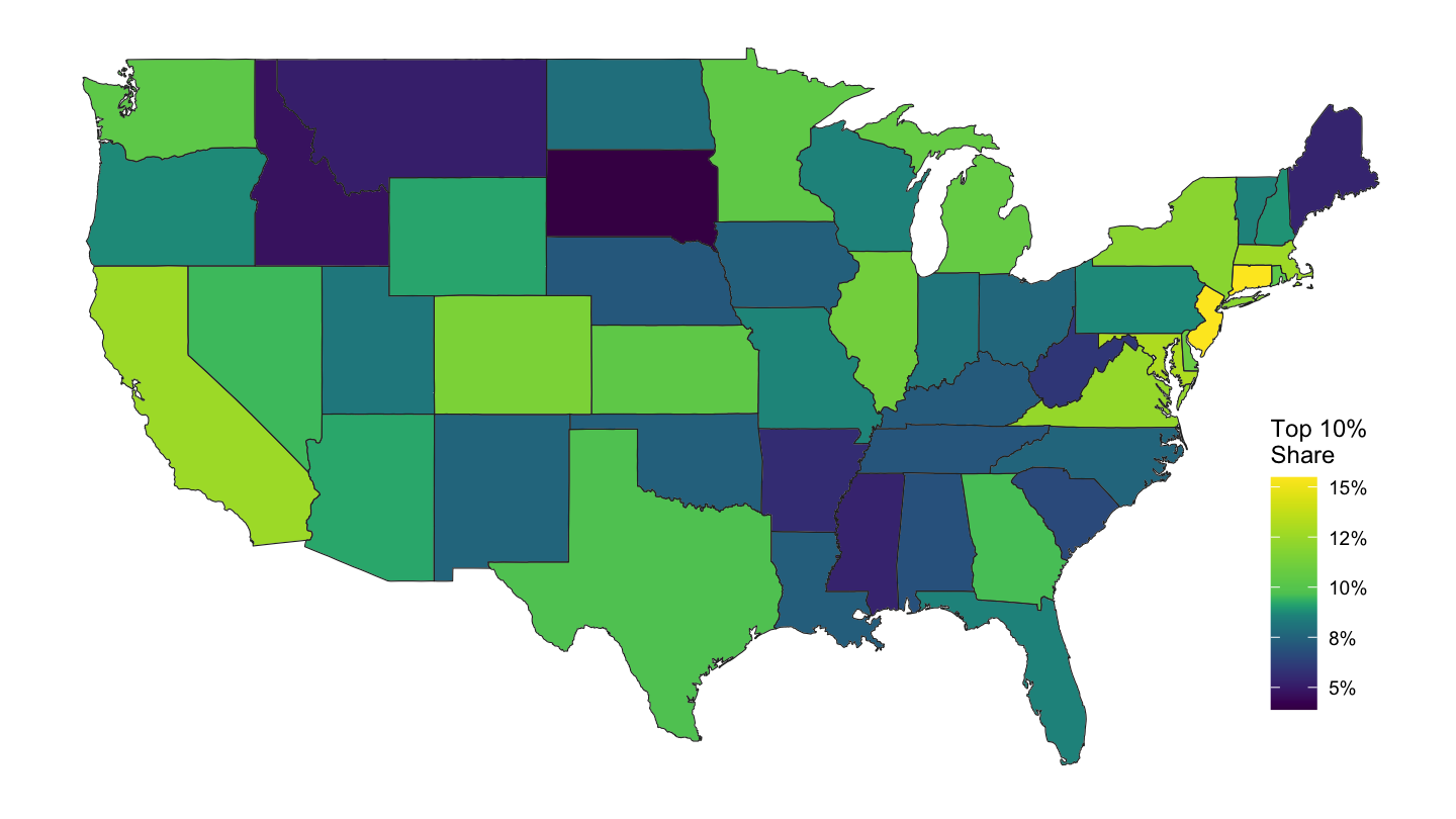
sh_top10_state_fig2b %>%
  left_join(fips_statenames_xwalk_short, by = "state") %>%
  mutate(value = mean_s_stateig10 /100) %>%
  right_join(map_state, by = "region") %>%
  ggplot(aes(long, lat, group = group)) +
  geom_polygon(aes(fill = value), colour = alpha("black", 1/2), size = 0.2)  +
  scale_fill_viridis_c(labels = scales::percent_format(accuracy = 1),
                       breaks = c(0.05, 0.08, 0.10, 0.12, 0.15),
                       values = c(0, 0.2, 0.4, 0.5, 1)) +
  theme_void() +
  theme(legend.position = c(0.9, 0.2)) + labs(fill = "Top 10%\nShare")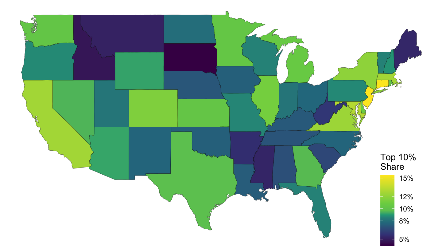
Figure 10: Top 10% Per Cent Share.
County Map
CBSA Map
State Maps
Per Capita Income
ggplot() +
  geom_map(data = df_state_demographics, map = map_state,
           aes(fill = per_capita_income, map_id = region),
           color = "white", size = 0.15) +
  geom_map(data = map_state, map = map_state,
           aes(long, lat, map_id = region),
           color = "#2b2b2b", fill = NA, size = 0.20) +
  scale_fill_viridis(name = "Per Capita \nIncome",
                     labels = dollar_format(accuracy = 1),
                     values = c(0, 0.2, 0.3, 0.4, 1)) +
  theme_map() + theme(legend.position = c(0.87, 0.1))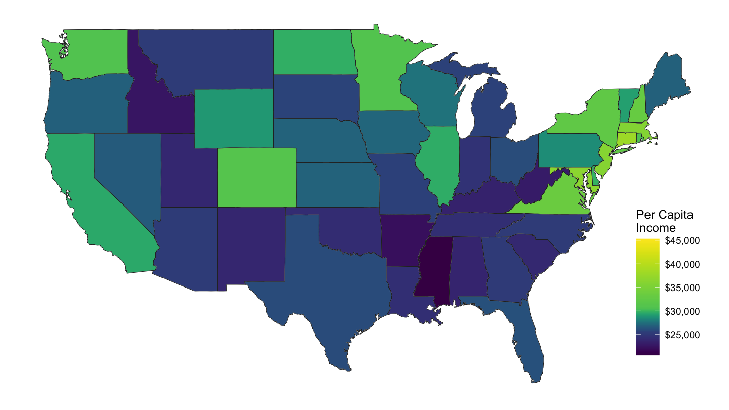
Figure 11: Per Capita Income by State
Median Rent
ggplot() +
  geom_map(data = df_state_demographics, map = map_state,
           aes(fill = median_rent, map_id = region),
           color = "white", size = 0.15) +
  geom_map(data = map_state, map = map_state,
           aes(long, lat, map_id = region),
           color = "#2b2b2b", fill = NA, size = 0.20) +
  scale_fill_viridis(name = "Median Rent",
                     labels = dollar_format(accuracy = 1),
                     values = c(0, 0.2, 0.3, 0.4, 1)) +
  theme_map() + theme(legend.position = c(0.87, 0.1))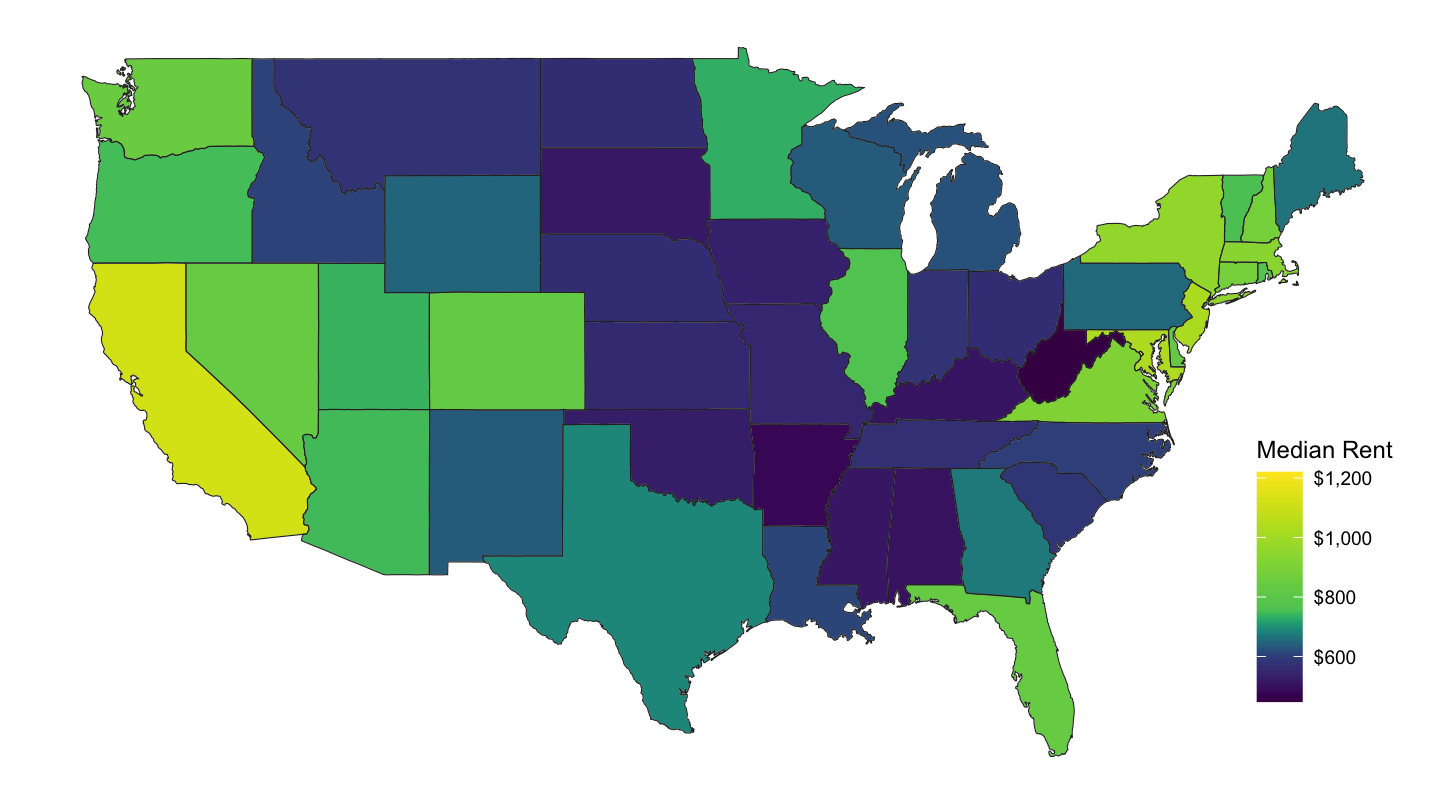
Figure 12: State Median Rent
Hispanic Share
ggplot() +
  geom_map(data = df_state_demographics, map = map_state,
           aes(fill = percent_hispanic / 100, map_id = region),
           color = "white", size = 0.15) +
  geom_map(data = map_state, map = map_state,
           aes(long, lat, map_id = region),
           color = "#2b2b2b", fill = NA, size = 0.20) +
  scale_fill_viridis(name = "Hispanic \nShare",
                     labels = percent_format(accuracy = 1),
                     values = c(0, 0.2, 0.3, 0.4, 1)) +
  theme_map() + theme(legend.position = c(0.87, 0.1))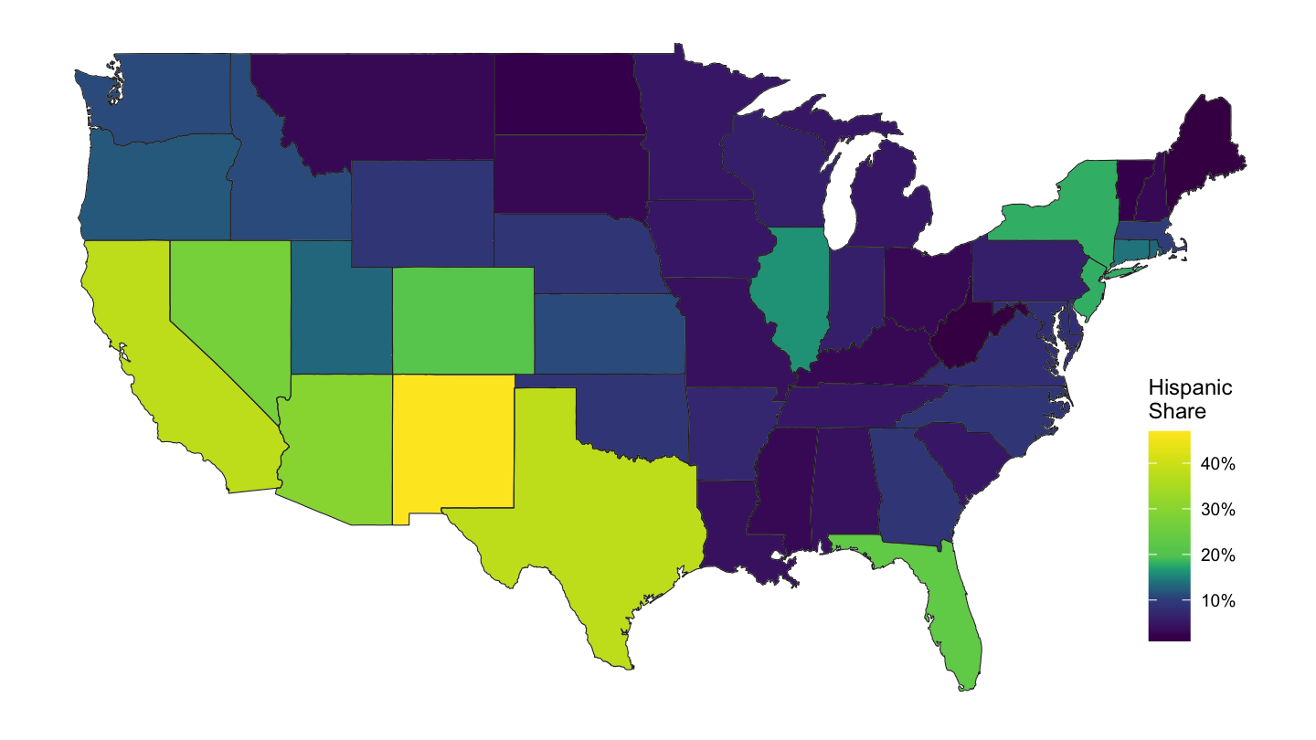
Figure 13: State Percentage of Hispanics
Median Age
ggplot() +
  geom_map(data = df_state_demographics, map = map_state,
           aes(fill = median_age, map_id = region),
           color = "white", size = 0.15) +
  geom_map(data = map_state, map = map_state,
           aes(long, lat, map_id = region),
           color = "#2b2b2b", fill = NA, size = 0.20) +
  scale_fill_viridis(name = "Median Age",
                     labels = comma,
                     values = c(0, 0.2, 0.3, 0.5, 0.7, 1)) +
  theme_map() + theme(legend.position = c(0.87, 0.1))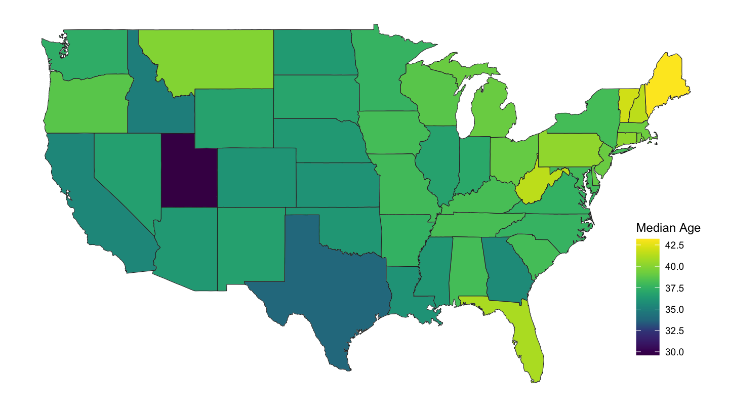
Figure 14: State Median Age
Zidar (2019): Share of High Income Workers
ggplot() +
  geom_map(data = sh_top10_state_fig2b %>%
             left_join(fips_statenames_xwalk_short, by = "state") %>%
             mutate(mean_s_stateig10 = mean_s_stateig10 /100), map = map_state,
           aes(fill = mean_s_stateig10, map_id = region),
           color = "white", size = 0.15) +
  geom_map(data = map_state, map = map_state,
           aes(long, lat, map_id = region),
           color = "#2b2b2b", fill = NA, size = 0.20) +
  scale_fill_viridis(name = "Top 10% \nShare",
                     labels = percent_format(accuracy = 1),
                     values = c(0, 0.2, 0.4, 0.5, 1)) +
  theme_map() + theme(legend.position = c(0.87, 0.1))
Figure 15: Zidar (2019) Share of High Income
County Maps
Per Capita Income
df_county_demographics %>%
  left_join(county.regions, by = "region") %>%
  rename(fips = region, subregion = county.name) %>%
  left_join(us, by = "subregion") %>%
  ggplot(., aes(x = long, y = lat, group = group, fill = per_capita_income)) +
  geom_polygon() + coord_map() +
  theme_map() +
  geom_map(data = map_state, map = map_state,
           aes(long, lat, map_id = region),
           color = "#2b2b2b", fill = NA, size = 0.20) +
  scale_fill_viridis(name = "Per Capita \nIncome",
                     labels = dollar_format(accuracy = 1),
                     values = c(0, 0.2, 0.3, 0.4, 1)) +
  theme(legend.position = c(0.87, 0.1))
Figure 16: County Median Rent
Median Rent
df_county_demographics %>%
  left_join(county.regions, by = "region") %>%
  rename(fips = region, subregion = county.name) %>%
  left_join(us, by = "subregion") %>%
  ggplot(., aes(x = long, y = lat, group = group, fill = median_rent)) +
  geom_polygon() + coord_map() +
  theme_map() +
  geom_map(data = map_state, map = map_state,
           aes(long, lat, map_id = region),
           color = "#2b2b2b", fill = NA, size = 0.20) +
  scale_fill_viridis(name = "Monthly Rent",
                     labels = scales::dollar,
                     breaks = c(200, 400, 800, 1200, 1600),
                     values = c(0, 0.2, 0.4, 0.5, 1)) +
  theme(legend.position = c(0.87, 0.1))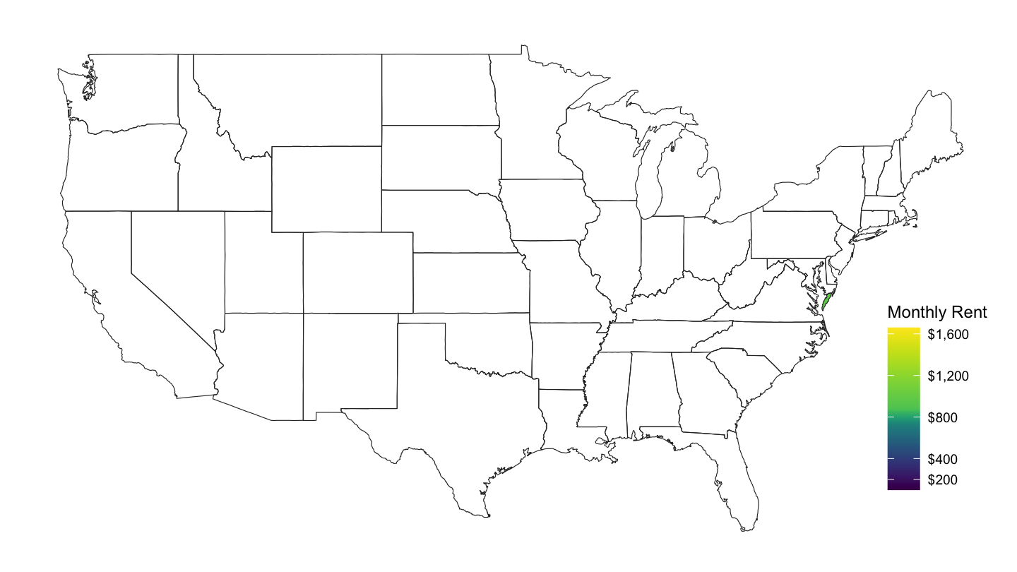
Figure 17: County Median Rent
Hispanic Share
df_county_demographics %>%
  left_join(county.regions, by = "region") %>%
  rename(fips = region, subregion = county.name) %>%
  left_join(us, by = "subregion") %>%
  ggplot(., aes(x = long, y = lat, group = group, fill = percent_hispanic/100)) +
  geom_polygon() + coord_map() +
  theme_map() +
  geom_map(data = map_state, map = map_state,
           aes(long, lat, map_id = region),
           color = "#2b2b2b", fill = NA, size = 0.20) +
  scale_fill_viridis(name = "Hispanic \nShare",
                     labels = percent_format(accuracy = 1),
                     values = c(0, 0.1, 0.2, 0.3, 0.5, 1)) +
  theme(legend.position = c(0.87, 0.1))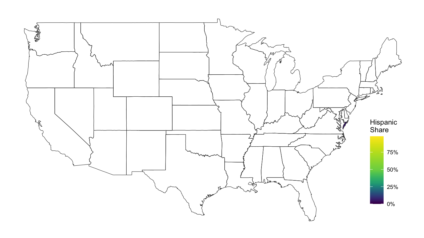
Figure 18: County Percentage of Hispanics
Median Age
df_county_demographics %>%
  left_join(county.regions, by = "region") %>%
  rename(fips = region, subregion = county.name) %>%
  left_join(us, by = "subregion") %>%
  ggplot(., aes(x = long, y = lat, group = group, fill = median_age)) +
  geom_polygon() + coord_map() +
  theme_map() +
  geom_map(data = map_state, map = map_state,
           aes(long, lat, map_id = region),
           color = "#2b2b2b", fill = NA, size = 0.20) +
  scale_fill_viridis(name = "Median Age",
                     labels = comma,
                     values = c(0, 0.2, 0.3, 0.5, 0.7, 1)) +
  theme(legend.position = c(0.87, 0.1))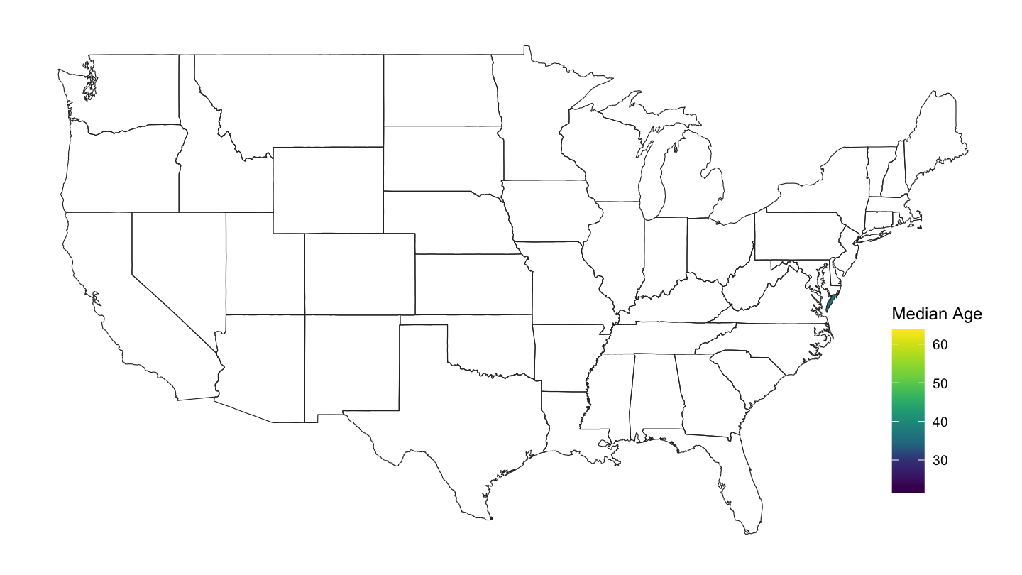
Figure 19: County Median Age