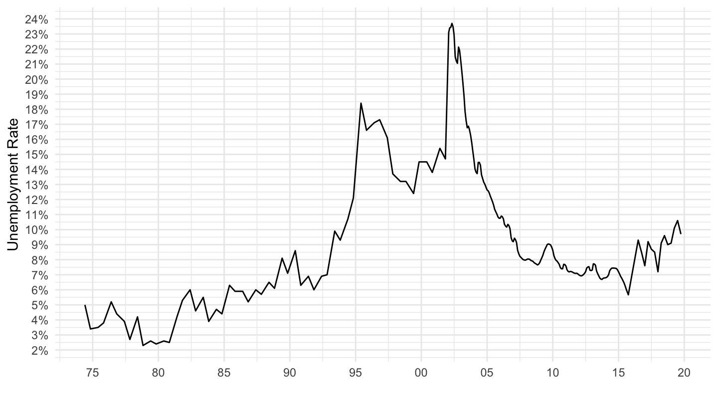
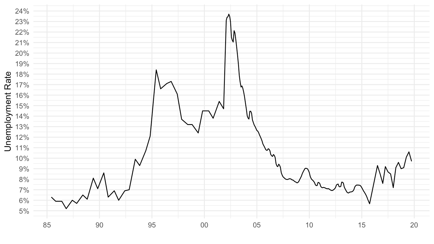
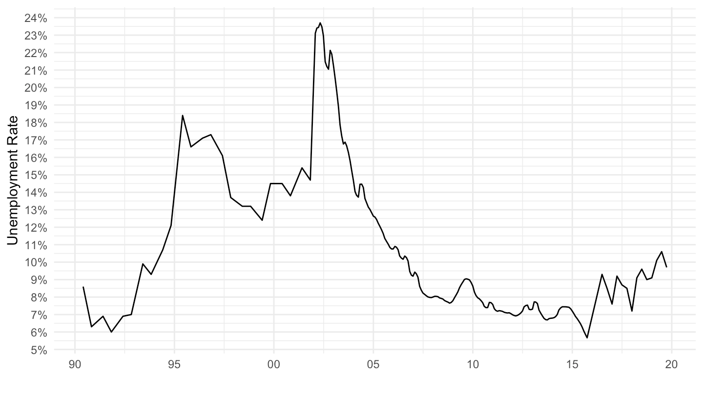
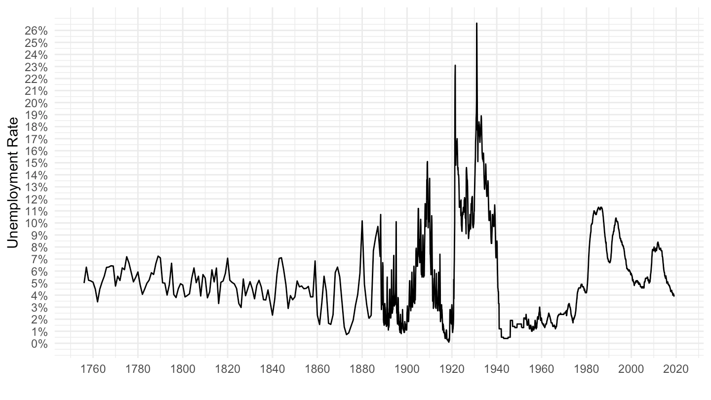
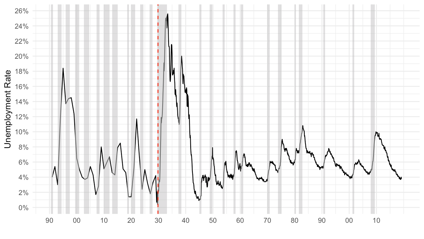
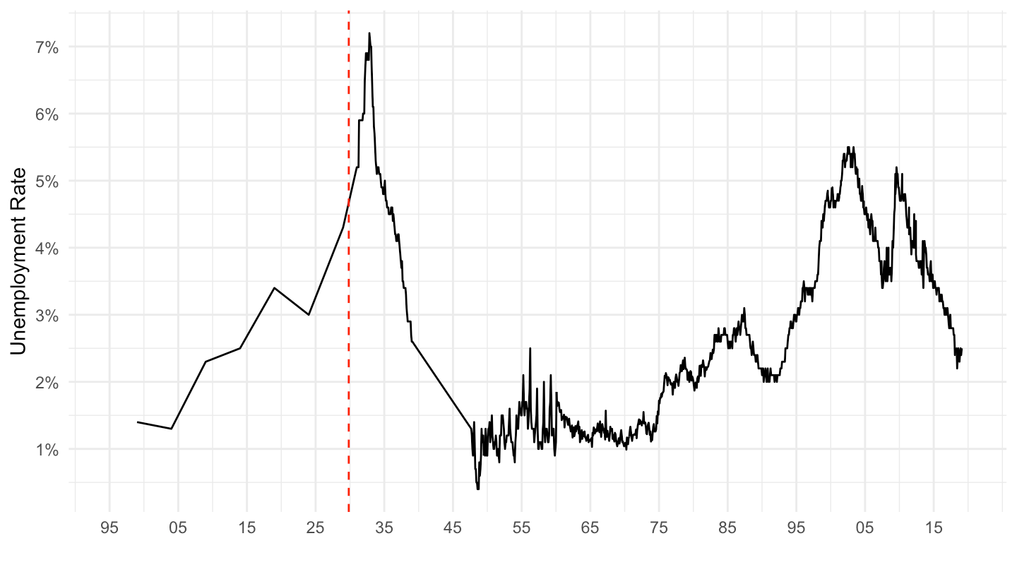
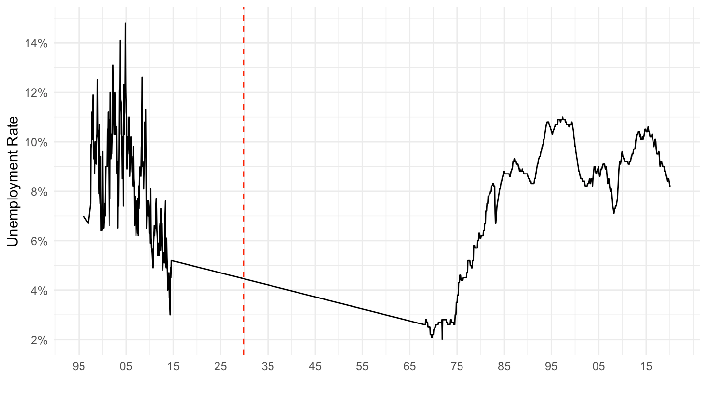
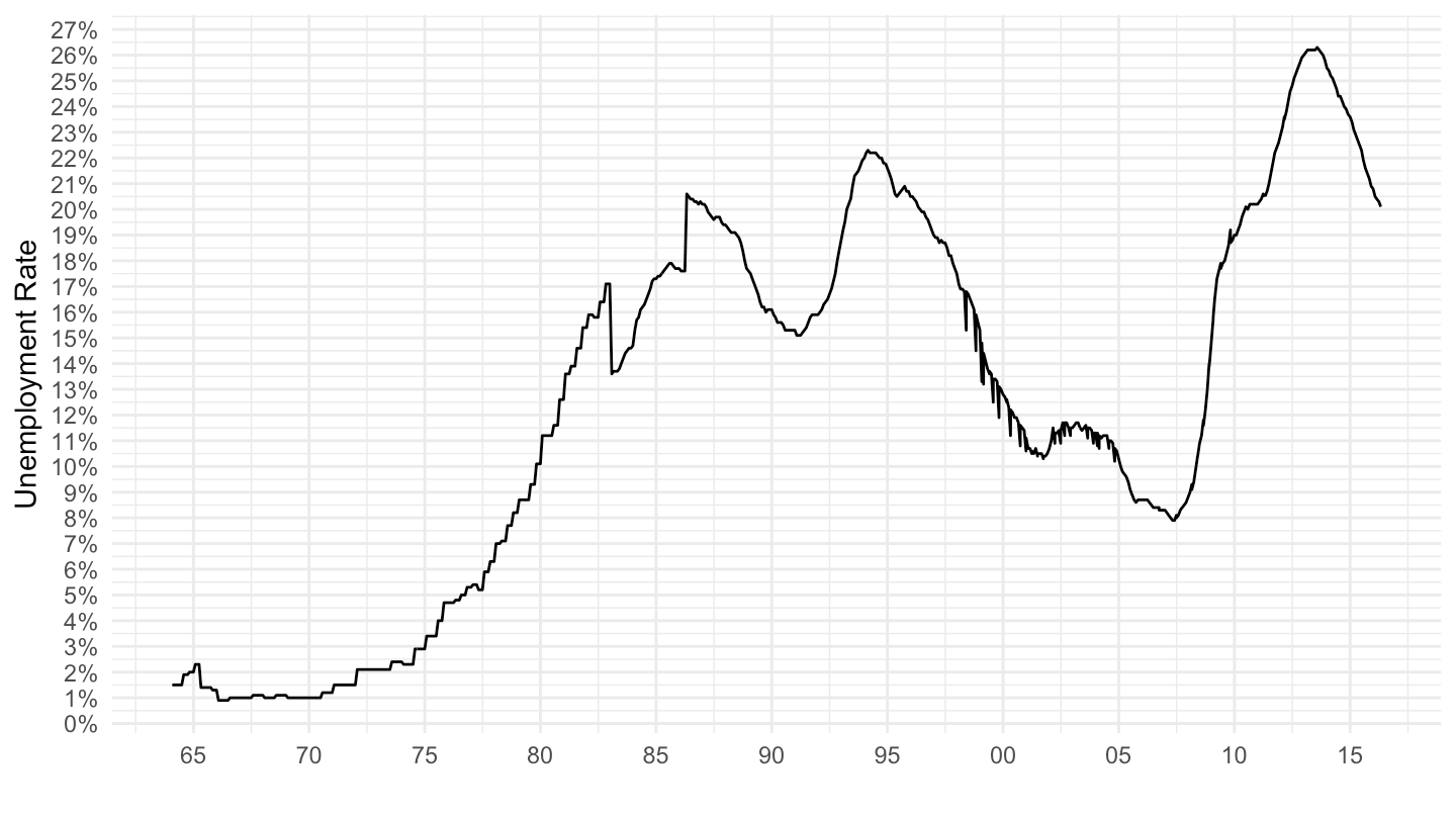
unr %>%
  filter(Ticker == "UNUSAM") %>%
  ggplot(.) +
  geom_line(aes(x = date, y = value / 100)) +
  ylab("Unemployment Rate") + xlab("") +
  geom_rect(data = nber_recessions,
            aes(xmin = Peak, xmax = Trough, ymin = -Inf, ymax = +Inf),
            fill = 'grey', alpha = 0.5) +
  scale_y_continuous(breaks =  0.01*seq(0, 26, 2),
                     labels = scales::percent_format(accuracy = 1)) +
  scale_x_date(breaks = as.Date(paste0(seq(1890, 2019, 10), "-01-01")),
               labels = date_format("%y"),
               limits = c(as.Date("1890-04-01"), as.Date("2019-06-01"))) +
  theme_minimal() +
  geom_vline(xintercept = as.Date("1929-10-29"), linetype = "dashed", color = "red")