Last observation: 8 janv. 2021 (N = 2)
First observation: 31 déc. 1257 (N = 3)
Last data update: 07 oct. 2026, 01:59
Last compile: 07 oct. 2026, 02:01
gold_us_info |>
  select(Ticker, Name, Country) |>
  right_join(gold_us |>
               group_by(Ticker) |>
               summarise(Nobs = n()), by = "Ticker") |>
  arrange(-Nobs) %>%
{if (is_html_output()) datatable(., filter = 'top', rownames = F) else .}gold_us_info |>
select(Ticker, Name, Country) |>
right_join(gold_us |>
group_by(Ticker) |>
summarise(Nobs = n(),
start = first(year(date)),
end = last(year(date))), by = "Ticker") |>
arrange(-Nobs) %>%
{if (is_html_output()) datatable(., filter = 'top', rownames = F) else .}gold_us |>
filter(Ticker == "CMGCGBW",
date >= as.Date("1900-01-01"),
date <= as.Date("1945-01-01")) |>
ggplot() + geom_line(aes(x = date, y = value)) +
ylab("London Gold Price (GBP/Oz)") + xlab("") +
geom_rect(data = nber_recessions,
aes(xmin = Peak, xmax = Trough, ymin = -Inf, ymax = +Inf),
fill = 'grey', alpha = 0.5) +
scale_y_continuous(breaks = seq(0, 50, 1),
labels = scales::dollar_format(accuracy = 1, p = "", su = " GBP/Oz")) +
scale_x_date(breaks = seq(1700, 2100, 5) |> paste0("-01-01") |> as.Date(),
labels = date_format("%Y"),
limits = c(1900, 1945) |> paste0("-01-01") |> as.Date()) +
theme_minimal()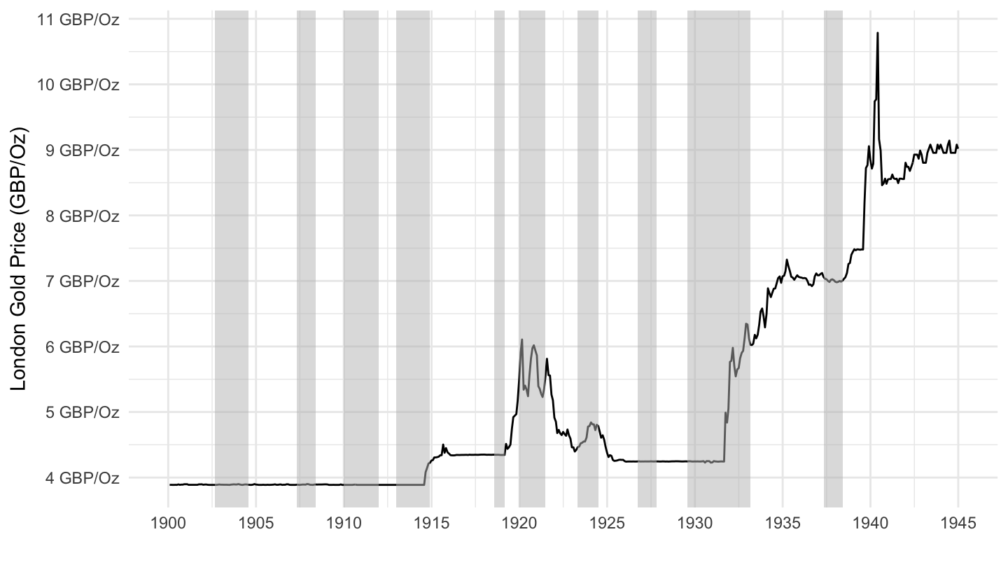
gold_us |>
  filter(Ticker == "CMGCGBW",
         date >= as.Date("1861-01-01"),
         date <= as.Date("1957-01-01")) |>
  ggplot() + geom_line(aes(x = date, y = value)) +
  ylab("London Gold Price (GBP/Oz)") + xlab("") +
  geom_rect(data = nber_recessions,
            aes(xmin = Peak, xmax = Trough, ymin = -Inf, ymax = +Inf),
            fill = 'grey', alpha = 0.5) +
  scale_y_continuous(breaks = seq(0, 50, 1),
                     labels = scales::dollar_format(accuracy = 1, p = "", su = " GBP/Oz")) +
  scale_x_date(breaks = seq(1700, 2100, 10) |> paste0("-01-01") |> as.Date(),
               labels = date_format("%Y"),
               limits = c(1861, 1957) |> paste0("-01-01") |> as.Date()) +
  theme_minimal()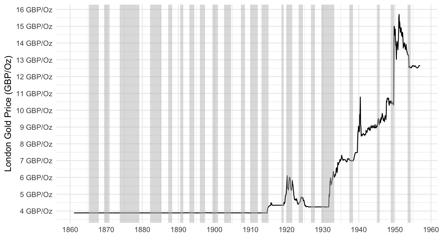
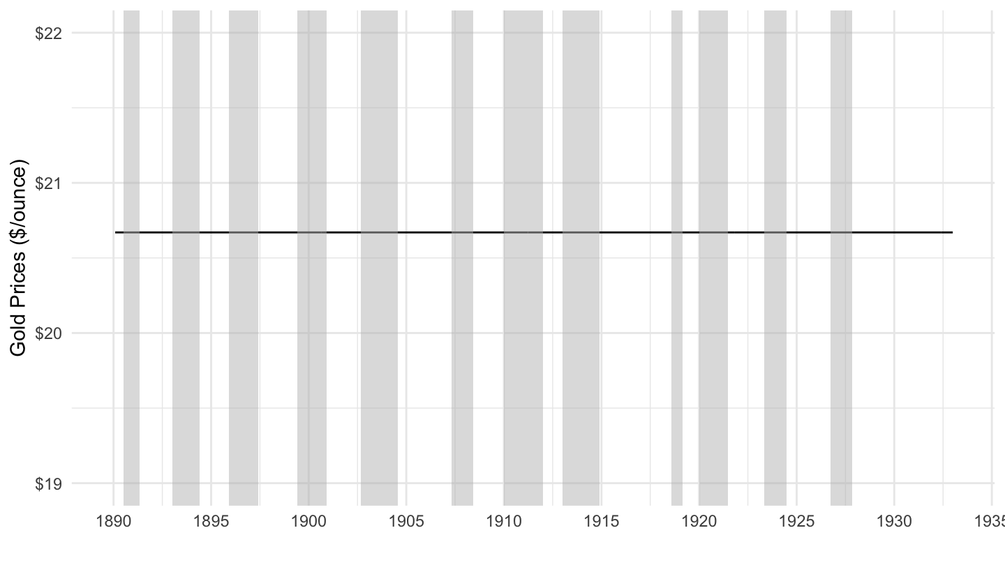
(ref:1890-1933) Price of Gold (1890-1933)
gold_us |>
  filter(Ticker == "XAUFIXAD",
         date >= as.Date("1890-01-01"),
         date <= as.Date("1933-01-01")) |>
  ggplot() + geom_line(aes(x = date, y = value)) +
  ylab("Gold Prices ($/ounce)") + xlab("") +
  geom_rect(data = nber_recessions,
            aes(xmin = Peak, xmax = Trough, ymin = -Inf, ymax = +Inf),
            fill = 'grey', alpha = 0.5) +
  scale_y_continuous(breaks = seq(0, 50, 1),
                     labels = scales::dollar_format(accuracy = 1),
                     limits = c(19, 22)) +
  scale_x_date(breaks = seq(1700, 2100, 5) |> paste0("-01-01") |> as.Date(),
               labels = date_format("%Y"),
               limits = c(1890, 1933) |> paste0("-01-01") |> as.Date()) +
  theme_minimal()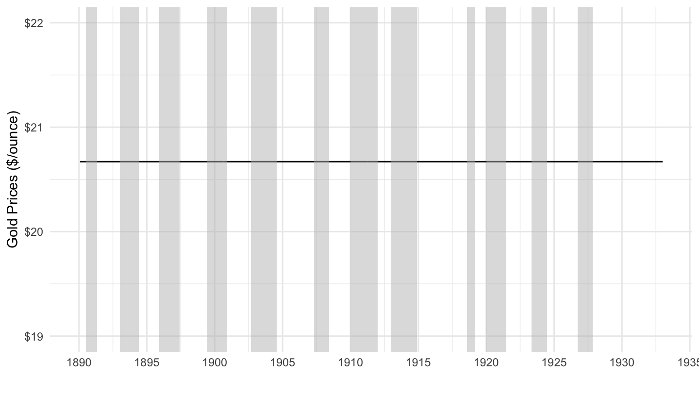
(ref:1800-2019) Price of Gold (1800-2019)
gold_us |>
  filter(Ticker == "XAUFIXAD") |>
  ggplot() + geom_line(aes(x = date, y = value)) +
  ylab("Gold Prices ($/ounce)") + xlab("") +
  geom_rect(data = nber_recessions,
            aes(xmin = Peak, xmax = Trough, ymin = -Inf, ymax = +Inf),
            fill = 'grey', alpha = 0.5) +
  scale_y_continuous(breaks = seq(0, 2000, 200),
                     labels = scales::dollar_format(accuracy = 1)) +
  scale_x_date(breaks = seq(1700, 2100, 20) |> paste0("-01-01") |> as.Date(),
               labels = date_format("%Y")) +
  theme_minimal()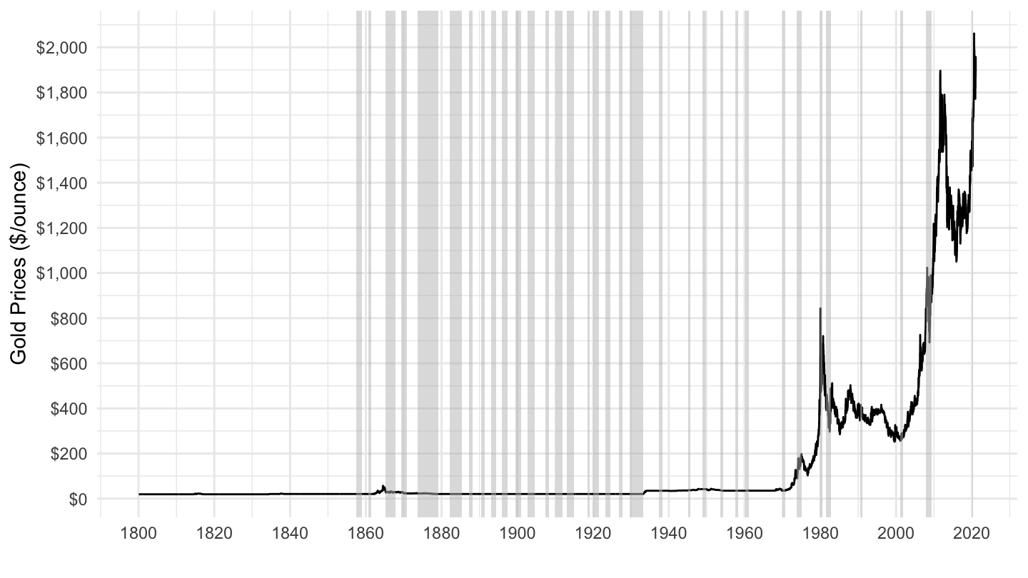
(ref:1920-1942) Spring 1933: FDR takes U.S. off the Gold Standard
gold_us |>
  filter(Ticker == "XAUFIXAD") |>
  ggplot() + geom_line(aes(x = date, y = value)) +
  ylab("Gold Prices ($/ounce)") + xlab("") +
  geom_rect(data = nber_recessions,
            aes(xmin = Peak, xmax = Trough, ymin = -Inf, ymax = +Inf),
            fill = 'grey', alpha = 0.5) +
  scale_y_continuous(breaks = seq(15, 40, 5),
                     limits = c(15, 40),
                     labels = scales::dollar_format(accuracy = 1)) +
  scale_x_date(breaks = c(nber_recessions$Peak, nber_recessions$Trough),
               labels = date_format("%Y"),
               limits = c(as.Date("1920-01-01"), as.Date("1942-01-01"))) +
  theme_minimal() +
  geom_vline(xintercept = as.Date("1933-06-05"), linetype = "dashed", color = viridis(3)[2])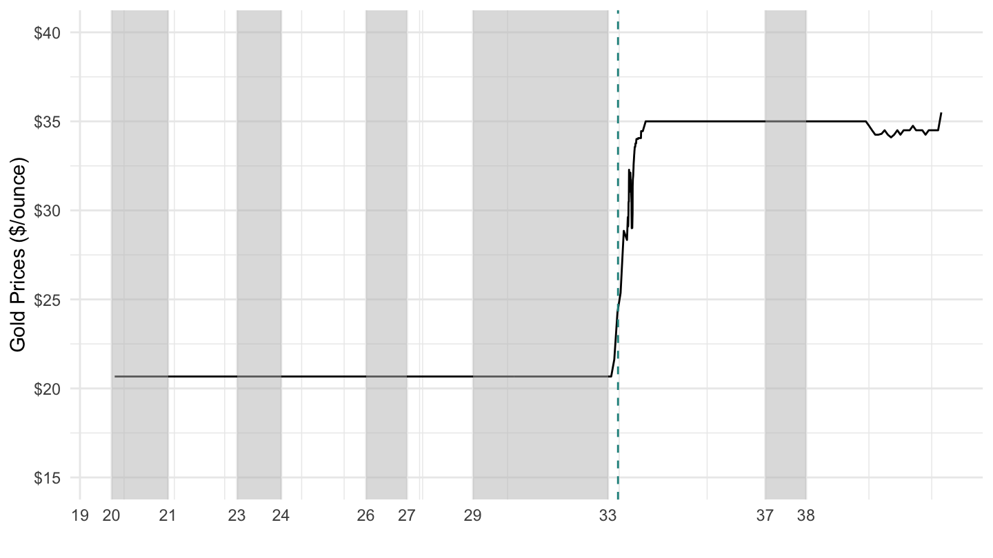
(ref:1920-1942) Spring 1933: FDR takes U.S. off the Gold Standard
gold_us |>
  filter(Ticker == "XAUFIXAD") |>
  ggplot() + geom_line(aes(x = date, y = value)) +
  ylab("Gold Prices ($/ounce)") + xlab("") +
  geom_rect(data = nber_recessions,
            aes(xmin = Peak, xmax = Trough, ymin = -Inf, ymax = +Inf),
            fill = 'grey', alpha = 0.5) +
  scale_y_continuous(breaks = seq(15, 50, 5),
                     limits = c(30, 50),
                     labels = scales::dollar_format(accuracy = 1)) +
  scale_x_date(breaks = c(nber_recessions$Peak, nber_recessions$Trough),
               labels = date_format("%Y"),
               limits = c(as.Date("1945-01-01"), as.Date("1971-01-01"))) +
  theme_minimal() +
  geom_vline(xintercept = as.Date("1933-06-05"), linetype = "dashed", color = viridis(3)[2])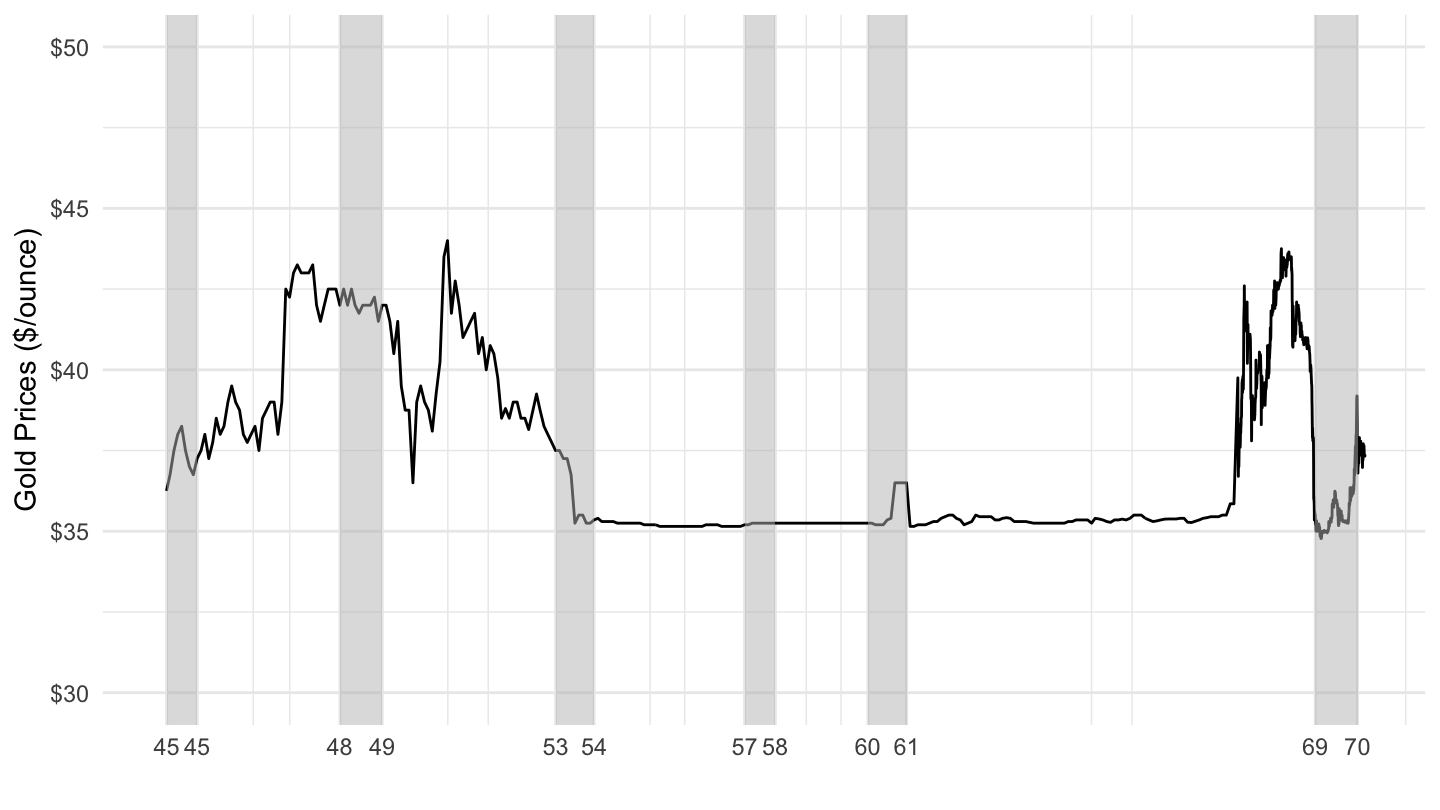
(ref:1800-1972) Gold Prices ($/Ounce) 1800-1972
gold_us |>
  filter(Ticker == "XAUFIXAD") |>
  ggplot() +
  geom_line(aes(x = date, y = value)) +
  ylab("Gold Prices ($/ounce)") + xlab("") +
  geom_rect(data = nber_recessions,
            aes(xmin = Peak, xmax = Trough, ymin = -Inf, ymax = +Inf),
            fill = 'grey', alpha = 0.5) +
  scale_y_continuous(breaks = seq(15, 75, 5),
                     limits = c(15, 65),
                     labels = scales::dollar_format(accuracy = 1)) +
  scale_x_date(breaks = as.Date(paste0(seq(1810, 1990, 20), "-01-01")),
               labels = date_format("%Y"),
               limits = c(as.Date("1800-01-01"), as.Date("1972-01-01"))) +
  theme_minimal() +
  geom_vline(xintercept = as.Date("1971-08-15"), linetype = "dashed", color = viridis(3)[2])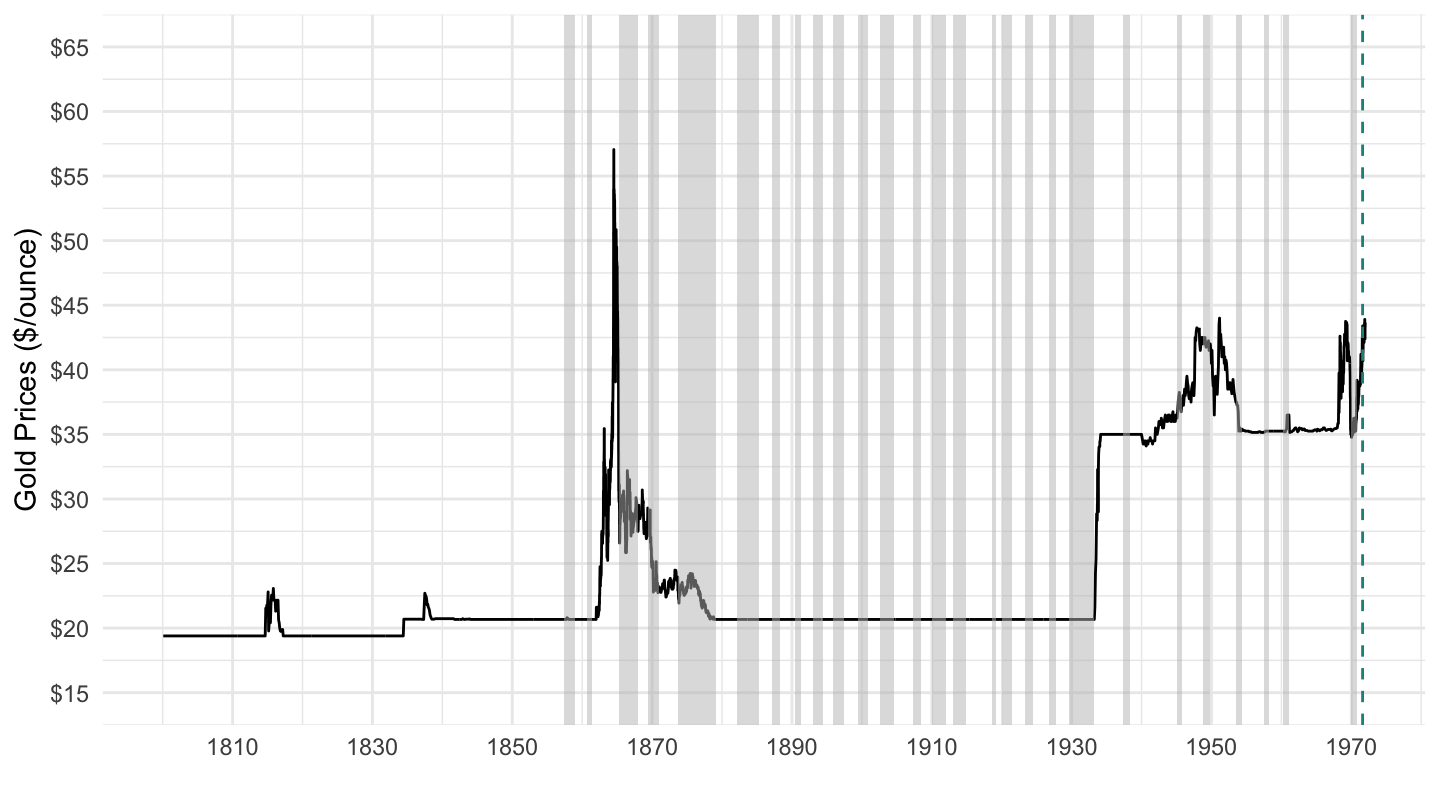
(ref:1800-1972-log) Gold Prices ($/Ounce) 1800-1972
gold_us |>
  filter(Ticker == "XAUFIXAD") |>
  ggplot() +
  geom_line(aes(x = date, y = value)) +
  ylab("Gold Prices ($/ounce)") + xlab("") +
  geom_rect(data = nber_recessions,
            aes(xmin = Peak, xmax = Trough, ymin = -Inf, ymax = +Inf),
            fill = 'grey', alpha = 0.5) +
  scale_y_log10(breaks = seq(15, 75, 5),
                     limits = c(15, 65),
                     labels = scales::dollar_format(accuracy = 1)) +
  scale_x_date(breaks = as.Date(paste0(seq(1810, 1990, 20), "-01-01")),
               labels = date_format("%Y"),
               limits = c(as.Date("1800-01-01"), as.Date("1972-01-01"))) +
  theme_minimal() +
  geom_vline(xintercept = as.Date("1971-08-15"), linetype = "dashed", color = viridis(3)[2])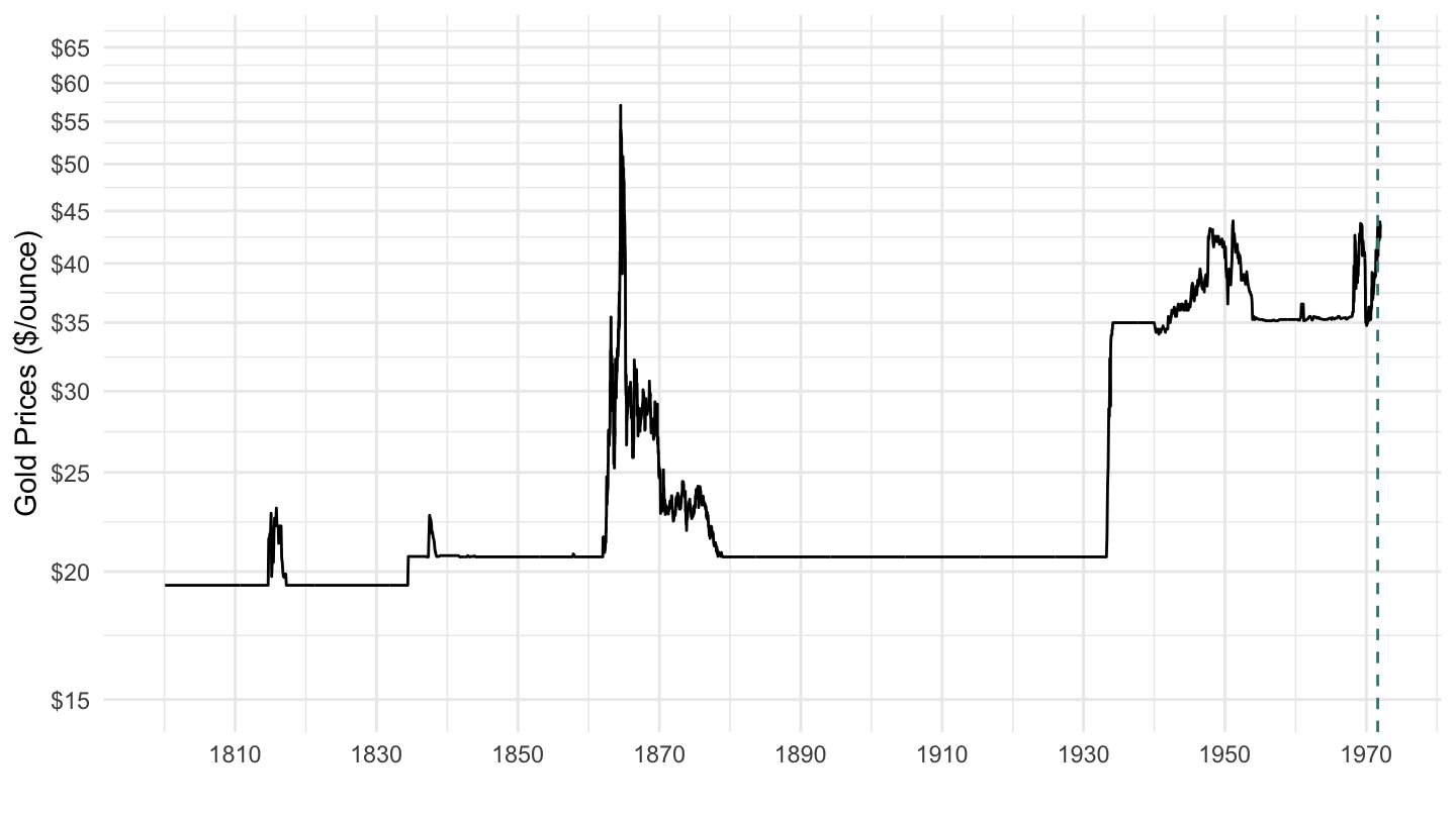
(ref:us-gold-1970-2019) Gold Prices ($/Ounce) 1970-2019.
gold_us |>
  filter(Ticker == "XAUFIXAD") |>
  ggplot() +
  geom_line(aes(x = date, y = value)) +
  ylab("Gold Prices ($/ounce)") + xlab("") +
  geom_rect(data = nber_recessions,
            aes(xmin = Peak, xmax = Trough, ymin = -Inf, ymax = +Inf),
            fill = 'grey', alpha = 0.5) +
  scale_y_continuous(breaks = seq(0, 2000, 250),
                labels = scales::dollar_format(accuracy = 1)) +
  scale_x_date(breaks = as.Date(paste0(c(1971, 1973, 1979, 1990, 2001, 2006, 2007, 2009, 2019), "-01-01")),
               labels = date_format("%Y"),
               limits = c(as.Date("1970-01-01"), as.Date("2019-01-01"))) +
  theme_minimal() +
  geom_vline(xintercept = as.Date("1971-08-15"), linetype = "dashed", color = viridis(3)[2])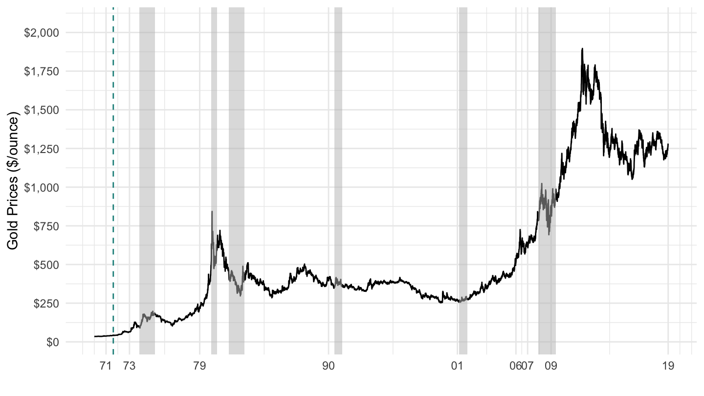
gold_us |>
  filter(Ticker == "XAUFIXAD") |>
  ggplot() +
  geom_line(aes(x = date, y = value)) +
  ylab("Gold Prices ($/ounce)") + xlab("") +
  geom_rect(data = nber_recessions,
            aes(xmin = Peak, xmax = Trough, ymin = -Inf, ymax = +Inf),
            fill = 'grey', alpha = 0.5) +
  scale_y_log10(breaks = c(35, seq(50, 300, 50), seq(0, 2000, 250)),
                labels = scales::dollar_format(accuracy = 1)) +
  scale_x_date(breaks = as.Date(paste0(c(1971, 1973, 1979, 1990, 2001, 2006, 2007, 2009, 2019), "-01-01")),
               labels = date_format("%Y"),
               limits = c(as.Date("1970-01-01"), as.Date("2019-01-01"))) +
  theme_minimal() +
  geom_vline(xintercept = as.Date("1971-08-15"), linetype = "dashed", color = viridis(3)[2])
(ref:1937-1971) Price of Gold (1937-1971)
gold_us |>
  filter(Ticker == "XAUFIXAD") |>
  filter(date >= as.Date("1937-01-01"),
         date <= as.Date("1971-01-01")) |>
  ggplot() + geom_line(aes(x = date, y = value)) +
  ylab("Gold Prices ($/ounce)") + xlab("") +
  geom_rect(data = nber_recessions,
            aes(xmin = Peak, xmax = Trough, ymin = -Inf, ymax = +Inf),
            fill = 'grey', alpha = 0.5) +
  scale_y_continuous(breaks = seq(0, 50, 1),
                     labels = scales::dollar_format(accuracy = 1),
                     limits = c(34, 45)) +
  scale_x_date(breaks = seq(1700, 2100, 5) |> paste0("-01-01") |> as.Date(),
               labels = date_format("%Y"),
               limits = c(1937, 1971) |> paste0("-01-01") |> as.Date()) +
  theme_minimal()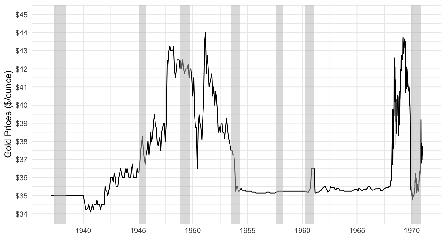
gold_us |>
  filter(Ticker == "__XAU_BD",
         date >= as.Date("1890-01-01"),
         date <= as.Date("1933-01-01")) |>
  ggplot() + geom_line(aes(x = date, y = value)) +
  ylab("Gold Prices ($/ounce)") + xlab("") +
  geom_rect(data = nber_recessions,
            aes(xmin = Peak, xmax = Trough, ymin = -Inf, ymax = +Inf),
            fill = 'grey', alpha = 0.5) +
  scale_y_continuous(breaks = seq(0, 50, 1),
                     labels = scales::dollar_format(accuracy = 1),
                     limits = c(19, 22)) +
  scale_x_date(breaks = seq(1700, 2100, 5) |> paste0("-01-01") |> as.Date(),
               labels = date_format("%Y"),
               limits = c(1890, 1933) |> paste0("-01-01") |> as.Date()) +
  theme_minimal()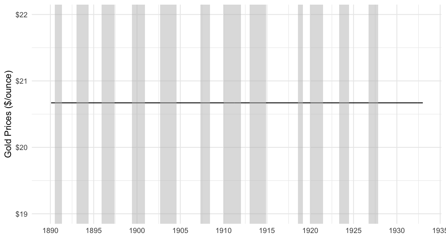
gold_us |>
  filter(Ticker == "__XAU_D",
         date >= as.Date("1890-01-01"),
         date <= as.Date("1933-01-01")) |>
  ggplot() + geom_line(aes(x = date, y = value)) +
  ylab("Gold Prices ($/ounce)") + xlab("") +
  geom_rect(data = nber_recessions,
            aes(xmin = Peak, xmax = Trough, ymin = -Inf, ymax = +Inf),
            fill = 'grey', alpha = 0.5) +
  scale_y_continuous(breaks = seq(0, 50, 1),
                     labels = scales::dollar_format(accuracy = 1),
                     limits = c(19, 22)) +
  scale_x_date(breaks = seq(1700, 2100, 5) |> paste0("-01-01") |> as.Date(),
               labels = date_format("%Y"),
               limits = c(1890, 1933) |> paste0("-01-01") |> as.Date()) +
  theme_minimal()