Lecture 2 - Statistics of Superstars
UCLA - Econ 19 - Fall 2020
## Warning: package 'fredr' is not available (for R version 4.0.2)## Warning in library(package, lib.loc = lib.loc, character.only = TRUE,
## logical.return = TRUE, : there is no package called 'fredr'During this course, we shall try to understand a technical passage in Sherwin Rosen’s The American Scholar piece:
Of particular interest here is an observation, first studied systematically by the great Italian economist Vilfredo Pareto in the late nineteenth century, that the distribution of income contains an unusually large proportion of top earners: that is, among the rich rather than the poor. A visual image will perhaps clarify what is meant by “unusual” in this connection. Imagine a graph plotting IQ scores on the horizontal and the frequency of scores on the vertical. The result is a familiar bell-shaped curve. The peak of the bell occurs at a score arbitrarily scaled at 100 and the curve falls symmetrically on either side of 100. Now picture a similar graph, except with earnings on the horizontal. The resulting curve is unbalanced and nonsymmetrical - a bell that is definitely out of whack. To the left of the modal (peak) value it appears much like the IQ frequency curve. However, to the right of the mode it does not fall as fast as it does to the left. It looks as if someone had stood at the right end of the curve, placed it over his back like a rope, and dragged and stretched it out a very long distance. The upper or right-hand tail of the distribution of income is much thicker than the lower, left-hand tail. The extra weight on the right lends a certain skewness to the distribution of income. What this comes down to is that the distribution of earnings is far from proportionate to the distribution of ability. Amazingly, Pareto’s observations have been qualitatively duplicated in virtually every era of every society for which data on income distributions can be found.
In this passage, Sherwin Rosen draws a sharp distribution between Gaussian distributions on the one hand (characterized by the well known bell-shaped curve) and Pareto distributions on the other hand:
“Imagine a graph plotting IQ scores on the horizontal and the frequency of scores on the vertical. The result is a familiar Bell-shaped curve.”
“The upper or right-hand tail of the distribution of income is much thicker than the lower, left-hand tail. The extra weight on the right lends a certain skewness to the distribution of income. What this comes down to is that the distribution of earnings is far from proportionate to the distribution of ability.”
We first investigate the mathematics of these different distributions, before proceeding to describing some real-world statistical distributions, and connect them to Bell-shaped curves on the one hand and Pareto distributions on the other hand.
Mathematics of Statistical Distributions
In order to understand Sherwin Rosen’s above comment, I need to take you through some mathematics. Do not panic ! I am going to take you through everything, and a prerequisite of mathematics from high school should be sufficient.
Bell-Shaped Distributions
The Bell shape curve is defined by a density function given by: \[f(x)=\frac{1}{\sqrt{2\pi}\sigma}\exp\left(-\frac{(x-\mu)^2}{\sigma^2}\right).\] One implication is that the density of a Bell Shaped curve goes very rapidly to zero as \(x\) goes to infinity. When premultiplied by any power function \(x^a\), no matter how large \(a\), the density of a Bell-shaped curve still converges to zero, which means that the density is negligible compared to any power function when \(x\) to infinity: \[\text{for all } a>0, \quad \lim_{x \to +\infty} x^a f(x) =0.\]
Intuitively, this means that the Gaussian Distribution goes “very fast” to zero as \(x\) becomes large, faster in fact than usual functions which are thought to go very fast to zero (thing, for example of \(x^10000\) when \(x\) becomes large).
Here is a link to the Google Sheets that we created in order to look at the Gaussian distribution. In particular, we were able to plot the density function of a Normal Distribution with \(\mu=0\) and \(\sigma=1\), using the formula above. Note: this Google Sheet is read only. However, you may copy and paste from this Google Sheet, and choose your own values for \(\mu\) and \(\sigma\).
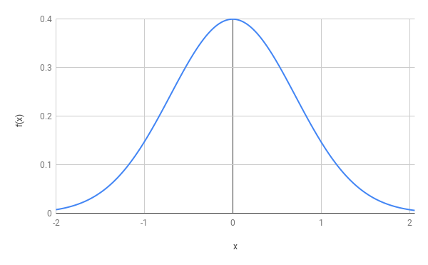
Figure 1: Bell Shaped Curve.
Pareto Distributions
A key feature of the Pareto distribution is that the density distribution does not go as fast to \(0\) as with the Gaussian Distribution, as \(x\) becomes large.
In the context For concreteness, if \(x\) is population, then this would mean that there are relatively many cities with a large size, especially when assessed against the average city size, as well as its standard deviation. Similarly, there are relatively many incomes that are much larger than the mean. The Pareto Distribution is in fact defined by: \[f(x)=a\frac{x_m^a}{x^{a+1}}.\]
For the cumulative distribution function, this implies: \[1-F(x)=\left(\frac{x_m}{x}\right)^a.\]
Some Real-Life Distributions
Natural Sciences
Many distributions in the natural sciences are well described by a Bell-shaped curve. In order to illustrate this, let us use the National Longitudinal Surveys (NLS) from the Bureau of Labor Statistics which tracks the income, education, and life circumstances of a large cohort of Americans across several decades. The below figures shows the distribution of height in the population, first for both genders, and then for male and female separately.
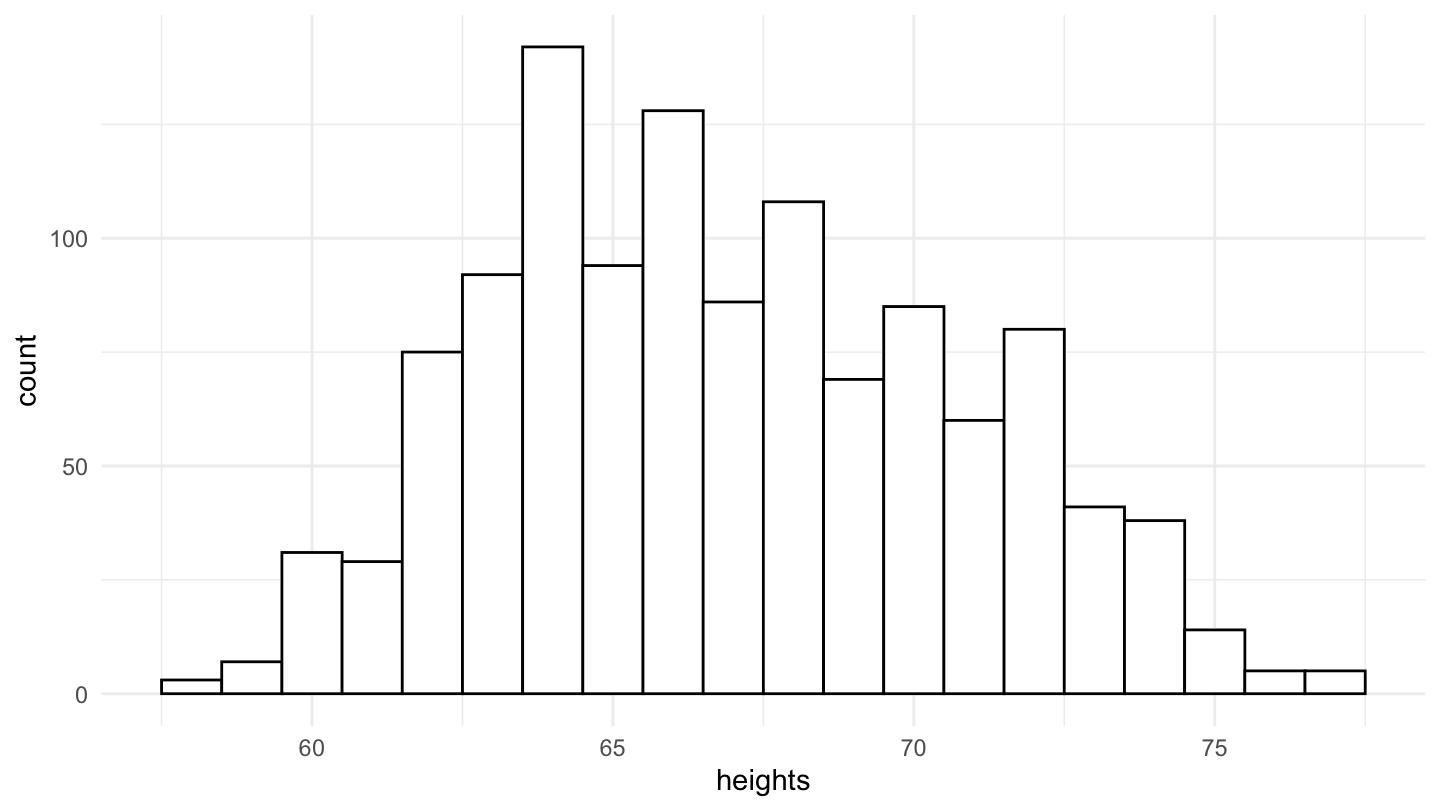
Figure 2: Distribution of Height in the National Longitudinal Surveys (NLS).
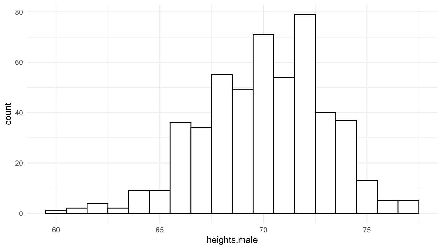
Figure 3: Male Distribution of Height in the National Longitudinal Surveys (NLS).
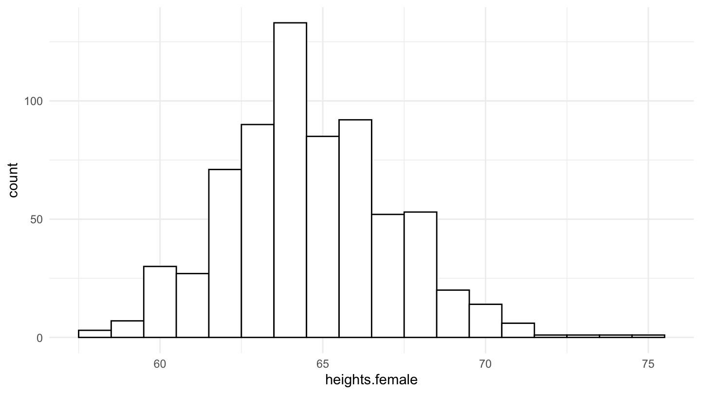
Figure 4: Female Distribution of Height in the National Longitudinal Surveys (NLS).
Cities
During the class, we have used this Google Spreadsheet in order to plot the city size distribution of cities. We note that the result is something that is close to a linear relationship, when the log rank is plotted against the log size, which shows that the distribution is close to Pareto.
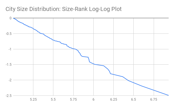
Figure 5: City Size Distribution, Pareto Plot.
We can also download everything in R directly. The data comes from the following Wikipedia entry: List of United States cities by population.
Biggest cities:
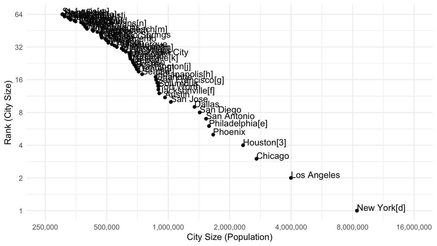
Figure 6: Most populated cities in the U.S. (> 250,000), Pareto Plot.
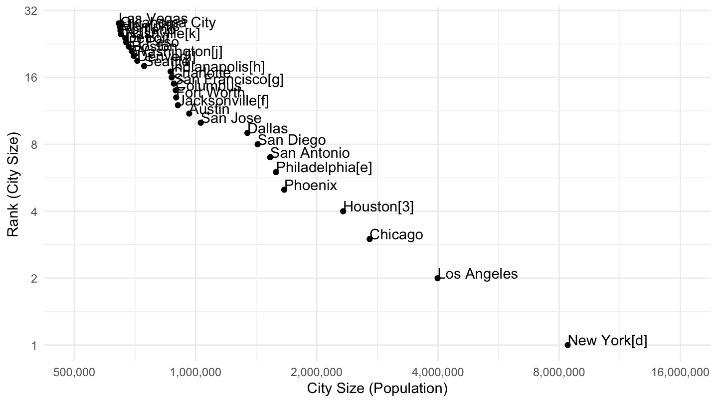
Figure 7: Most populated cities in the U.S. (> 500,000), Pareto Plot.
MSAs
Instead of cities, we can look at MSAs instead. The data comes from the following Wikipedia entry: List of metropolitan statistical areas.
The list of the 28 largest Metropolitan Statistical Areas is as follows.
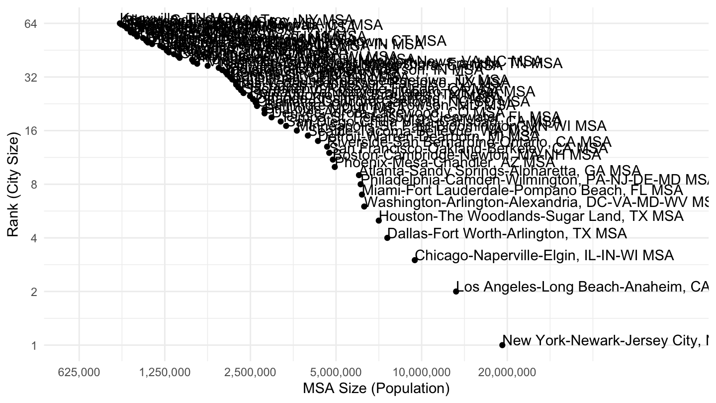
Figure 8: Most populated MSAs in the U.S. (> 600,000), Pareto Plot.
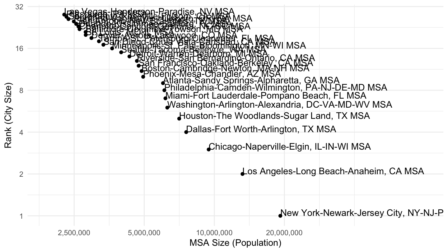
Figure 9: Most populated MSAs in the U.S. (> 1,900,000), Pareto Plot.