Time Series Functions
Code - R
François Geerolf
Quarterly Data
read.table(text = "
Country Time Value
1 USA 1999-Q1 292929
2 USA 1999-Q2 392023
3 USA 1999-Q3 9392992") %>%
  mutate(Time = as.yearqtr(Time, format = "%Y-Q%q")) %>%
  ggplot + geom_line(aes(Time, Value, col = Country)) +
  scale_x_yearqtr(format = "%Y-Q%q")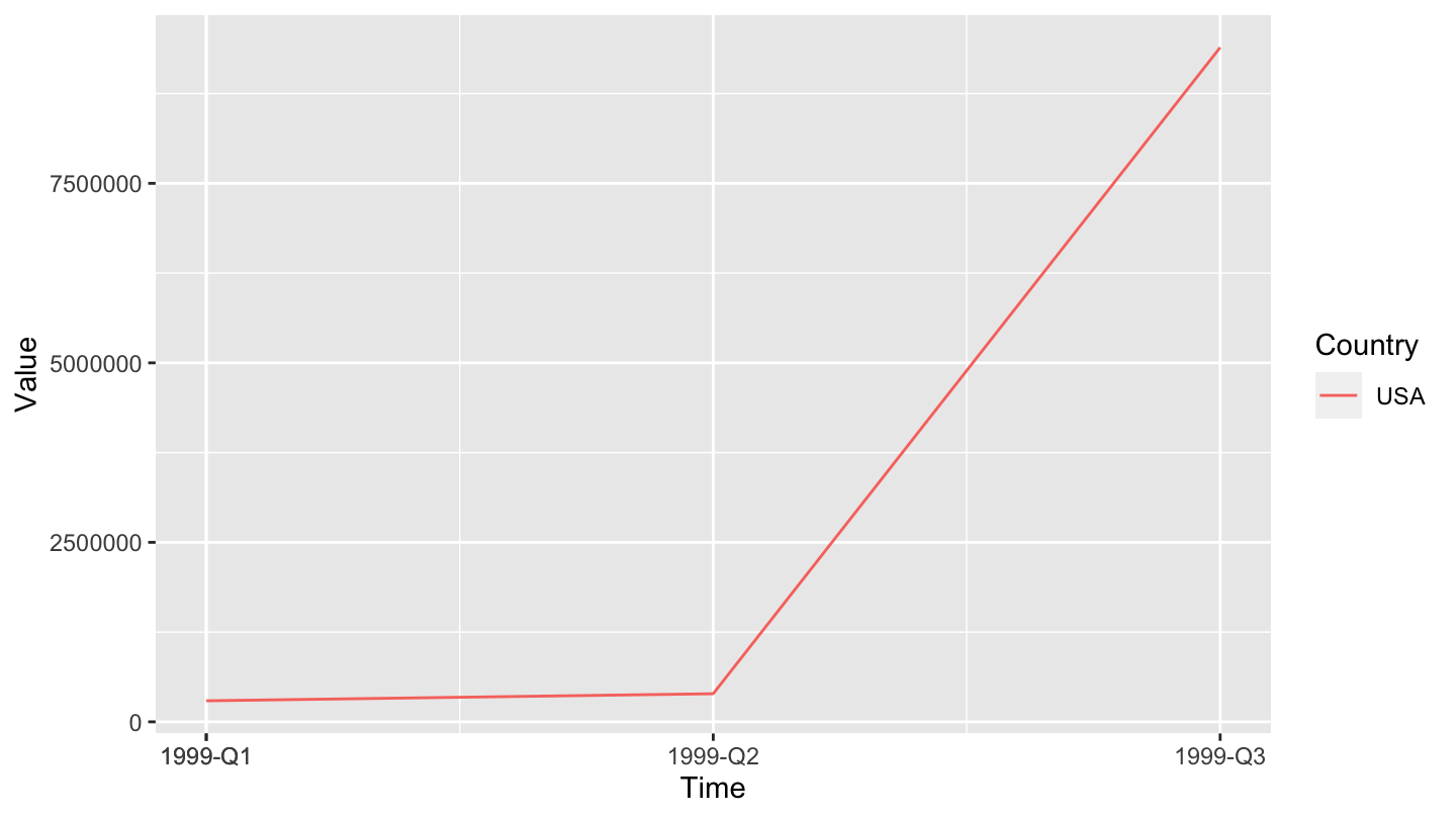
New ones
kings <- scan("http://robjhyndman.com/tsdldata/misc/kings.dat", skip=3)
kingstimeseries <- ts(kings)
kingstimeseries
# Time Series:
# Start = 1
# End = 42
# Frequency = 1
# [1] 60 43 67 50 56 42 50 65 68 43 65 34 47 34 49 41 13 35 53 56 16 43 69 59 48
# [26] 59 86 55 68 51 33 49 67 77 81 67 71 81 68 70 77 56plot.ts(kingstimeseries)
kingstimeseriesSMA3 <- SMA(kingstimeseries, n = 3)
plot.ts(kingstimeseriesSMA3)
souvenir <- scan("http://robjhyndman.com/tsdldata/data/fancy.dat")
souvenirtimeseries <- ts(souvenir, frequency=12, start=c(1987, 1))
souvenirtimeseries
# Jan Feb Mar Apr May Jun Jul
# 1987 1664.81 2397.53 2840.71 3547.29 3752.96 3714.74 4349.61
# 1988 2499.81 5198.24 7225.14 4806.03 5900.88 4951.34 6179.12
# 1989 4717.02 5702.63 9957.58 5304.78 6492.43 6630.80 7349.62
# 1990 5921.10 5814.58 12421.25 6369.77 7609.12 7224.75 8121.22
# 1991 4826.64 6470.23 9638.77 8821.17 8722.37 10209.48 11276.55
# 1992 7615.03 9849.69 14558.40 11587.33 9332.56 13082.09 16732.78
# 1993 10243.24 11266.88 21826.84 17357.33 15997.79 18601.53 26155.15
# Aug Sep Oct Nov Dec
# 1987 3566.34 5021.82 6423.48 7600.60 19756.21
# 1988 4752.15 5496.43 5835.10 12600.08 28541.72
# 1989 8176.62 8573.17 9690.50 15151.84 34061.01
# 1990 7979.25 8093.06 8476.70 17914.66 30114.41
# 1991 12552.22 11637.39 13606.89 21822.11 45060.69
# 1992 19888.61 23933.38 25391.35 36024.80 80721.71
# 1993 28586.52 30505.41 30821.33 46634.38 104660.67Complete dataset Example
There is an example here. We start from the following dataset of VATs:
taux_tva %>%
print_table_long()| date | taux_normal | taux_reduit |
|---|---|---|
| 2014-01-01 | 0.200 | 0.055 |
| 2012-01-01 | 0.196 | 0.055 |
| 2000-04-01 | 0.196 | 0.055 |
| 1995-08-01 | 0.206 | 0.055 |
| 1993-01-01 | 0.186 | 0.055 |
| 1991-07-29 | 0.186 | 0.055 |
| 1990-09-13 | 0.186 | 0.055 |
| 1990-01-01 | 0.186 | 0.055 |
| 1989-09-08 | 0.186 | 0.055 |
| 1989-01-01 | 0.186 | 0.055 |
| 1987-09-17 | 0.186 | 0.055 |
| 1986-07-01 | 0.186 | 0.055 |
| 1982-07-01 | 0.186 | 0.055 |
| 1977-01-01 | 0.176 | 0.070 |
| 1972-01-01 | 0.200 | 0.070 |
| 1970-01-01 | 0.230 | 0.075 |
| 1968-12-01 | 0.190 | 0.070 |
| 1955-07-01 | 0.195 | 0.100 |
| 1954-07-01 | 0.165 | 0.075 |
If we plot this, it does not make any sense:
taux_tva %>%
  gather(variable, value, -date) %>%
  ggplot() + geom_line(aes(x = date, y = value, color = variable)) +
  scale_color_manual(values = viridis(4)[1:3]) +
  theme_minimal() +
  scale_x_date(breaks = seq(1920, 2025, 2) %>% paste0("-01-01") %>% as.Date,
               labels = date_format("%y")) +
  theme(legend.position = c(0.65, 0.6),
        legend.title = element_blank()) +
  scale_y_continuous(breaks = 0.01*seq(0, 50, 1),
                     labels = percent_format(accuracy = 1)) +
  ylab("Tax Rate (%)") + xlab("")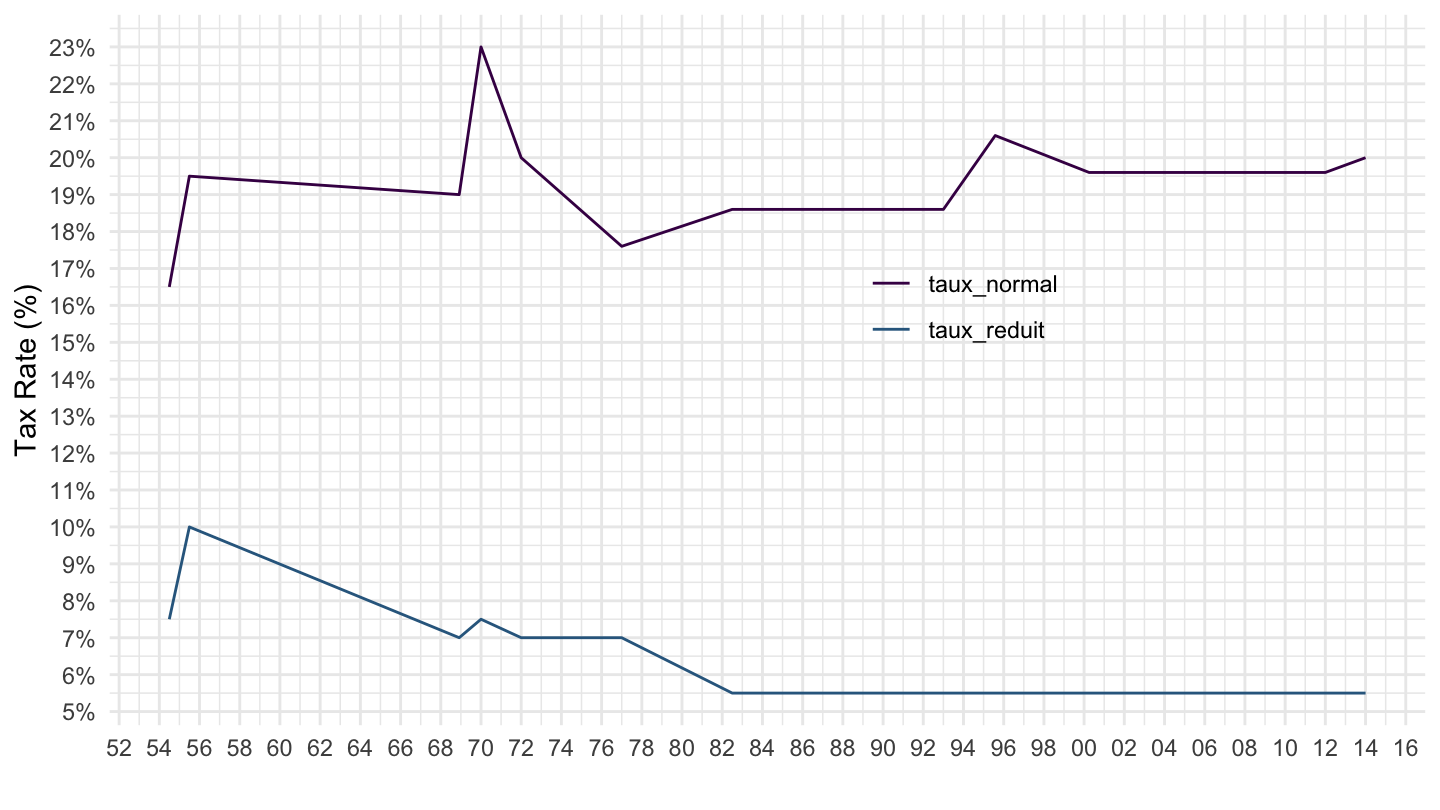
taux_tva %>%
  complete(date = seq.Date(min(date), max(date), by = "day")) %>%
  fill(taux_normal, taux_reduit) %>%
  head(10) %>%
print_table_long()| date | taux_normal | taux_reduit |
|---|---|---|
| 1954-07-01 | 0.165 | 0.075 |
| 1954-07-02 | 0.165 | 0.075 |
| 1954-07-03 | 0.165 | 0.075 |
| 1954-07-04 | 0.165 | 0.075 |
| 1954-07-05 | 0.165 | 0.075 |
| 1954-07-06 | 0.165 | 0.075 |
| 1954-07-07 | 0.165 | 0.075 |
| 1954-07-08 | 0.165 | 0.075 |
| 1954-07-09 | 0.165 | 0.075 |
| 1954-07-10 | 0.165 | 0.075 |
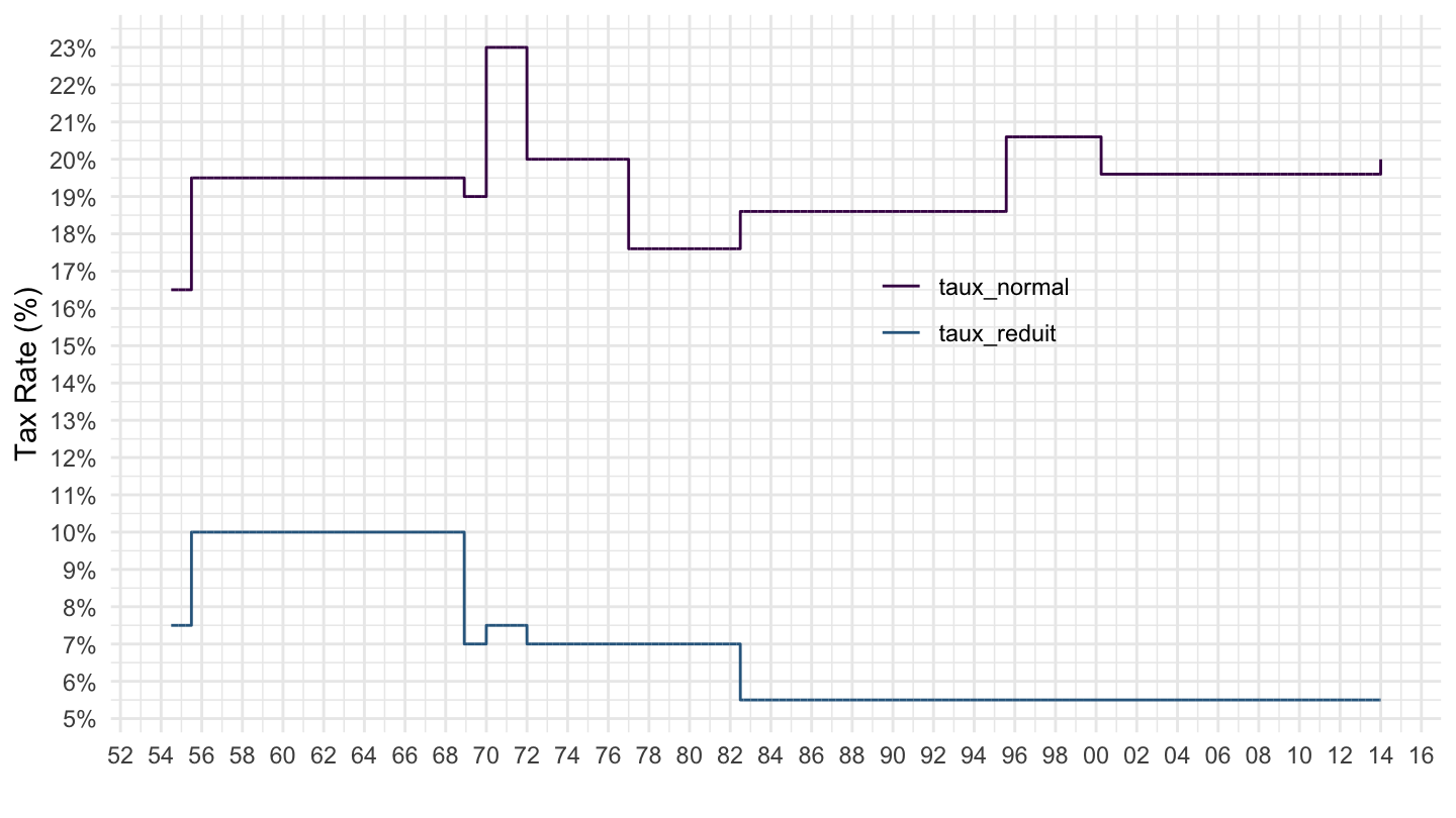
taux_tva %>%
  complete(date = seq.Date(min(date), max(date), by = "day")) %>%
  fill(taux_normal, taux_reduit) %>%
  gather(variable, value, -date) %>%
  ggplot() + geom_line(aes(x = date, y = value, color = variable)) +
  scale_color_manual(values = viridis(4)[1:3]) +
  theme_minimal() +
  scale_x_date(breaks = seq(1920, 2025, 2) %>% paste0("-01-01") %>% as.Date,
               labels = date_format("%y")) +
  theme(legend.position = c(0.65, 0.6),
        legend.title = element_blank()) +
  scale_y_continuous(breaks = 0.01*seq(0, 50, 1),
                     labels = percent_format(accuracy = 1)) +
  ylab("Tax Rate (%)") + xlab("")