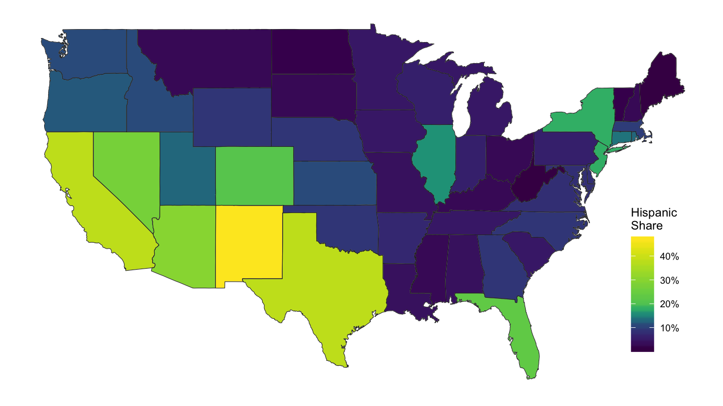
U.S. Maps
Code - R
François Geerolf
State Map
sh_top10_state_fig2b %>%
  left_join(fips_statenames_xwalk_short,
            by = "state") %>%
  mutate(value = mean_s_stateig10 /100) %>%
  right_join(map_data("state"),
             by = "region") %>%
  ggplot(aes(long, lat, group = group)) +
  geom_polygon(aes(fill = value), colour = alpha("black", 1/2), size = 0.2)  +
  scale_fill_viridis_c(labels = scales::percent_format(accuracy = 1),
                       breaks = c(0.05, 0.08, 0.10, 0.12, 0.15),
                       values = c(0, 0.2, 0.4, 0.5, 1)) +
  theme_void() +
  theme(legend.position = c(0.9, 0.2)) + labs(fill = "Top 10%\nShare")
Figure 1: State-level Top 10% Per Cent Share.
County Map
U.S. Wide
dataraw_county_long %>%
  filter(variable == "mortgage", date == as.Date("2007-10-01")) %>%
  select(county_code, value) %>%
  left_join(county_code_name %>%
              select(county_code, subregion = county_name3, region = state_name3),
            by = "county_code") %>%
  right_join(map_data("county"),
             by = c("region", "subregion")) %>%
  ggplot(aes(long, lat, group = group)) +
  geom_polygon(aes(fill = value), colour = alpha("black", 1/2), size = 0.2)  +
  scale_fill_viridis_c(labels = scales::dollar_format(accuracy = 1),
                       na.value = "white",
                       breaks = c(25000, 50000, 75000, 100000, 125000)) +
  theme_void() +
  theme(legend.position = c(0.9, 0.2)) +
  labs(fill = "Per Capita\nMortgage Debt")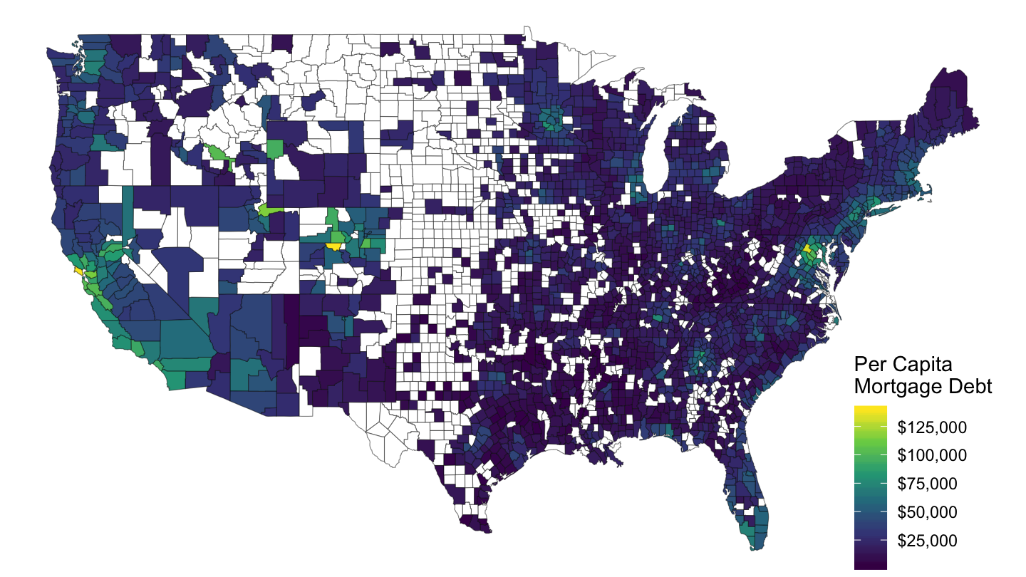
Figure 2: Mortgage Debt Per Capita, 2007-Q4, FRB
dataraw_county_long %>%
  filter(variable == "UNR", date == as.Date("2007-10-01")) %>%
  select(county_code, value) %>%
  mutate(value = value/100) %>%
  left_join(county_code_name %>%
              select(county_code, subregion = county_name3, region = state_name3),
            by = "county_code") %>%
  right_join(map_data("county"),
             by = c("region", "subregion")) %>%
  ggplot(aes(long, lat, group = group)) +
  geom_polygon(aes(fill = value), colour = alpha("black", 1/2), size = 0.2)  +
  scale_fill_viridis_c(labels = scales::percent_format(accuracy = 1),
                       na.value = "white",
                       breaks = c(0, 0.05, 0.10, 0.15, 0.20),
                       values = c(0, 0.1, 0.2, 0.3, 1)) +
  theme_void() +
  theme(legend.position = c(0.9, 0.2)) + labs(fill = "Unemp.\nRate")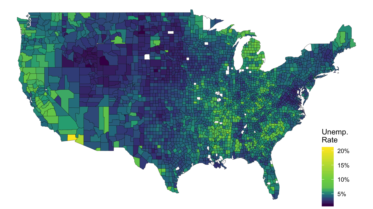
Figure 3: Mortgage Debt Per Capita, 2007-Q4, FRB
mme_percap_county %>%
  select(county_code = fips, value) %>%
  filter(value <= 500) %>%
  left_join(county_code_name %>%
              select(county_code, subregion = county_name3, region = state_name3),
            by = "county_code") %>%
  right_join(map_data("county"),
             by = c("region", "subregion")) %>%
  ggplot(aes(long, lat, group = group)) +
  geom_polygon(aes(fill = value), colour = alpha("black", 1/2), size = 0.2)  +
  scale_fill_viridis_c(labels = scales::dollar_format(accuracy = 1, prefix = ""),
                       na.value = "white",
                       breaks = c(-100,  0, 100, 200, 300, 400, 500),
                       values = c(0, 0.1, 0.2, 0.3, 1)) +
  theme_void() +
  theme(legend.position = c(0.9, 0.2)) + labs(fill = "Opioid\nConsumption")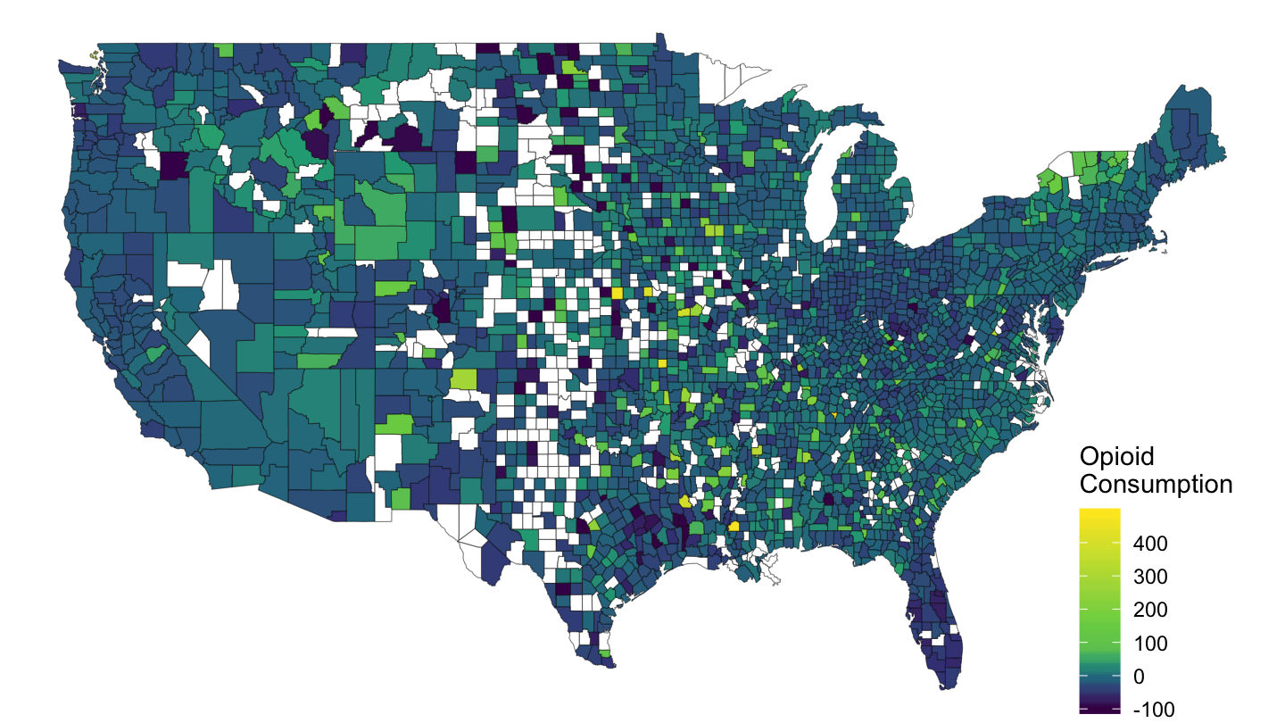
Figure 4: Opioid Consumption by County
California
dataraw_county_long %>%
  filter(variable == "mortgage", date == as.Date("2006-10-01")) %>%
  select(county_code, value) %>%
  left_join(county_code_name %>%
              select(county_code, subregion = county_name3, region = state_name3),
            by = "county_code") %>%
  right_join(map_data("county") %>%
               filter(region == "california"),
             by = c("region", "subregion")) %>%
  ggplot(aes(long, lat, group = group)) +
  geom_polygon(aes(fill = value), colour = alpha("black", 1/2), size = 0.2)  +
  scale_fill_viridis_c(na.value = "white",
                       labels = scales::dollar_format(accuracy = 1)) +
  theme_void() + theme(legend.position = c(0.9, 0.8)) +
  labs(fill = "Per Capita\nMortgage Debt") + coord_fixed(ratio = 1)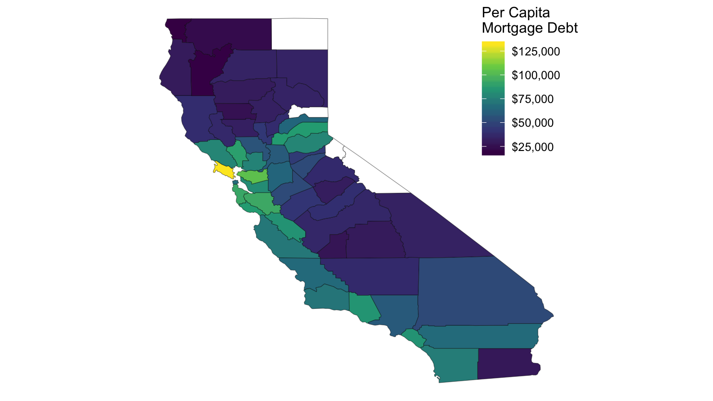
Figure 5: Mortgage Debt Per Capita, California, 2006-Q4, FRB
dataraw_county_long %>%
  filter(variable == "UNR", date == as.Date("2007-10-01")) %>%
  select(county_code, value) %>%
  mutate(value = value/100) %>%
  left_join(county_code_name %>%
              select(county_code, subregion = county_name3, region = state_name3),
            by = "county_code") %>%
  right_join(map_data("county") %>%
               filter(region == "california"),
             by = c("region", "subregion")) %>%
  ggplot(aes(long, lat, group = group)) +
  geom_polygon(aes(fill = value), colour = alpha("black", 1/2), size = 0.2)  +
  scale_fill_viridis_c(labels = scales::percent_format(accuracy = 1),
                       na.value = "white",
                       breaks = c(0, 0.05, 0.10, 0.15, 0.20),
                       values = c(0, 0.1, 0.2, 0.3, 1)) +
  theme_void() +
  theme(legend.position = c(0.8, 0.8)) +
  labs(fill = "Unemp.\nRate") + coord_fixed(ratio = 1)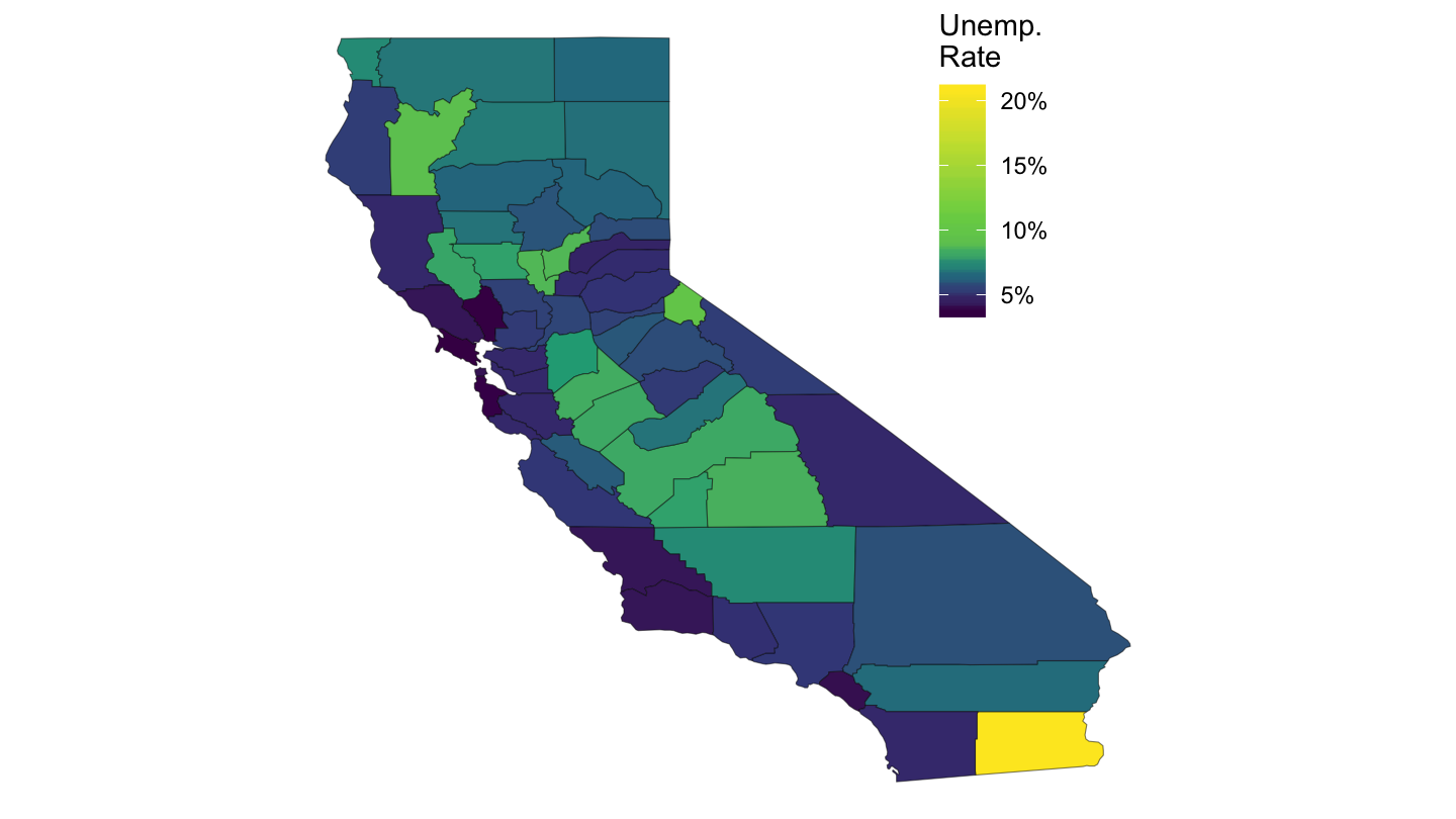
Figure 6: Mortgage Debt Per Capita, 2007-Q4, FRB
dataraw_county_long %>%
  filter(variable == "HOUSE_zillow_sqfeet", date == as.Date("2007-10-01")) %>%
  select(county_code, value) %>%
  left_join(county_code_name %>%
              select(county_code, subregion = county_name3, region = state_name3),
            by = "county_code") %>%
  right_join(map_data("county") %>%
               filter(region == "california"),
             by = c("region", "subregion")) %>%
  ggplot(aes(long, lat, group = group)) +
  geom_polygon(aes(fill = value), colour = alpha("black", 1/2), size = 0.2)  +
  scale_fill_viridis_c(labels = scales::dollar_format(accuracy = 1),
                       na.value = "white",
                       breaks = c(0, 200, 300, 400, 500, 600),
                       values = c(0, 0.2, 0.4, 0.6, 0.8, 1)) +
  theme_void() +
  theme(legend.position = c(0.8, 0.8)) +
  labs(fill = "Price Per\nSq Feet") + coord_fixed(ratio = 1)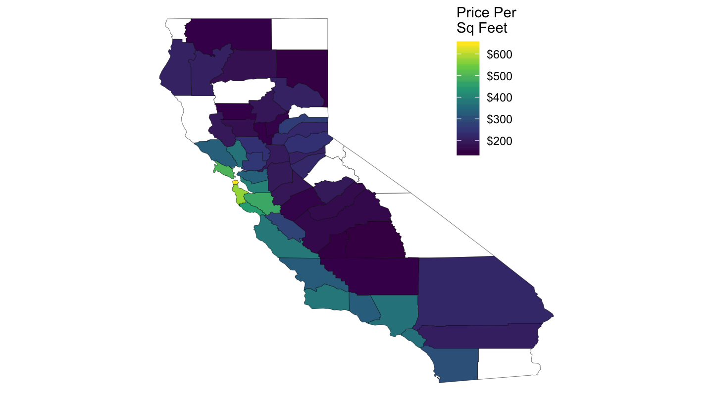
Figure 7: Price per Square Feet, 2007-Q4, FRB
Vermont
dataraw_county_long %>%
  filter(variable == "mortgage", date == as.Date("2006-10-01")) %>%
  select(county_code, value) %>%
  left_join(county_code_name %>%
              select(county_code, subregion = county_name3, region = state_name3),
            by = "county_code") %>%
  right_join(map_data("county") %>%
               filter(region == "vermont"),
             by = c("region", "subregion")) %>%
  ggplot(aes(long, lat, group = group)) +
  geom_polygon(aes(fill = value), colour = alpha("black", 1/2), size = 0.2)  +
  scale_fill_viridis_c(na.value = "white",
                       labels = scales::dollar_format(accuracy = 1)) +
  theme_void() + theme(legend.position = c(1, 0.4)) +
  labs(fill = "Per Capita\nMortgage Debt") + coord_fixed(ratio = 1)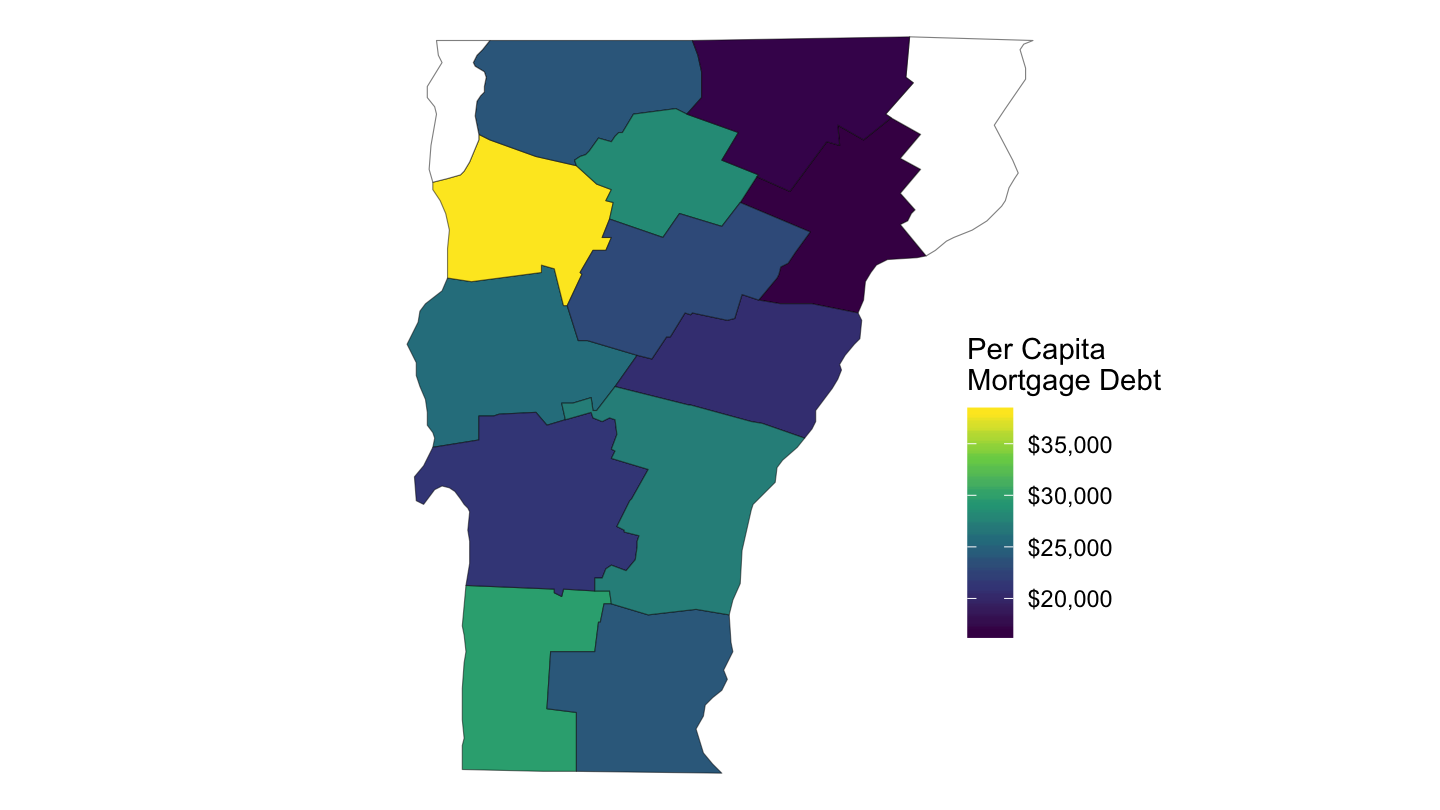
Figure 8: Mortgage Debt Per Capita, Vermont, 2006-Q4, FRB
Texas
dataraw_county_long %>%
  filter(variable == "mortgage", date == as.Date("2006-10-01")) %>%
  select(county_code, value) %>%
  left_join(county_code_name %>%
              select(county_code, subregion = county_name3, region = state_name3),
            by = "county_code") %>%
  right_join(map_data("county") %>%
               filter(region == "texas"),
             by = c("region", "subregion")) %>%
  ggplot(aes(long, lat, group = group)) +
  geom_polygon(aes(fill = value), colour = alpha("black", 1/2), size = 0.2)  +
  scale_fill_viridis_c(na.value = "white",
                       labels = scales::dollar_format(accuracy = 1)) +
  theme_void() + theme(legend.position = c(0.05, 0.2)) +
  labs(fill = "Per Capita\nMortgage Debt") + coord_fixed(ratio = 1)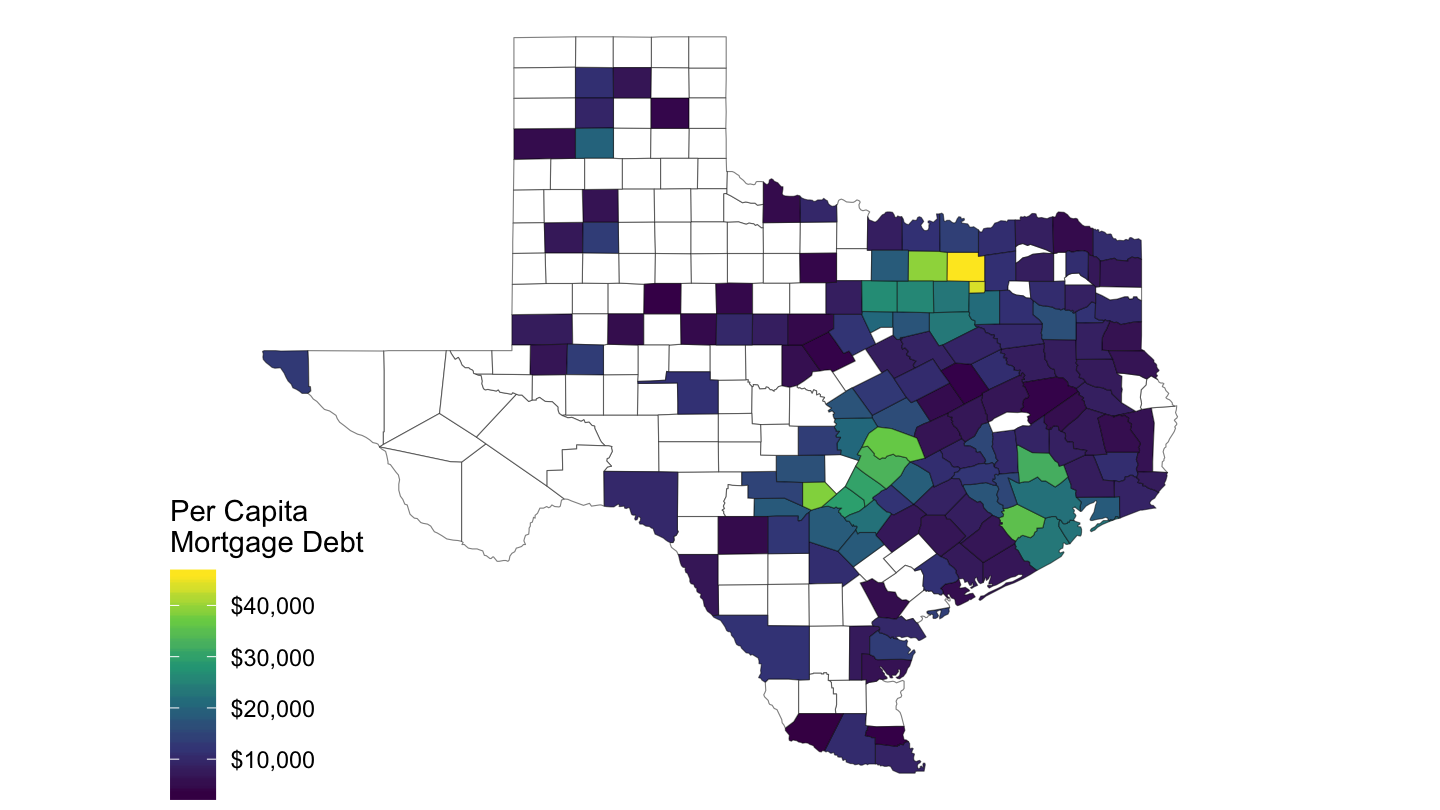
Figure 9: Mortgage Debt Per Capita, Texas, 2006-Q4, FRB
Massachusetts
dataraw_county_long %>%
  filter(variable == "mortgage", date == as.Date("2006-10-01")) %>%
  select(county_code, value) %>%
  left_join(county_code_name %>%
              select(county_code, subregion = county_name3, region = state_name3),
            by = "county_code") %>%
  right_join(map_data("county") %>%
               filter(region == "massachusetts"),
             by = c("region", "subregion")) %>%
  ggplot(aes(long, lat, group = group)) +
  geom_polygon(aes(fill = value), colour = alpha("black", 1/2), size = 0.2)  +
  scale_fill_viridis_c(na.value = "white",
                       labels = scales::dollar_format(accuracy = 1)) +
  theme_void() + theme(legend.position = c(0.2, 0.2)) +
  labs(fill = "Per Capita\nMortgage Debt") + coord_fixed(ratio = 1)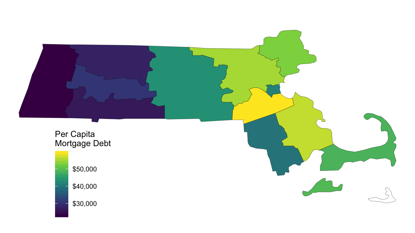
Figure 10: Mortgage Debt Per Capita, Massachusetts, 2006-Q4, FRB
County Map - Dynamic
County Map
The list of maps data is: https://code.highcharts.com/mapdata/
dataraw_county_long %>%
  filter(variable == "UNR", date == as.Date("2007-10-01")) %>%
  select(county_code, value) %>%
  mutate(county_code = str_pad(county_code, 5, pad = "0")) %>%
  hcmap("countries/us/us-all-all", data = .,
        name = "Unemployment", value = "value", joinBy = c("fips", "county_code"),
        borderColor = "transparent", valueSuffix = "%") %>%
  hc_colorAxis(dataClasses = color_classes(c(seq(0, 10, by = 2), 50))) %>%
  hc_legend(layout = "vertical", align = "right",
            floating = TRUE, valueDecimals = 0, valueSuffix = "%") %>%
  hc_mapNavigation(enabled = TRUE)
California
dataraw_county_long %>%
  filter(variable == "UNR", date == as.Date("2007-10-01")) %>%
  select(county_code, value) %>%
  mutate(county_code = str_pad(county_code, 5, pad = "0")) %>%
  hcmap("countries/us/us-ca-all", data = .,
        name = "Unemployment", value = "value", joinBy = c("fips", "county_code"),
        borderColor = "transparent") %>%
  hc_colorAxis(dataClasses = color_classes(c(seq(0, 10, by = 2), 50))) %>%
  hc_legend(layout = "vertical", align = "right",
            floating = TRUE, valueDecimals = 0, valueSuffix = "%")
United Kingdom
cities <- data.frame(
  name = c("London", "Birmingham", "Glasgow", "Liverpool"),
  lat = c(51.507222, 52.483056, 55.858, 53.4),
  lon = c(-0.1275, -1.893611, -4.259, -3),
  z = c(1, 2, 3, 2)
)

hcmap("countries/gb/gb-all", showInLegend = FALSE) %>%
  hc_add_series(data = cities, type = "mapbubble", name = "Cities", maxSize = '10%') %>%
  hc_mapNavigation(enabled = TRUE)
CBSA Map
CBSA-level
cbsa_nodate %>%
  select(cbsa_code, value = elasticity) %>%
  left_join(county_to_cbsa %>%
              select(county_code, cbsa_code),
            by = "cbsa_code") %>%
  left_join(county_code_name %>%
              select(county_code, subregion = county_name3, region = state_name3),
            by = c("county_code")) %>%
  right_join(map_data("county"),
             by = c("region", "subregion")) %>%
  ggplot(aes(long, lat, group = group)) +
  geom_polygon(aes(fill = value), colour = alpha("black", 1/2), size = 0.2)  +
  scale_fill_viridis_c(na.value = "white",
                       labels = scales::dollar_format(accuracy = 1, prefix = "")) +
  theme_void() +
  theme(legend.position = c(0.9, 0.2)) +
  labs(fill = "CBSA\nElasticity")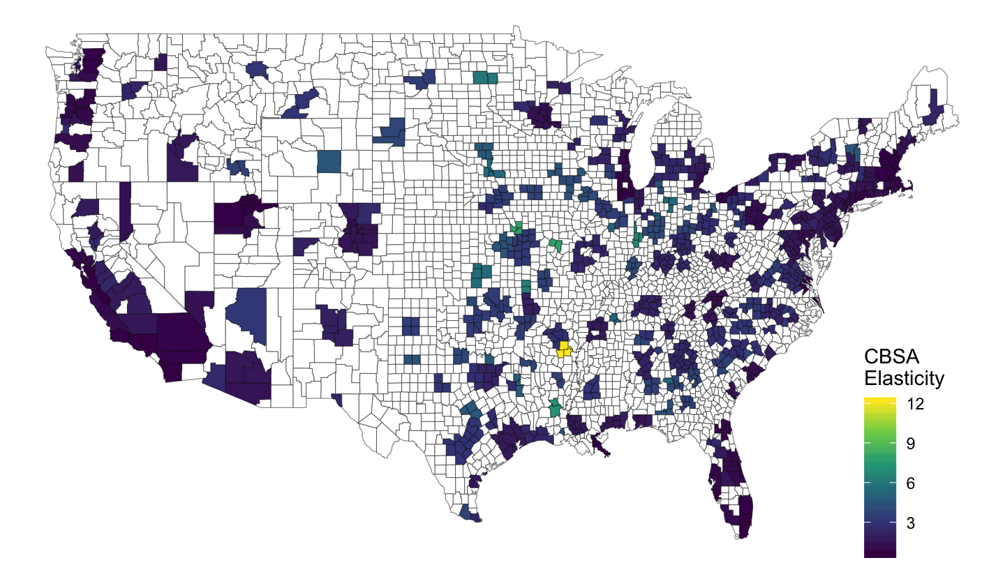
Figure 11: CBSA Level
cbsa_nodate %>%
  select(cbsa_code, value = elasticity) %>%
  left_join(county_to_cbsa %>%
              select(county_code, cbsa_code),
            by = "cbsa_code") %>%
  left_join(county_code_name %>%
              select(county_code, subregion = county_name3, region = state_name3),
            by = c("county_code")) %>%
  right_join(map_data("county") %>%
               filter(region == "florida"),
             by = c("region", "subregion")) %>%
  ggplot(aes(long, lat, group = group)) +
  geom_polygon(aes(fill = value), colour = alpha("black", 1/2), size = 0.2)  +
  scale_fill_viridis_c(na.value = "white",
                       labels = scales::dollar_format(accuracy = 0.1, prefix = "")) +
  theme_void() +
  theme(legend.position = c(0.2, 0.4)) +
  labs(fill = "CBSA\nElasticity") +
  coord_fixed(ratio = 1)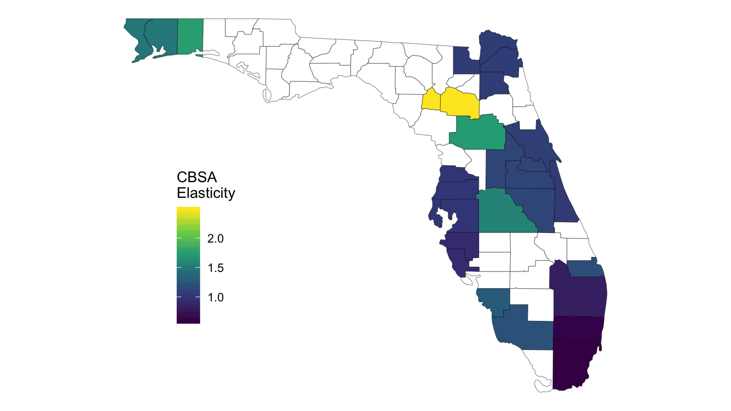
Figure 12: CBSA Level Elasticity, Florida
cbsa_nodate %>%
  select(cbsa_code, value = elasticity) %>%
  left_join(county_to_cbsa %>%
              select(county_code, cbsa_code),
            by = "cbsa_code") %>%
  left_join(county_code_name %>%
              select(county_code, subregion = county_name3, region = state_name3),
            by = c("county_code")) %>%
  right_join(map_data("county") %>%
               filter(region == "california"),
             by = c("region", "subregion")) %>%
  ggplot(aes(long, lat, group = group)) +
  geom_polygon(aes(fill = value), colour = alpha("black", 1/2), size = 0.2)  +
  scale_fill_viridis_c(na.value = "white",
                       labels = scales::dollar_format(accuracy = 0.1, prefix = "")) +
  theme_void() +
  theme(legend.position = c(0.05, 0.25)) +
  labs(fill = "CBSA\nElasticity") +
  coord_fixed(ratio = 1)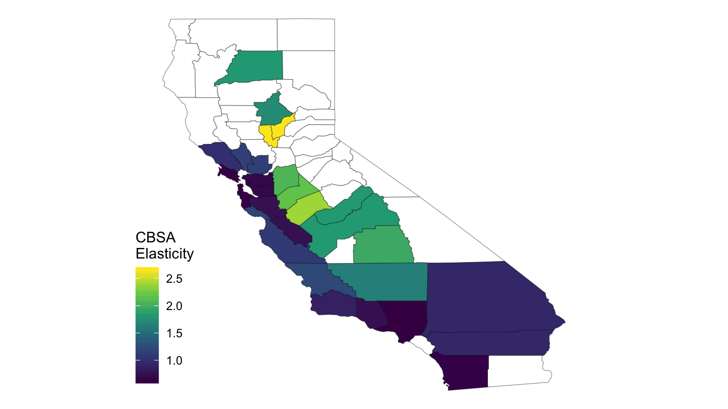
Figure 13: CBSA Level Elasticity, California
cbsa %>%
  filter(date == as.Date("2017-01-01")) %>%
  mutate(rent_share = median_rent*12/medincome) %>%
  select(cbsa_code, value = rent_share) %>%
  left_join(county_to_cbsa %>%
              select(county_code, cbsa_code),
            by = "cbsa_code") %>%
  left_join(county_code_name %>%
              select(county_code, subregion = county_name3, region = state_name3),
            by = c("county_code")) %>%
  right_join(map_data("county") %>%
               filter(region == "florida"),
             by = c("region", "subregion")) %>%
  ggplot(aes(long, lat, group = group)) +
  geom_polygon(aes(fill = value), colour = alpha("black", 1/2), size = 0.2)  +
  scale_fill_viridis_c(na.value = "white",
                       labels = scales::percent_format(accuracy = 1, prefix = "")) +
  theme_void() +
  theme(legend.position = c(0.2, 0.4)) +
  labs(fill = "Rent\nShare") +
  coord_fixed(ratio = 1)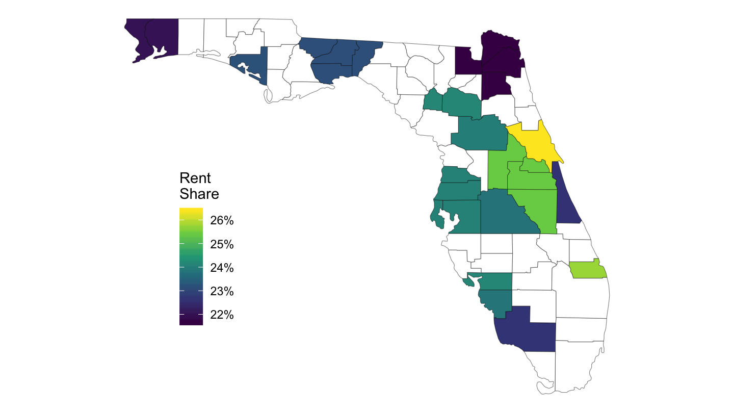
Figure 14: CBSA Level Rent Share (%)
cbsa %>%
  filter(date == as.Date("2015-01-01")) %>%
  mutate(rent_share = median_gross_rent*12/medincome) %>%
  select(cbsa_code, value = rent_share) %>%
  left_join(county_to_cbsa %>%
              select(county_code, cbsa_code),
            by = "cbsa_code") %>%
  left_join(county_code_name %>%
              select(county_code, subregion = county_name3, region = state_name3),
            by = c("county_code")) %>%
  right_join(map_data("county") %>%
               filter(region == "california"),
             by = c("region", "subregion")) %>%
  ggplot(aes(long, lat, group = group)) +
  geom_polygon(aes(fill = value), colour = alpha("black", 1/2), size = 0.2)  +
  scale_fill_viridis_c(na.value = "white",
                       labels = scales::percent_format(accuracy = 1, prefix = "")) +
  theme_void() +
  theme(legend.position = c(0.05, 0.4)) +
  labs(fill = "Rent\nShare") +
  coord_fixed(ratio = 1)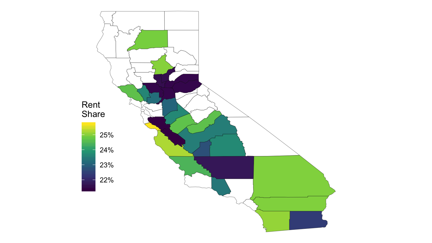
Figure 15: CBSA Level (California)
CBSA Map - Dynamic
cbsa_nodate %>%
  left_join(county_to_cbsa %>%
              select(county_code, cbsa_code),
            by = "cbsa_code") %>%
  select(county_code, value = elasticity) %>%
  mutate(county_code = str_pad(county_code, 5, pad = "0"),
         value = value %>% round(digits = 1)) %>%
  hcmap("countries/us/us-all-all", data = .,
        name = "Elasticity", value = "value", joinBy = c("fips", "county_code"),
        borderColor = "transparent") %>%
  hc_colorAxis(dataClasses = color_classes(c(seq(0, 10, by = 1), 15))) %>%
  hc_legend(layout = "vertical", align = "right",
            floating = TRUE, valueDecimals = 0) %>%
  hc_mapNavigation(enabled = TRUE)
State Map
us <- map_data("state")

ggplot() +
  geom_map(data = sh_top10_state_fig2b %>%
             left_join(fips_statenames_xwalk_short, by = "state") %>%
             mutate(mean_s_stateig10 = mean_s_stateig10 /100),
           map = us,
           aes(fill = mean_s_stateig10, map_id = region),
           color = "white", size = 0.15) +
  geom_map(data = us, map = us,
           aes(long, lat, map_id = region),
           color = "#2b2b2b", fill = NA, size = 0.20) +
  scale_fill_viridis(name = "Top 10% \nShare",
                     labels = percent_format(accuracy = 1),
                     values = c(0, 0.2, 0.4, 0.5, 1)) +
  theme_map() +
  theme(legend.position = c(0.87, 0.1))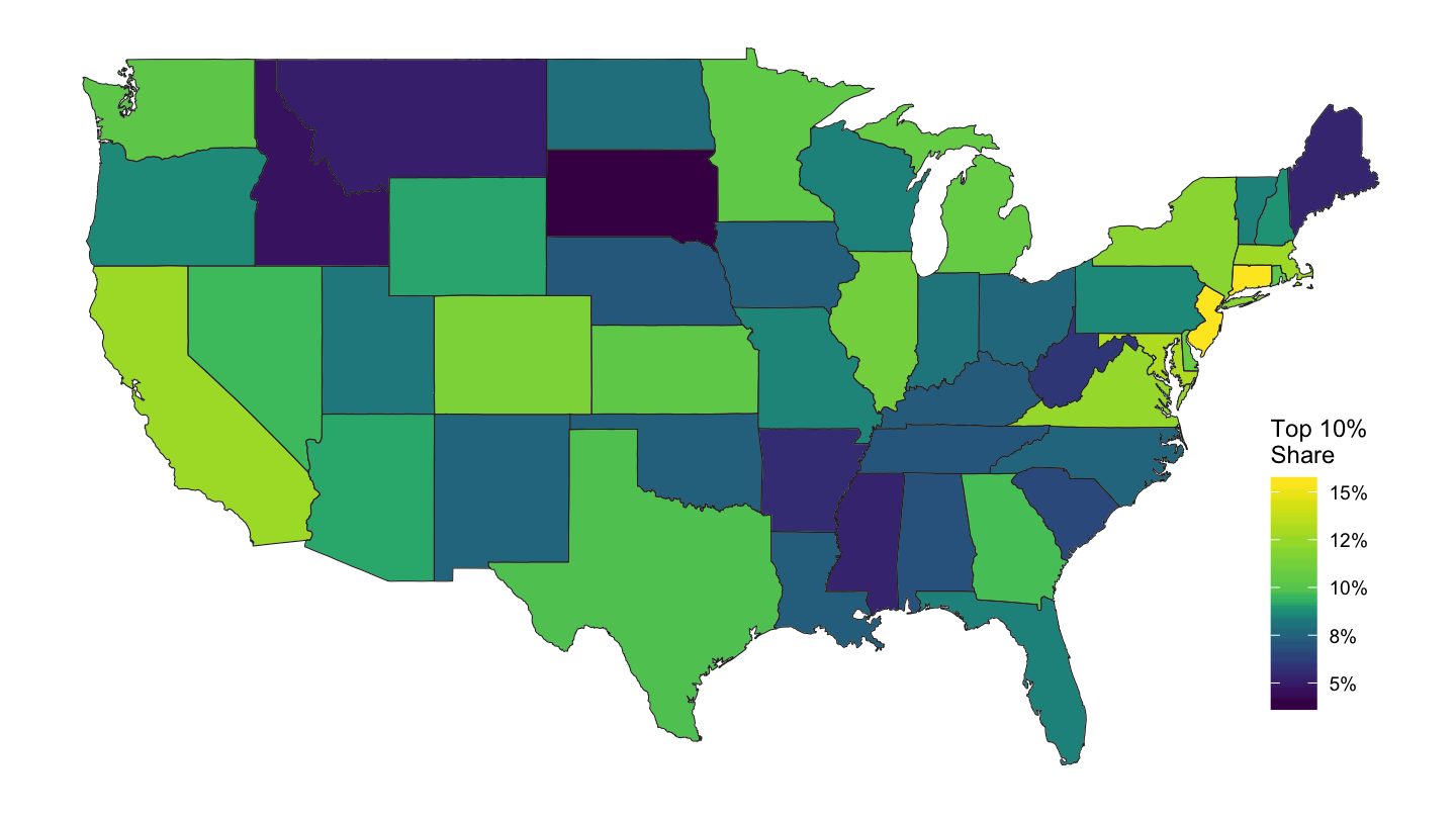
sh_top10_state_fig2b %>%
  left_join(fips_statenames_xwalk_short, by = "state") %>%
  mutate(value = mean_s_stateig10 /100) %>%
  right_join(map_data("state"), by = "region") %>%
  ggplot(aes(long, lat, group = group)) +
  geom_polygon(aes(fill = value), colour = alpha("black", 1/2), size = 0.2)  +
  scale_fill_viridis_c(labels = scales::percent_format(accuracy = 1),
                       breaks = c(0.05, 0.08, 0.10, 0.12, 0.15),
                       values = c(0, 0.2, 0.4, 0.5, 1)) +
  theme_void() +
  theme(legend.position = c(0.9, 0.2)) + labs(fill = "Top 10%\nShare")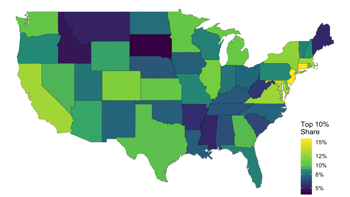
Figure 16: Top 10% Per Cent Share.
County Map
CBSA Map
State Maps
Per Capita Income
ggplot() +
  geom_map(data = df_state_demographics, map = us,
           aes(fill = per_capita_income, map_id = region),
           color = "white", size = 0.15) +
  geom_map(data = us, map = us,
           aes(long, lat, map_id = region),
           color = "#2b2b2b", fill = NA, size = 0.20) +
  scale_fill_viridis(name = "Per Capita \nIncome",
                     labels = dollar_format(accuracy = 1),
                     values = c(0, 0.2, 0.3, 0.4, 1)) +
  theme_map() + theme(legend.position = c(0.87, 0.1))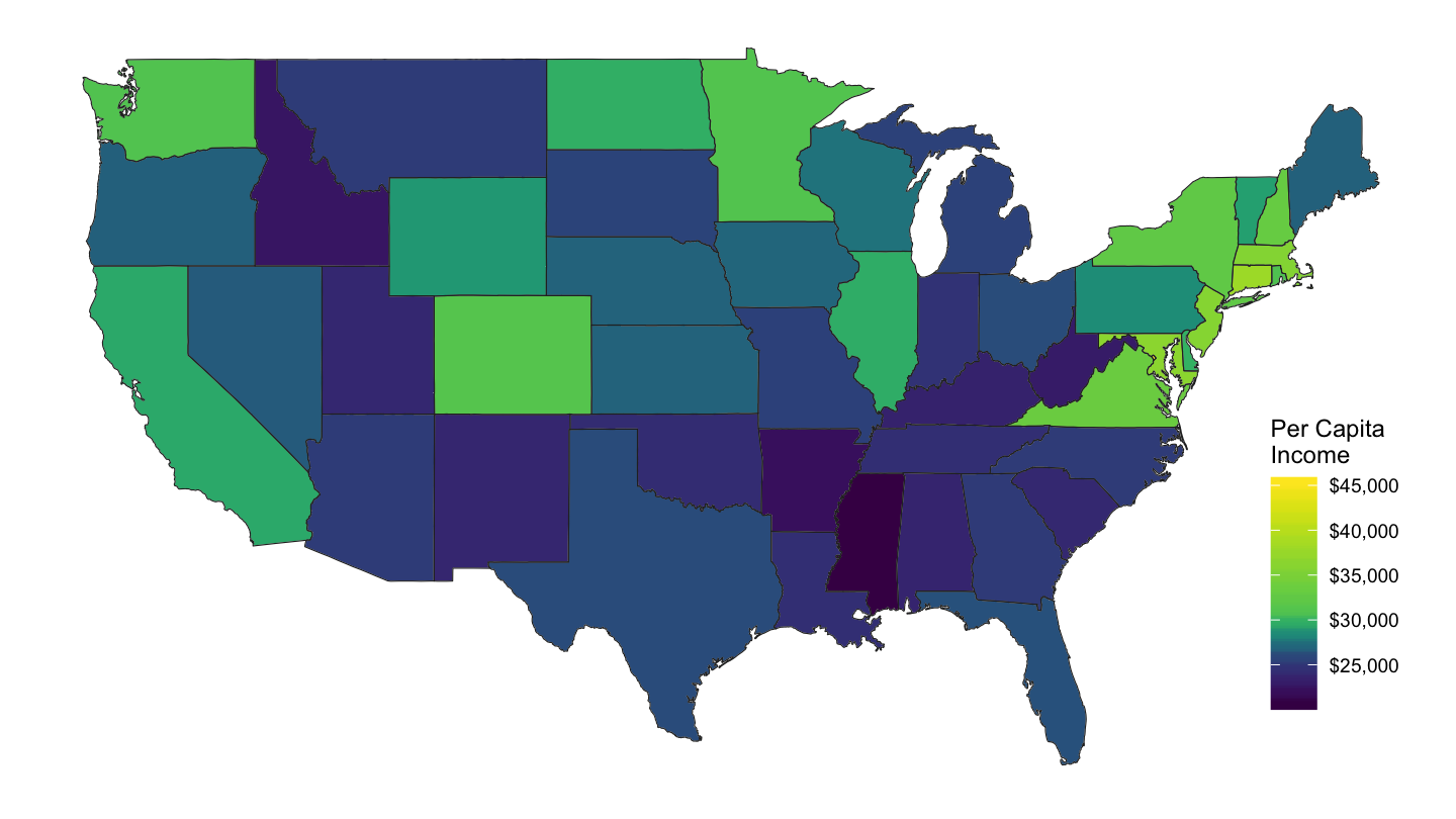
Figure 17: Per Capita Income by State
Median Rent
ggplot() +
  geom_map(data = df_state_demographics, map = us,
           aes(fill = median_rent, map_id = region),
           color = "white", size = 0.15) +
  geom_map(data = us, map = us,
           aes(long, lat, map_id = region),
           color = "#2b2b2b", fill = NA, size = 0.20) +
  scale_fill_viridis(name = "Median Rent",
                     labels = dollar_format(accuracy = 1),
                     values = c(0, 0.2, 0.3, 0.4, 1)) +
  theme_map() + theme(legend.position = c(0.87, 0.1))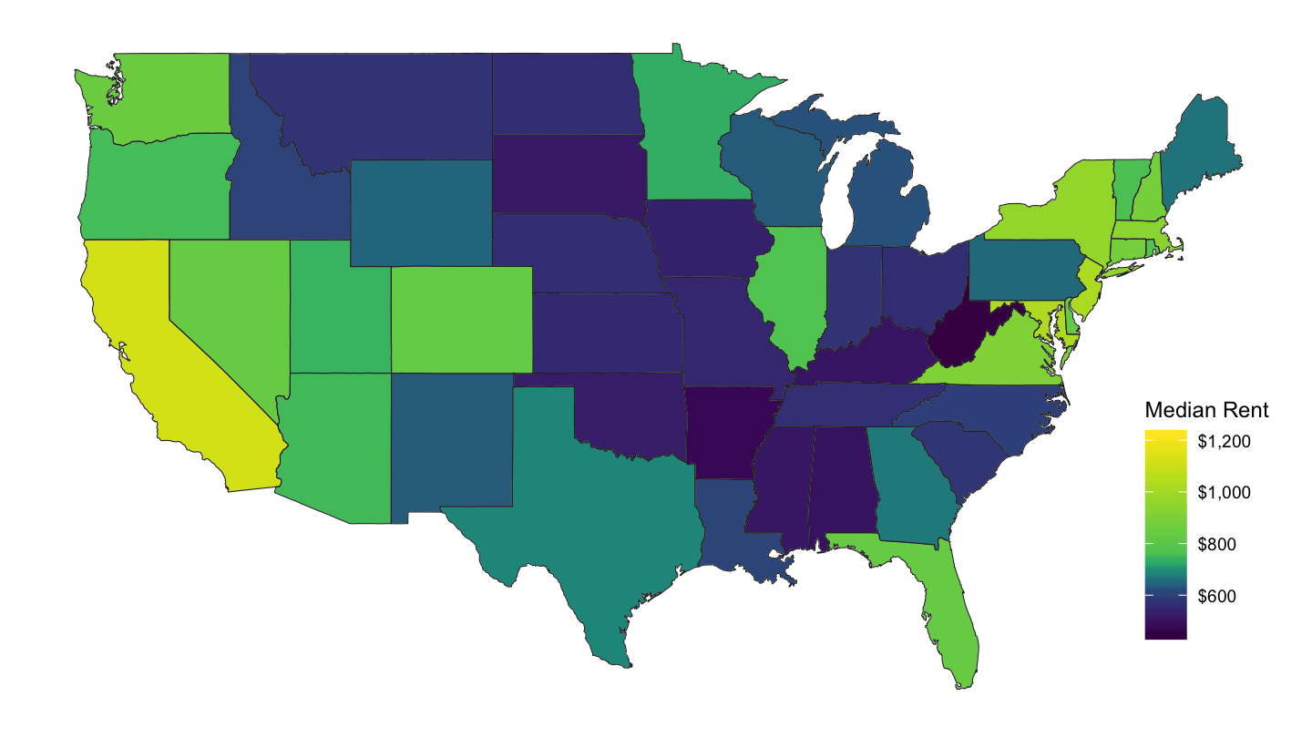
Figure 18: State Median Rent
Median Age
ggplot() +
  geom_map(data = df_state_demographics, map = us,
           aes(fill = median_age, map_id = region),
           color = "white", size = 0.15) +
  geom_map(data = us, map = us,
           aes(long, lat, map_id = region),
           color = "#2b2b2b", fill = NA, size = 0.20) +
  scale_fill_viridis(name = "Median Age",
                     labels = comma,
                     values = c(0, 0.2, 0.3, 0.5, 0.7, 1)) +
  theme_map() + theme(legend.position = c(0.87, 0.1))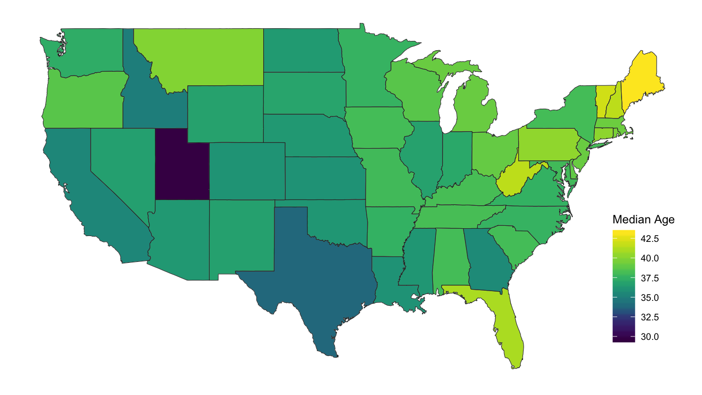
Figure 20: State Median Age
County Maps
Per Capita Income
df_county_demographics %>%
  left_join(county.regions, by = "region") %>%
  rename(fips = region, subregion = county.name) %>%
  left_join(us, by = "subregion") %>%
  ggplot(., aes(x = long, y = lat, group = group, fill = per_capita_income)) +
  geom_polygon() + coord_map() +
  theme_map() +
  geom_map(data = us, map = us,
           aes(long, lat, map_id = region),
           color = "#2b2b2b", fill = NA, size = 0.20) +
  scale_fill_viridis(name = "Per Capita \nIncome",
                     labels = dollar_format(accuracy = 1),
                     values = c(0, 0.2, 0.3, 0.4, 1)) +
  theme(legend.position = c(0.87, 0.1))
Figure 22: County Median Rent
Median Rent
df_county_demographics %>%
  left_join(county.regions, by = "region") %>%
  rename(fips = region, subregion = county.name) %>%
  left_join(us, by = "subregion") %>%
  ggplot(., aes(x = long, y = lat, group = group, fill = median_rent)) +
  geom_polygon() + coord_map() +
  theme_map() +
  geom_map(data = us, map = us,
           aes(long, lat, map_id = region),
           color = "#2b2b2b", fill = NA, size = 0.20) +
  scale_fill_viridis(name = "Monthly Rent",
                     labels = scales::dollar,
                     breaks = c(200, 400, 800, 1200, 1600),
                     values = c(0, 0.2, 0.4, 0.5, 1)) +
  theme(legend.position = c(0.87, 0.1))
Figure 23: County Median Rent
Median Age
df_county_demographics %>%
  left_join(county.regions, by = "region") %>%
  rename(fips = region, subregion = county.name) %>%
  left_join(us, by = "subregion") %>%
  ggplot(., aes(x = long, y = lat, group = group, fill = median_age)) +
  geom_polygon() + coord_map() +
  theme_map() +
  geom_map(data = us, map = us,
           aes(long, lat, map_id = region),
           color = "#2b2b2b", fill = NA, size = 0.20) +
  scale_fill_viridis(name = "Median Age",
                     labels = comma,
                     values = c(0, 0.2, 0.3, 0.5, 0.7, 1)) +
  theme(legend.position = c(0.87, 0.1))
Figure 25: County Median Age
